Master Bath With a Twist
Sunshine pouring over a glass-mosaic shower wall transforms a dreary little bathroom.
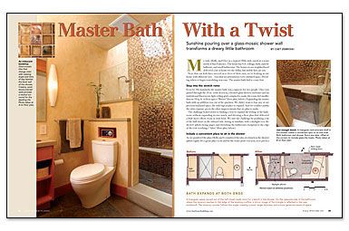
Synopsis: When architect Chet Zebroski and his wife decided to remodel their 1960s-era ranch, their first priority was the master bath. They wanted to expand the 18-sq.-ft. bathroom without building an addition. Their solution? To grab space from an adjacent hall closet. Other clever tactics involve the use of a triangular lavatory, varying ceiling heights, a skylight, and different types of tile.
My wife, Holly, and I live in a typical 1960s-style ranch in a town north of San Francisco. The house has 8-ft. ceilings, dark, narrow hallways, and small bathrooms. The homes in our neighborhood delivered a lot of house for the dollar, but stylish they are not. Now that our kids have moved on to lives of their own, we’re looking at our house with different eyes — eyes that see potential in every outdated space. Deciding where to begin remodeling was easy: The master bath had to come first.
Step into the stretch remo
Even by ’60s standards, the master bath was a squeeze for two people. Once you passed through the 24-in.-wide doorway, a frosted-glass shower enclosure and an institutional fluorescent-light ceiling grid conspired to make the room feel smaller than its 18 sq. ft. of floor space. Expanding the master bath with an addition was out of the question. We didn’t want to lose any of our precious backyard space, the only logical place to expand. And we couldn’t justify the extra expense, given the other improvements that we plan to make.
The challenge boiled down to finding a way to expand the feeling of the bathroom without expanding its size much, and devising a floor plan that delivered a little more elbow room at rush hour. We met the challenge by grabbing a bit of the hall closet on the inboard side, letting in sunshine with a skylight over the shower and stretching the bathroom’s footprint to the edge of the roof overhang.
Include a convenient place to sit in the shower
As we pondered the plan, Holly and I considered the idea of a bench in the shower. It’s a great place to sit and let the water pour over you, or to perch a leg for a soapy scrub. When we realized that we could annex a triangular piece of an adjacent hall closet, we turned it into a bench in the corner of our new shower. The wall above it torques into a rectangular skylight well as it climbs to the roof, creating a twisting backdrop of glass tile.
The shape of the bench is repeated at the opposite end of the room, where a triangular concrete windowsill sits atop the lavatory counter’s backsplash. The cabinet below reflects this shape, creating a floor that is wider on the hallway side and making it easier to get into and out of the room.
Capture adjacent space with a big door and a garden view
All designers have their tricks. An old standby is to make a small room seem larger by making it a part of another room. We played that card by taking advantage of the new, wide opening to the bathroom. Instead of a swinging door, we installed a 4-ft. 6-in.-wide barn-style door on a track. When the door is fully open, the hallway seems a part of the bath.
For more photos, drawings, and details, click the View PDF button below:
