How to Avoid the Seven Sins of Bathroom Design
Get the details right the first time when remodeling or building a new bathroom, because making changes later can be costly and difficult.

Bathrooms are botched more than any other room in the house. The big problem is water. It’s central to the room’s function, but it’s a protean source of damage. And designers unduly focus on cosmetics at the expense of critically important construction basics. Broadly speaking, the two causes of botched bathrooms are an unwillingness to spend the time and money it takes to construct a bathroom properly, and inept or inexperienced people handling the work. After 10 years of remodeling bathrooms, I’ve torn out a lot of other people’s mistakes. Here is my list of the seven sins of bathroom design.
1. Inadequate waterproofing
Bathrooms are wet rooms first, design showcases second. Every aspect of the planning and construction of bathrooms should take water exposure into account. If the waterproofing bill isn’t at least 5% to 10% of the job cost, someone is cutting corners or doesn’t know what they’re doing. Badly made shower pans and improperly flashed windows in showers routinely fail and lead to major damage. Inexpensive building and decorating materials like MDF, particleboard, veneered cabinetry, laminate counters, thinly plated metal fixtures, and wallpaper make for planned obsolescence.
Design instead with durable homogeneous materials like stone (including man-made varieties), glass and glass block, tile, terrazzo, concrete, stainless steel, and tough hardwoods. For baseboards and casings, I like to use PVC or composites such as MoistureShield (www.moistureshield.com). Wood cabinetry and trim should be a nickel’s thickness off the floor to prevent water contact; furniture-leveling feet are great for letting cabinetry stay dry.
2. Slippery floors
Shine is fine for faucets, but it’s bad for bathroom floors. Glossy tile and polished stone make for slippery, unsafe floors. These materials cause lots of falls, and they’re maintenance headaches, too, revealing every scratch and wearing unevenly.
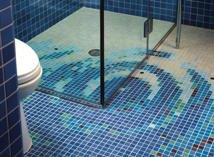
Imperfections and bumps are good qualities in bathroom floors. The floor should be made of tumbled stone or tile that provides ample traction. Variation in color, texture, and size also helps to prevent falls, and it looks great, too. Use floor tiles smaller than 12×12 to increase the number of grout joints for improved traction. Shower floors need even smaller tile with lots of grout joints, both to offer traction and to conform to the floor slope. Porous tumbled stone (travertine, limestone, etc.) is an ideal bathroom-floor material, both for its traction and its low maintenance. I love designing small-stone and unglazed-tile mosaics for shower floors. Daltile (www.daltile.com) has a reasonably priced water-jet service that allows fine details and curves to be cut in even the smallest tiles, permitting the creation of almost any image or geometry in a tile field at far less expense than hand-laid stone mosaics.
Tread cautiously when considering a wood floor. Teak, ipé, and other tropical woods might make attractive bathroom floors, but building a safe, durable wood floor for a bathroom costs a lot more than laying basic tile over backerboard and thick plywood. I still doubt wood’s long-term durability, even with a good installation. As for carpet, just forget it. Water and carpet pad are a nasty brew, and don’t get me started about carpet around toilets. Ick! The year 1975 was very bad for bathrooms.
3. No natural light
Our ancestors were so grateful to have indoor plumbing, they didn’t need ambience. But nowadays, people expect a lot more from a bathroom. The tiny, damp, and dingy interior bathroom with a little round light fixture in the ceiling is old-school.
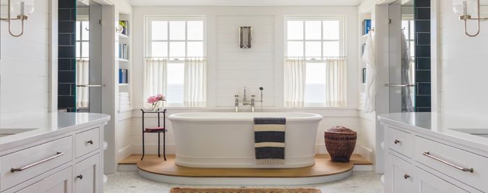
Admittedly, lack of natural light is a sin in any room, but bathrooms feel particularly creepy without natural light. Find any conceivable way to bring it into a bathroom. Use etched-glass or glass-block interior windows to carry in light from an adjoining room that has exterior windows. Use skylights. Use light tubes. Use structural glass block dropped into a hole in the floor to bring light in from the room below. Use motorized mirrors salvaged from a shuttle mission—whatever it takes. When nothing else works, use a trompe l’oeil tile design that suggests a light source exists, or paint a sun and clouds on the ceiling. I’ve used these tricks and more besides.
4. Boring tile
Daunted by seemingly unlimited choices, too many people just go with a tried-and-true blanket of 4×4 white tile. It’s boring, but it’s safe.
Plain-Jane tile represents a lost opportunity for personal expression, or simply for visual interest. I’ve seen it in new houses going for over a million dollars. Taking the trouble to design with various colors or sizes costs almost nothing extra. Anything, and I mean anything, is better than a blanket of 4×4 white tile. Live a little. If you feel lost among the tile products available, keep in mind a specific design theme, and then find the tiles that execute the theme. Believe me, they’re out there somewhere. But remember, a great tile design still can’t overcome a leak prone installation, which effectively makes the tile worthless.
5. Bad math
I was once called about a just-completed tiled shower in which a sliver of cut tile ran vertically right up the middle of the wall. The installer hadn’t counted before setting the tile; he and his helper started at opposite sides and met in the middle. The job had to be gutted—again.
Math is important in bathrooms because space is usually at a premium; every inch matters. Errors in math lead to glaring tile-layout problems, shower stalls and toilet alcoves that don’t meet code minimums, faucet handles that bang into backsplashes (my pet peeve), oversize pedestal sinks that interfere with door clearances, large gaps between toilet tank and wall—you name it. Measure and count over and over before materials are ordered and installed in bathrooms. Make templates whenever possible. And builders, take note: Caulk doesn’t atone for the sin of bad math.
On the other hand, don’t assume that because a space is small, you can’t design storage solutions into it. Storage of extra toilet tissue, vanity items, and towels is important. For small bathrooms, I’ve designed many kinds of recessed, partly recessed, and wall-mounted cabinets; neat little drawer cabinets that sit on the floor between a toilet and a pedestal sink; and open shelves in whatever sizes and shapes seem to work for the client, given the space constraints.
6. Bathrooms in the kitchen
People will stick powder rooms anywhere. One place is particularly egregious, though: A bathroom should not open directly into a kitchen. (Your local building code might forbid it anyway.) I will do anything to prevent a bathroom door from opening into a kitchen, or to avoid placing a toilet so that it’s visible from the kitchen. No one working with food or enjoying food wants to be reminded where baked ziti goes in the end.
7. Toilets facing the door
You know how those little push-button door locks sometimes don’t catch? It always happens when Uncle Elmer comes for a visit. Don’t place a toilet facing the bathroom door. How embarrassing.
Good sight lines are key. In a small bathroom, the toilet should be perpendicular to the doorway and visually screened. For instance, use simple wood screens or semitranslucent panels such as etched glass to suggest some degree of privacy for this, the most intimate of personal tasks. My favorite solution for setting off a toilet area is a thick wood panel with an open-work design or interesting veneering. The panel needs to rest on stainless-steel furniture glides or round doorstops with the rubber pulled out so that the wood doesn’t take up water through the end grain. At the same time, avoid entirely walled-in toilets in minimum code widths (usually 30 in.). People hate them, and inevitably the fan roars loudly within. A toilet stall is ideal at 36 in. to 42 in. wide, with 27 in. to 30 in. of clear space in front of the toilet.
Speaking of fans, the best advice is to vent quickly and quietly. Building codes require fart fans (this is a legitimate term in the building trades, universally understood and never confused with any other kind of fan), so builders grudgingly buy cheap $25 fans that roar like jet engines. They are attached to cheap flex duct. Effective cfm: 6. But the actual cfm is zero, since no one turns on the fan except the building inspector. For bathroom-specific venting, Panasonic (www.panasonic.com) fans are dead quiet and long-lasting. Remote blowers like those from Fantech (www.fantech.net) are also an option.
From Fine Homebuilding #191


