A Clever Kitchen Built-in
Six small boxes joined behind a simple face frame exploit a shallow space.
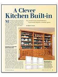
Synopsis: Kitchens often need all the storage space they can surrender, but awkward locations can mean useless real estate in this busy room. Cabinetbuilder Nancy R. Hiller developed a solution for a kitchen-storage challenge: fitting a clever, useful built-in against a shallow slice of kitchen wall. She did it by joining six small cabinet boxes behind a face frame and by using smart details and strong hardware. The result is a roomy storage unit with cabinets, drawers, and shelves.
Modern kitchens are made for storage, but it never seems to be sufficient. Recently, my company built a cabinet to provide generous storage on a shallow section of wall in our clients’ kitchen. It was space that normally would have gone to waste because it was too shallow for stock cabinets.
The inspiration for this custom-made cabinet came from a traditional piece of British furniture known as a Welsh dresser. In use since the 17th century, the dresser originally provided the main storage in a kitchen; built-in cabinets did not become the norm until the early-20th century. More commonly known in the United States by the less-elegant term hutch, the dresser typically has a shallow, open upper section that sits on a partially enclosed base. The dresser described here also exemplifies the sort of planning, production, and installation essential for genuinely custom built-in cabinets.
A strategy for storage that doesn’t waste space
The kitchen had a section of unused wall about 11 ft. long, which I thought could be used for storage and display space without impeding traffic flow. Although 1 ft. of depth is shallow for a base cabinet, it is enough to hold a surprising variety of kitchen wares: cookbooks, decorative china, coffee mugs, small mixing bowls, jars of beans or pasta. Knowing that one of my clients had grown up in England and would be familiar with Welsh dressers, I suggested a similar cabinet with more-contemporary lines, customized for her family’s budget and for the available space.
The upper sections would have open shelves, but the base cabinets would be enclosed with doors and drawers to keep their contents free of the dust and debris that collect at a kitchen’s edges. Enclosing the lower sections also would give a nice visual weight to the wall without making it appear too heavy. The break between base and upper cabinets would be at 32 in., not the typical kitchen-counter height of 36 in., because I wanted this piece to look more like furniture than a regular kitchen cabinet.
Building smaller components makes the project easier
The six-piece unit is divided into three uppers and three bases for ease of production, delivery, and installation. To make the six plywood cases and the solid-maple counter resemble a single piece of cabinetry, I used a complete maple face frame on the center section of the upper and lower casework and a partial face frame on each end. The end cases would butt tightly against the center unit and share its face-frame stiles to make the unit appear as one piece.
Although 10-in. slides are available for many purposes and would have been ideal for this job, they are rated only for drawers up to approximately 2 ft. wide. For smooth operation, I needed hardware designed for oversize openings. Given the location of the adjacent door casing, which limited the cabinet’s depth to a maximum of 12 3⁄4 in., and a design that called for inset drawer faces, we needed to create 1⁄4 in. of additional depth to accommodate the 12-in. slides by routing out the plywood cabinet back in those locations.
For more photos, drawings, and details, click the View PDF button below:
