A Narrow Kitchen Opens Up
Increased access and creative cabinetry let a small kitchen live big.

Synopsis: An interior design firm transforms a cramped and outmoded narrow kitchen into a more functional, beautiful, and family-friendly place, with creative use of unfitted cabinetry and wall openings. A sidebar presents a list of design-related questions that people considering a kitchen remodel should consider before settling on a design.
Jeff and Catherine Cappel’s 1930s brick Georgian was built in the days when many households had a cook to prepare the meals. As such, the kitchen was designed as a private service space. The room was small, narrow, and closed off visually from the rooms used most. And, with little natural light, it contrasted starkly with the large, light-filled rooms in the rest of the house. Cooking was a lonely and difficult chore for Jeff and Catherine, especially with three young children. Adding to the frustration, the old kitchen had limited countertop space, deteriorating cabinets, inadequate storage, and broken-down appliances.
As a stopgap measure, the Cappels refinished the wood floor, painted the cabinets, and replaced the countertops. They also added a small mudroom to the west end of the kitchen to replace a cramped hallway. These improvements helped, but the reality was that the cabinetry and appliances were on their last legs, and something needed to be done.
Getting the most from a difficult space
When the Cappels came to our interior design firm, they told us they wanted their new kitchen to be open to the adjacent breakfast room to make the whole space conducive to gathering as a family. They requested that it have adequate storage in the right places, high performance appliances, more natural light, and an island for food preparation, storage, and seating.
At less than 12 feet wide, the narrow space would not easily accommodate an island along with the necessary storage and appliances. Set-back rules and the desire to keep the symmetry of the exterior intact kept us from widening the kitchen. We had to make the most of the light and space that was already there. So, we replaced the single north-facing window above the sink with a double window. And we gained 5 feet on the length of the kitchen by expanding the mudroom toward the garage.
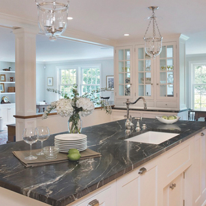
The greatest impact, though, came from removing the wall between the kitchen and the breakfast room. “It was inconvenient having a separate breakfast room. Our youngest child was two when we moved here—the others were six and nine—so there was a lot of running between the two rooms,” said Catherine. Removing the wall brought in light, visually enlarged the kitchen, and let the two rooms function as one.
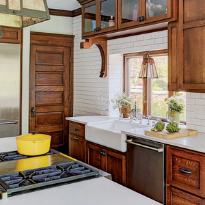
Architect Thomas Bair, AIA, determined the proper support where walls were removed, and designed the extension to the mudroom. Removing walls required support beams and a post in the middle of the kitchen, for which we designed cherry paneling to match the island and hutch cabinetry.
Efficient planning makes it all fit
To make this tight space work, careful alignment of cabinetry and appliances was essential. In the original kitchen, poor placement made the small space even more difficult. Not only did opening the refrigerator block entry from the backdoor, but the layout of appliances and cabinetry along perimeter walls left an inconvenient 7-foot aisle in between. This put vital prep-work countertop space too far away from the sink, stove, and refrigerator. To deal with the gap and to make the cooking area efficient we lined up the range top, range hood, under-cabinet microwave, sink, dishwasher, refrigerator, and two ovens (all requiring 24 inches of depth) along the same wall. Keeping appliances together left the opposite wall free for 12-inch-deep, floor-to-ceiling pantry storage and saved valuable space for the island.
For before and after photos and details on this kitchen remodel, click the View PDF button below.
