Built to Blend In
Overlooking Maine’s rocky coastline, this summer getaway follows the site’s contours and takes on the color of the forest.
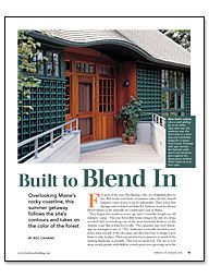
Synopsis: Architect Roc Caivano’s clients charged him with designing a new summer house that would preserve as much of the existing landscape as possible—no mean feat, considering the steep site was mostly granite, populated by spruce trees, and hard against a road on the uphill side. The solution involved an 11° bend in the plan (taking advantage of the stunning ocean views) and cedar trellises as siding. Once the clematis and hydrangea mature, the house will look as if it has been there forever.
For most of the year, Hot Springs, Arkansas, is a delightful place to live. But in the cruel heart of summer, when the hot, humid hammer comes down, it can be unbearable. That’s when Hot Springs natives Isabel and John Ed Anthony head for Mount Desert island on the naturally air-conditioned coast of Maine.
They began this tradition years ago and eventually bought an old summer “camp.” This run-down little house clung to the side of a steep, wooded cliff, overlooking one of the most beautiful harbors on the Atlantic coast. But as John Ed recalls, “The carpenter ants were defeating our attempts to save it.” The Anthonys eventually decided to tear down what was left of the old camp, and they hired me to design a new home to take its place. Their top priority was to preserve as much of the existing landscape as possible. This was no mean feat. The site is very steep, mostly granite with shallow-rooted spruce trees growing out of the crevices, and hard against a road on its uphill side. Not surprisingly, the property is governed by a rigorous list of state and local ordinances that limit the footprint and volume of any new construction.
The Anthonys asked for a garage, a workspace, and a guest apartment in the design. We talked, walked the land, and sketched, and eventually, we decided to put them in a separate building, a bit uphill and to the east of the main house. As a result, the garage is easy to reach from the road and provides some privacy from the neighbors.
Take advantage of the kinks
Unlike in life, a kink can be a good thing in a well-designed home. The kink in the plan of the Anthony house is the 11° bend between the dining room and the family room. This bend was a direct response to the shape of the site and its contours, the views, and the coastal-zone setback restrictions.
In this case, the bend presented a couple of opportunities to add some zest to our simple plan. For one, the bend made it visually logical to fold an eyebrow into the roof at the entrance, where the two roof planes intersect. Also, the bend added a funnel-shaped flare to the entry-room walls to better capture its stunning view of the ocean.
The layout of the house balances two elemental facts. First, this is a downslope lot with magnificent views to the south. That influenced my decision to flip the traditional plan of downstairs living spaces and upstairs bedrooms. The entry is on the upper floor, where all the primary spaces—living room, dining room, family room, kitchen, and decks—have as much exposure to the view as possible. And second, the support spaces—hallways, bathrooms, closets, and laundry—line the north side of the building to create a sound buffer from the road.
For more photos, floor plans, and details, click the View PDF button below:
Fine Homebuilding Recommended Products
Fine Homebuilding receives a commission for items purchased through links on this site, including Amazon Associates and other affiliate advertising programs.

Plate Level

Anchor Bolt Marker

Smart String Line

