How Great Houses Take Shape
An architect explains how to use the six principles of massing to shape a distinctive small home.
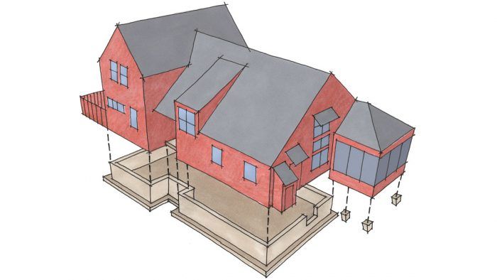
Synopsis: Architect Jeremiah Eck knows that jargon like “massing” can turn off a lot of clients. But carefully planned volumes can make a small house feel more spacious and inviting. Distinction is in the details, and Eck illustrates the difference between good and bad design with easily identifiable alternatives. He boils down this powerful design tool into six principles that can turn a house into one really worth coming home to.
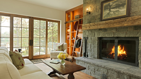
Magazine extra: Applying the six massing principles on the exterior can lead to some interesting interiors. View photos and read Smart Massing Adds Space and Light to learn how the interior shapes were influenced by the exterior’s mass.
After designing lots of houses, I’ve seen what can happen when I mention the term massing to clients. Their eyes roll back into that space where jargon goes to die. But as pretentious as the term sounds, it nevertheless describes a fundamental design element that can’t be ignored.
Massing describes the way a house looks in three dimensions: height, length, and width. The interrelationships created by these dimensions give a house its mass and determine whether it looks right. This house, designed by my partner, Paul MacNeely, sits on the shore of a small lake west of Boston. At 1926 sq. ft., it’s modest in size, yet it projects a sense of variety and function typical of larger homes. In fact, massing is a great tool for making a small house seem more spacious.
A former professor of mine used to say, “Keep it simple, but make it complex.” That’s just what Paul did by balancing the six principles of massing explored here. Yes, injecting this kind of complexity makes for a house that costs more than one designed with a simpler approach. But the result can be a house that’s really worth coming home to.
Keep the shapes simple
A house with good massing doesn’t make you wonder where to look first. The general rule is that the composition should have one dominant element. In our example, it’s the taller portion of the house. Your eye goes there first, and then begins to explore the rest.
One way to make a small house seem larger is to break it into distinct parts. Start with simple, uncomplicated shapes that are easily identifiable as major or minor functions of the house. Don’t overdo it; one or two major components are always better than too many. In this case, we divided the house into two wings: one for living/dining, the other for sleeping. This reflection of the inside function on the outside massing is one mark of a distinctive home.
It’s also important that the separate masses of the house have strong boundaries so that they read as distinct from one another. Shadowlines from offsets and indentations achieve this goal. Note how the separation at the entry and the lower form of the one-story portion create a distinct hierarchy. The bulky alternative shown in the “bad” drawing in the article stops your eye cold.
Make a statement with the foundation
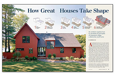
For more photos, drawings, and details, click the View PDF button below:
Fine Homebuilding Recommended Products
Fine Homebuilding receives a commission for items purchased through links on this site, including Amazon Associates and other affiliate advertising programs.

Hook Blade Roofing Knife

Shingle Ripper
Original Speed Square

