Neighborly From the Start
A new home combines privacy, daylight, and durability, and fits comfortably into a traditional neighborhood.
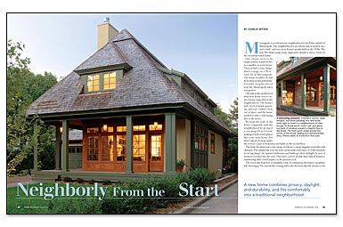
Synopsis: Architect Charlie Witzke was charged with designing a new house respectful of an established neighborhood in a Minneapolis suburb. To ensure compatibility with the neighbors, Witzke decided on a very steep roof, so at first glance the house looks like it’s one story. There’s plenty of room under the roof, though, for a pair of bedrooms and baths. And there are no unsightly roof vents, thanks to a continuous decorative cap. What else makes a good neighbor? How about a broad porch, a wall of windows facing the street, and an unobtrusive garage.
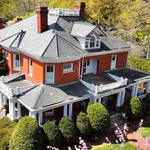
Morningside is an old streetcar neighborhood in the Edina suburb of Minneapolis. The neighborhood is an eclectic mix of modest one-and-a-half- and two-story houses mostly built in the 1930s, ’40s, and ’50s. Styles range from clapboard colonial to stucco Tudor to the occasional ranch house.
Our clients, soon to be empty nesters, wanted to live in a smaller, in-town house. They found a tiny, dilapidated cottage on a 50-ft.-wide lot in Morningside. The house wouldn’t do, but its location in this pedestrian-friendly neighborhood near the Minneapolis lakes was perfect.
Our task as the architects of their new house was to create a home respectful of the neighborhood. The house’s style, level of detail, materials, and size couldn’t look out of place, and the house needed to turn a welcoming face to the street.
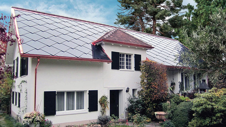
We kept the scale of the house compatible with the neighborhood by giving it a very steep (15-in-12) roof, making it look at first glance like a one-story house. Yet there’s plenty of room under the roof for a pair of bedrooms and baths on the second floor.
The front elevation is an iconic image of a house: a steep, singular roof with a tall chimney. The simpler the roof, the more memorable it becomes. To help maintain its strong shape, the upstairs bedrooms and baths get their daylight by way of dormers recessed into the roof. They have a lower profile than typical dormers, minimizing their visual impact on the primary roof.
The roof is also kept free of unsightly vents. A continuous, decorative cap conceals the venting and is also the form that the dormer roofs echo. The exterior columns are minimal, with just enough millwork detail top and bottom to give them character.
Finding the sweet spot between openness and privacy
On an urban lot, the temptation is to close off the front of the house from the street for the sake of privacy. The result typically limits the amount of daylight reaching the interior and any connection to the outdoors. We took a different approach, providing daylight for the living spaces and developing a strong connection to the front and back yards.
Framed by four columns, the living room is mostly windows. The windows wrap the corner to expand the connection to the outside, opening the room to light from the north and west and to views down the street.
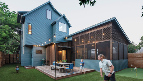
At the opposite end of the house, the kitchen faces east and also has windows wrapping the corner to catch south and first light. They overlook the backyard patio and grilling area. A screened porch also opens onto the patio. The backyard landscaping and deciduous trees were designed for privacy, and they create a parklike atmosphere, which is great either for relaxing with the paper or for entertaining a large party.
For more photos, drawings, and details, click the View PDF button below:
Fine Homebuilding Recommended Products
Fine Homebuilding receives a commission for items purchased through links on this site, including Amazon Associates and other affiliate advertising programs.

Roof Jacks

Peel & Stick Underlayment

Smart String Line
