A Tiny Addition for a Growing Family
Dining, living, office, laundry, bathing, sleeping, and storage space built in just 650 sq. ft.
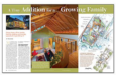
Synopsis: Architect Tina Govan needed to design an addition for her cozy Raleigh, N.C., home. By employing strategies and concepts she learned about while working in Japan, Govan was able to add space for a dining area, a living area, a home office, a laundry area, a bathroom, a bedroom, and storage room in only 650 sq. ft. The key to achieving this success was rooted in the idea of having spaces serve multiple purposes. With custom-made shoji screens, the master bedroom, for instance, is a private area by night but opens up to be a public space during the day. Windows and long sightlines keep the addition connected to the outdoors.
My husband and I moved into our 1923 bungalow in downtown Raleigh, N.C., as a young couple. Ten years, two children, and one dog later, the house had become cramped. Having lived in Japan, we were accustomed to tight quarters, but the constraints of 1000 sq. ft. had become too great, especially with the added demands of my home office. We chose to add on to our home instead of moving and had a lot of needs to accommodate, but not a lot of space to do it. For two years, I worked as an architect in Japan and admired how the Japanese were able to introduce a sense of expansiveness within the smallest of structures. It was through my observations there that I developed many of my own design ideas. With a strong reliance on those strategies, I approached the challenge of designing our tiny addition.
Soft spatial boundaries allow multiuse spaces
Using changes in ceiling height, floor level, or materials; using partial or sliding walls rather than solid, full-height ones; using pocket doors rather than swinging doors; and carving niches within larger spaces are all strategies I used for distinguishing spaces in a softer way.
The main common room, or plaza, of the addition needed to serve a wide range of functions. To keep the area open and to avoid separate rooms for each use, I created small but distinctive spaces along the edges of a high central living area.
One corner of the addition provides a dining space surrounded by a bank of windows, while the other accommodates my home office. The tatami room (our new bedroom) is raised several steps above the main living area. Tucked into another corner is a stacked washer/dryer unit that is hidden behind a sliding plywood panel held in place with a simple wooden peg. A counter and hamper sit opposite. This design allows the laundry area to coexist with more-public spaces and also saves valuable square footage.
Another example of this kind of space is the loft, which wraps two sides of the plaza. It allows us to inhabit the high volume of the room and serves as a private getaway with a small library and its own view of life below.
Softer boundaries also affect the family dynamic. By designing one common space with smaller spaces carved within it, we can be together as a family yet remain comfortably separate, engaged in different activities.
For more photos, drawings, and details, click the View PDF button below:
