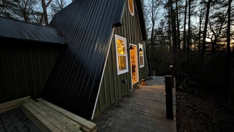
A home’s primary entrance— whether centered on the street or set a bit off the beaten path—functions as more than just a means of getting inside. Recognizing, approaching, and passing through that entry provide our first real interaction with the structure and the people who live there. The way an entrance is designed has everything to do with whether we walk into a house feeling welcomed or intimidated, impressed or amused, awed or unmoved. It’s no wonder entryways get so much attention during the design and renovation process; they’re an important threshold to cross.
Raising an eyebrow
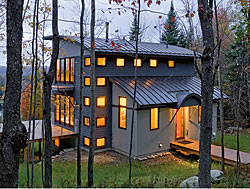
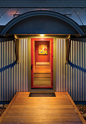
The front entry of this New Hampshire weekend home had to be eye-catching. With the home’s approach situated to the side and a large deck inviting visitors around back, this sheltered doorway needed strong features to assert its role as the home’s primary entrance. It does this with a bold curve and a glass entry door that provide an arresting view of a red wall inside. To get to the door, visitors cross a wooden bridge; a metal grate recessed in front of the entry helps to prevent snow and mud from getting in the house. Designed by Smith & Vansant Architects, Norwich, Vt.; built by Ron Fadden Builders, North Haverhill, Mass.
Past connection
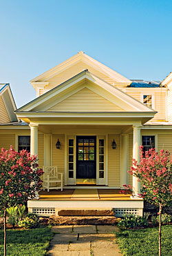
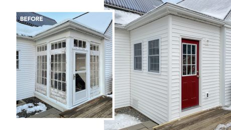
This side entry was added during a 2006 renovation to provide a convenient everyday entrance to this 1820s home. Poised between the old and the new, it mimics classic details with fiber-cement siding and fiberglass columns. Designed by architect Robert Page; built by Conner & Buck Design Build Contractors, Bristol, Vt.
Light balance
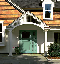
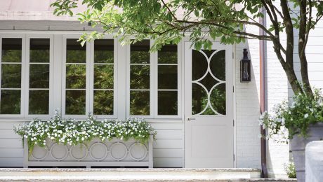
The lattice on this Narragansett, R.I., cottage sets its entry apart from the average stoop. Architect Gale Goff, who chose the material for its lightpattern effect, used a side panel with the same pattern to widen the entry door visually; otherwise, the door would have appeared off-center under the entryway roof. Designed by Goff, Estes/Twombly Architects, Newport, R.I.; built by Gardner Woodwrights, Saunderstown, R.I.
Back home
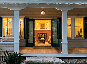
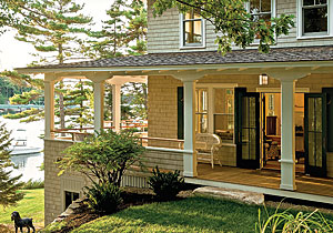
A double-wide entry was instrumental in the revival of this circa-1915 foursquare cottage. It replaced a fiberglass entry door installed by former owners who also sealed the porches and used vinyl siding. Architect Rob Whitten opened the porches, exposed the roof structure, and added French doors. “We wanted to give it the sense of presence and order it once had,” he said. Designed by Whitten Architects, Portland, Maine; built by Boothbay Home Builders Inc.
