Making a Galley Kitchen Count
A new entry and a built-in breakfast nook transformed this room from a hallway to a destination.
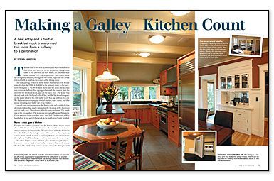
Magazine extra: Stefan Hampden shares the before, during, and after photos that illustrate this kitchen’s transformation.
The first time I met with Kimberly and Ryan Hamilton to talk about their kitchen, we sat around the dining-room table. Their affection for their home, a Craftsman-style house built in 1915, was irrepressible. They talked about the thoughtful detailing throughout the house, especially the newly restored built-in hutch in the corner of the dining room.
The only glaring weakness in the house was the kitchen. Poorly remodeled in the 1980s, it doubled as the primary route to the backyard. With three doors into the space, the kitchen was a narrow hallway that zigzagged around the counter, past the stove, by the breakfast nook, and out the back door. The house was already built to the backyard setback line, and the bit of outdoor space on the south side was the only usable yard. So a big addition was out. We had to make every square foot of existing space count, and that meant rerouting foot traffic out of the kitchen.
I spread some tracing paper on the dining table and scribbled a few alternative plans that might rationalize the location of the doorways and the back door. The schemes all led to one conclusion: The hutch was in the wrong place. The irony was not lost on Ryan and Kimberly. Good-natured clients that they were, they had a healthy, eye-rolling laugh about it and agreed that work on the hutch wasn’t quite finished.
Move a door, gain a kitchen
Flipping the kitchen doorway and the hutch allowed the door to the yard to be next to the new kitchen entry, creating a compact circulation path. The space taken up by the doorways from the hall and the dining room could now be used for a pantry, a linen closet, a built-in oven, a warming drawer, and a microwave. These changes freed up more space for countertops.
The other key to a more efficient plan was moving the breakfast nook from the back of the kitchen to a new bay window near the door. The kitchen bay mirrors another one in the dining room; I integrated the bays by extending the existing roof over the new one and over the entry in between. These circulation changes turned the west side of the kitchen into a dead end, allowing me to join the opposing counters into a U-shaped workspace.
Maximum efficiency in a tight space
With only a 4-ft.-wide aisle between the kitchen counters, we decided that a big double-bowl sink would be the best use of the short side of the U-shaped counter. I couldn’t find an off-the-shelf sink that exactly fit Ryan and Kimberly’s needs, so I collaborated with Craig Jeppesen at Metal Masters Northwest (www.metalmastersnw.com) to design a sink that would take full advantage of the available space. Given the size of the bowls, we used 16-ga. stainless steel and a 1⁄4-in. fillet radius for the corners.
For more photos, drawings, and details, click the View PDF button below:
