Foot Traffic Goes Out the Door
Flipping a doorway and hutch and relocating a breakfast nook were keys to improving the flow in this Craftsman-kitchen remodel
The original kitchen in Kimberly and Ryan Hamilton’s 1915 bungalow recalled the classic conundrum of how to get here from there. The primary route to the backyard was through the kitchen, yet a poorly executed remodel in the 1980s made that task akin to working your way through an obstacle course. And while their existing breakfast nook was useful, it was in the wrong spot. We relocated it and designed a built-in nook that mirrors the proportions of a new bay window.
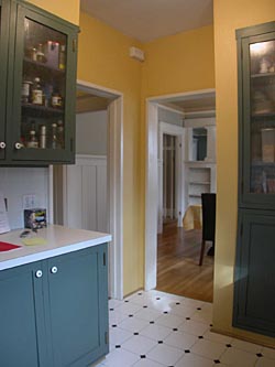
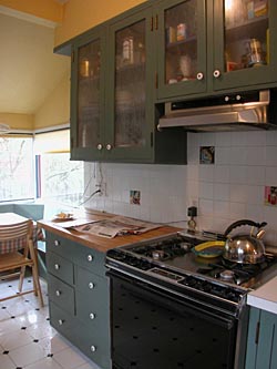
Because the house was built to the setback line, an addition wasn’t an option, which meant we had to work with the space we had. Since what the kitchen really needed was a circulation path (albeit a compact one), that made more sense; I was up for the challenge. Before, during, and after photos tell the story of how flipping the kitchen doorway with a painstakingly restored hutch cleared the way for a pantry and a linen closet, among other things, and provided a natural, unencumbered route for foot traffic.
A prized hutch takes center stage
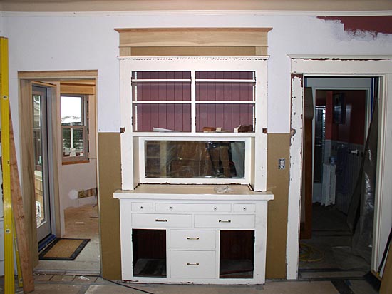
Before: The original location of the hutch was tight to the windows, which made for a crowded and jumbled arrangement. Here, we also get another view of the pinch point mentioned above. Both doorways lead into the kitchen, wasting valuable space.
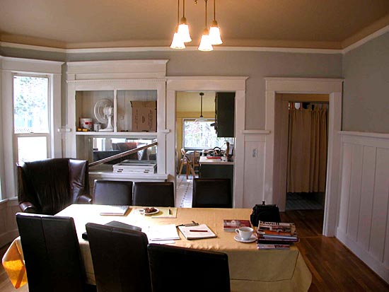
During: We disassembled the hutch and framed a new opening for it, centered in the dining room.
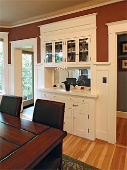
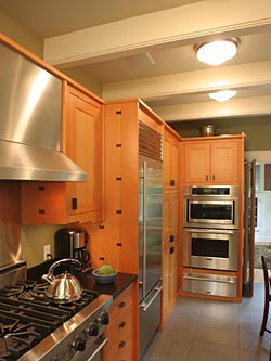
After: By moving the kitchen entry to the left (adjacent to a new door to the yard), we freed up enough space between each opening to allow the hutch some breathing room, and gave it a newfound sense of formality (photo left). Backed up against the relocated hutch is the wall oven, microwave, and warming drawer, and from the now separate hall to the left, a linen closet is shoehorned into the inside corner of the cabinets. Here, the new drop beams can be seen giving the space more of a sense of rhythm. Only the middle one was structurally required, but adding two more allowed us to align them with the eating nook and create a nice relationship between the spaces (photo right).
Slipping out the back
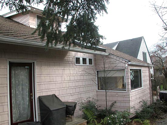
Before: About half of the existing kitchen was a small addition tacked on the back of the house. The addition was poorly planned, and because it sat directly on the ground with no foundation, it was rotting out. The addition was also on the setback line, so we couldn’t tear it down and start over outright. We could, however, rebuild it as long as the structure never completely disappeared. We supported the roof with a temporary beam, which allowed us to cut away the walls and floor below it. Then we built a proper foundation, and reframed up to the grandfathered roofline.
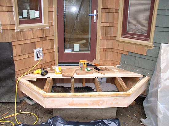
During: A small concrete wall was poured back from the intended edge of the deck to the side yard to allow the stonework of the patio to be the dominant element. The joists are cantilevered over this to pick up the rim board, so no perimeter beam is necessary, leaving room for new crawlspace vents.
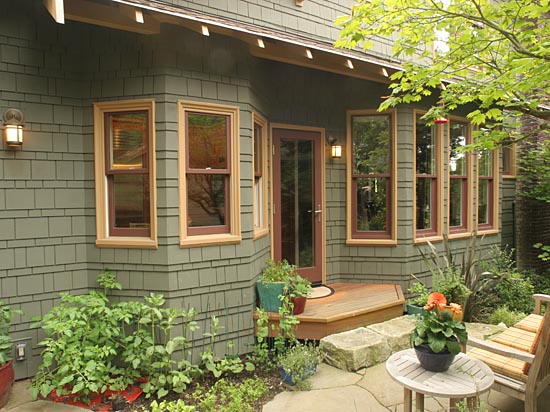
After: The new bay window for the breakfast nook on the left mimics the geometry of the dining-room bay window on the right, leaving a space between to nestle a deck and provide a natural location for a covered entry.
The breakfast nook moves to the bay
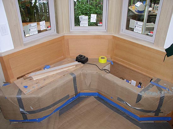
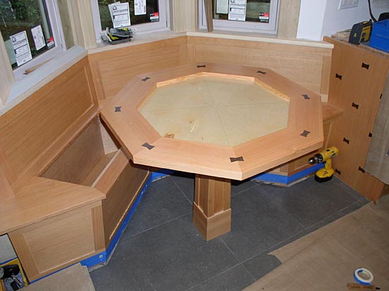
Before: In its previous life, the kitchen sink occupied the approximate location of the breakfast nook. The framed-out area with the built-in at the end shares its back face with the dining-room built-in, which was moved to the left to make way for the new entry to the kitchen and the door to the side yard.During: With space at a premium, additional storage is gained in two large piano-hinged bench seats (photo top). A 3/4-in. plywood deck and fir wrap await the fiber-cement inlay to form the center of the table. Walnut butterfly joints ring the table and add rhythm to the cabinet end panels (photo bottom).
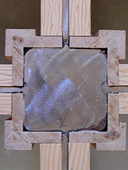
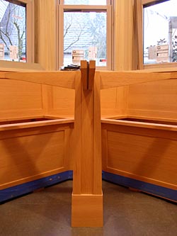
During: In order to create a stable table that accommodates slide-in seating, we decided to use a steel substructure. This allowed for an extremely stable monopod configuration. Plate-steel fins welded to a 4×4 square steel post were sandwiched with tapered fir members, creating a small, stiff flitch beam (photo left). The steel post within the fir casing anchors at the joists, and then extends another 30 in. to attach to a footing in the crawlspace, creating an extremely rigid assembly with maximum foot room. A slight bit of taper to the casing of the table and supports makes a big difference in the overall proportions and lightness of the table. The composite flitch assembly of the table supports were left exposed and can be seen here on end (photo right).
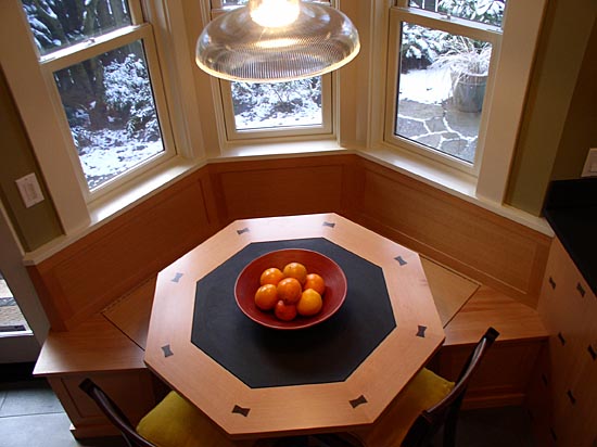
After: The breakfast nook at the front of the kitchen wraps itself inside a new bay window. This creates a compact, slide-in eating area that comfortably fits four and keeps kitchen spectators adjacent to, but out of, the path of the cook.
Counters make a U-turn
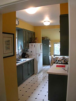
Before: From the entry of the original kitchen, you can see there is a lack of continuity of workspaces. Also, imagine someone working at the stove while someone else is washing dishes. Now imagine a third person making his way to the back door or to the existing breakfast nook, both located in the back of the kitchen. This was the crux of the circulation problem. To get out the door or to the table, you had to maneuver your way through the busiest part of the kitchen.
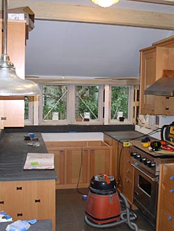
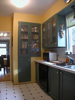
During: Before the sink is in, you can get a sense of how the counters on either side simply continue to the end of the kitchen, and the sink forms the whole of the bottom of the U. The beam supporting the roof was boxed out and helps to establish the pattern for the rest of the space.After: Walnut butterfly joints contrast with vertical-grain fir cabinets and match the simple, dark oil-rubbed bronze hardware. Here, you can get a sense of how the cook’s space is clearly separated from the kitchen’s circulation path and the eating nook.
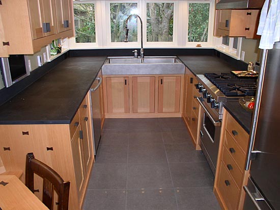
To learn more about this kitchen remodel, read Making a Galley Kitchen Count from Fine Homebuilding’s annual Kitchens & Baths issue, #199 (Winter 2008), pp.74-77.
