An American Bungalow: Before and After
Transformed into a classic Craftsman home, this Sears kit house lives, looks, and performs better than ever.
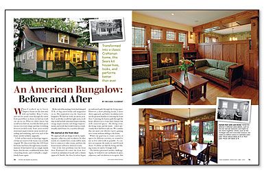
Synopsis: Remodeling a house can be a daunting prospect for both architect and homeowner. As architect Michael Klement demonstrates, however, the process can be made smoother. In this project, Klement worked with the homeowner over an eight-year period to make structural, energy, and design improvements and to create a traditionally styled home for modern lifestyles. The project was completed in phases to ease the financial and renovation stress on the homeowner.
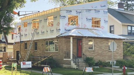
When I walked up to Gerry Duprey’s house for the first time with my builder, Bruce Curtis, and our feet nearly went through the rotten front-porch floor, we knew we had our work cut out for us. What we didn’t know, but would soon find out, was that the back porch was in even worse shape and that everything between needed work. Some areas needed structural improvement, most needed air-sealing and insulating, and every inch of the house needed aesthetic upgrades.
A little architectural archaeology suggested that not much of the house was actually original. We discovered that this 1928 Sears kit house had been through many transformations. It had started out as a single-family home, then became a multifamily home, then a boarding house, and eventually a single-family home again.
By the end of the meeting, Gerry had dumped 35 lb. of dog-eared books and magazines on us. His inspiration was the American bungalow. We had our work cut out for us indeed: work that would last eight years; work that would include structural improvements, energy improvements, and design improvements; and work that would result in a traditionally styled home for a modern lifestyle.
We started at the front door
We approach all our design work by exploring space, adjacency, and circulation. In other words, we consider how a room will be used, how it connects to other rooms, and how the homeowners will move between rooms.
One of the first problems was the front door. Positioned off-center, the front door created an unbalanced facade and a clumsy approach. Inside, the door location began an awkward path through the living space. However, a more pleasing facade, a more direct approach, and better circulation were not the greatest benefits of centering the front door. Centering the beaten path through the home allowed us to create three distinct but well-connected spaces — the dining room, the living room, and the study — where previously there had been only one. We consider this our most cost-effective move: gaining new rooms without adding to the house.
While our goal was to create a series of spaces for different activities, we wanted to use as few solid walls as possible. To connect yet separate the study, we used French doors. To define yet link the living and dining rooms, we used a 3⁄4-height wall.
The kitchen presented another challenge. Again, we looked to our yardsticks of space, adjacency, and circulation to recognize that keeping the path through the house on a consistent axis would yield maximum efficiency. This meant straightening the winding basement stairs and relocating their access from the kitchen to the dining room. The stairs are now safer, the door doesn’t disrupt traffic, and kitchen storage space increased.
Neither the budget nor the zoning board’s setback regulations would allow us to expand the kitchen’s footprint considerably. The solution to increasing storage and counter space lay in a careful reading of the zoning ordinance. Although it was clear that we could not extend “floor space” into the setback, we could project “architectural features.” So we laid out for the zoning official a careful explanation of how a cantilevered bay would project only cabinetry into the setback.
For more photos, drawings, and details, click the View PDF button below:

