Opening up a Small Kitchen
When you can't add on or bump out, open the kitchen to adjacent spaces and keep the layout simple.
Remodeling a small kitchen without adding square footage can be frustrating: too many tasks to fit into a limited space. However, a small kitchen can function well and include interesting elements if you open the kitchen to larger spaces and keep the layout simple.
Make it feel spacious
The first step toward making a small kitchen feel larger and more open is to improve its relationship with any adjoining rooms and outside spaces. A kitchen surrounded by four solid walls can feel downright claustrophobic. To improve the space, you can open the walls between the kitchen and any supporting rooms, such as a dining room, a breakfast nook, or a family room. By opening the wall and allowing the sightlines to expand beyond the kitchen, you create the perception of more space without the cost of creating more square footage.
Depending on the circumstances, the wall might be removed entirely or be replaced with a peninsula countertop, a high counter, or a half-wall. Even a simple pass-through window helps if other options are not feasible.
A popular solution when space is at a premium is a peninsula that serves both the kitchen and an adjacent space. This allows open sightlines between the two rooms, and adds counter space and storage on both sides.
A separate high counter above a transitional counter requires more space but replaces a table in a highly efficient manner. If the high counter will be a breakfast bar for morning coffee, it should be 12 in. to 15 in. wide. Bump the width to between 18 in. and 24 in. if it will be the place for all your informal meals. (A counter-height peninsula can be used as a primary eating area by adding 6 in. to 12 in. to the typical 24-in. counter depth.)
Regardless of depth, make sure it’s long enough for the number of people using it. Each person should have at least 24 in. of space, although 30 in. will be more comfortable.
Remove walls to improve sightlines
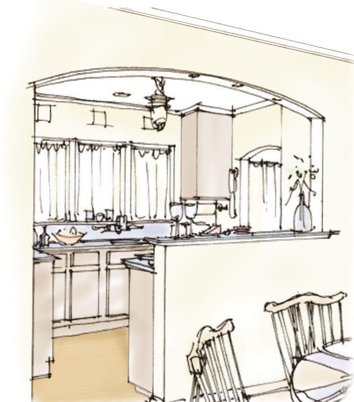
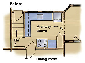
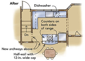
This small kitchen had too many doors, a dysfunctional range area, and a pantry that was too deep to be usable. Removing the wall between the kitchen and the dining room was the best way to enlarge the kitchen without adding space.
With an archway and a half-wall separating the kitchen from the dining area, the two rooms are perceived as one large room, greatly improving the relationship between the spaces. The high counter serves as a staging area for formal dinners and as an informal place to hang out at other times, keeping diners out of the small kitchen while still encouraging them to converse with the cook.
An additional window over the sink and open archways instead of doors enhance the spacious feeling. Using a smaller range made room for counter space on each side of the stovetop and a safer, more comfortable cooking arrangement.
 |
 |
Pay attention to the transition
Once the kitchen is opened up, you can detail the opening depending on how you wish to treat the transition from the kitchen to the adjoining space. If you remove a wall to connect the kitchen with another room, part of the enlarged space can be dedicated to food preparation and part to eating, socializing, reading, or watching TV (depending on whether the kitchen now adjoins a dining area, a living area, or a family room). A design element at the ceiling—an arch, a beam, a series of lights, a change in ceiling height—can define the two areas as effectively as a peninsula. An overhead element such as an arch above a transition counter helps to link the two spaces by repeating elements in one or both of the rooms.
Sometimes drawing a distinction between the two spaces with a half-wall makes sense. Extending 8 in. to 12 in. higher than the countertop, a half-wall screens the kitchen counter without taking up as much floor space as an eating counter. To display vases of flowers, the half-wall’s cap should be between 8 in. and 12 in. wide; to hold serving plates, plan on 10 in. to 12 in. Remember that the cap is a transitional element, so the material, the shape, and the style should relate to both spaces.
Direct foot traffic away from work spaces
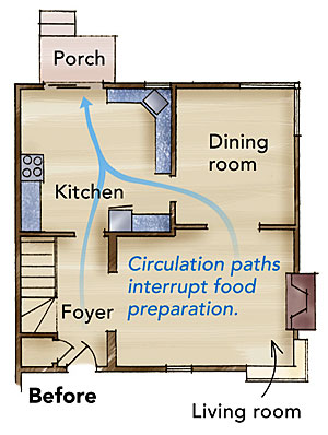
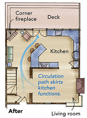
This small kitchen suffered from too many circulation routes, which disrupted its three main activity areas. Also, the dining room was rarely used.
The solution was to combine the two rooms into one spacious family room/kitchen that suits an informal lifestyle. The large new peninsula counter defines the main circulation route to the new deck, and it separates and marks the transition between family-room and kitchen activities. Opening the rear wall with a gang of windows and French doors incorporates the backyard. A cozy corner fireplace enhances both kitchen and family-room functions.
 |
 |
Add natural light
Take advantage of exterior walls by adding windows and doors. When you can see the landscaping, it becomes part of your kitchen. If a garden or yard borders the kitchen, add a French door or two to allow access and big views.
If a door isn’t possible, add as many windows as you can. When exterior-wall space is limited and you have to choose between an extra upper cabinet and a window, choose the window. Corner windows are especially effective for opening views and outside relationships. Even if there’s no view, a translucent or stained-glass window can brighten the space with natural light and lend an airy feeling to a tight room.
Take advantage of exterior walls
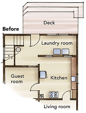
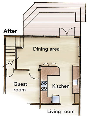
This small kitchen had little natural light, an awkward circulation path to the deck, and a laundry room with great garden views. Not only did the kitchen lack counter space, the home also lacked a dining area.
By relocating the washer and dryer upstairs, a dining room could occupy the desirable space overlooking the backyard. Three new windows and a pair of French doors complete the outdoor connection. The guest-room door was relocated, and continuous counters were installed for a functional, yet compact, kitchen.
The small peninsula’s extra depth serves as a coffee counter in the morning and as a preparation/staging area for large dinners.
 |
 |
Simplify the space
Maximize kitchen square footage by relocating functions not directly related to preparing and eating meals. The more regular or square a kitchen’s floor plan, the more functional its space will be. For example, many older homes have laundry areas or closets between the kitchen and the backyard. Moving the laundry to a small closet adds space and reduces traffic through the kitchen while gaining an exterior wall for windows and doors.
Make sure circulation patterns through the kitchen aren’t disruptive. This might mean eliminating some doorways and relocating others. If you must have multiple doorways in the kitchen, try to group them in one area to confine circulation to one or two routes. For example, relocate a back door next to the dining-room door to consolidate foot traffic. Rooms that aren’t related to the kitchen shouldn’t connect to the kitchen.
Drawings by: Jerri Holan (www.holanarchitects.com)
