Fix the Flow of the House With a Backyard Addition
A new family room and master suite, improved entries, and an updated building envelope saved this home from the wrecking ball, again.
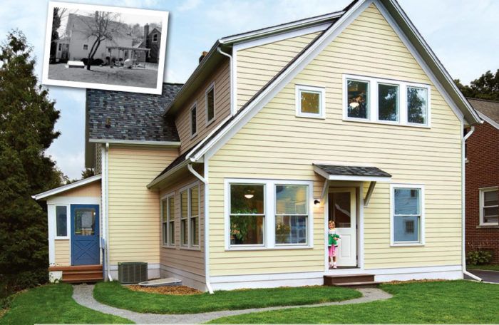
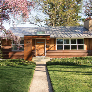
Synopsis: This small house had been moved to another lot almost 75 years ago—and turned 90° away from the street. As a result, the front entry abruptly dumped visitors into a cramped dining room. The kitchen was hardly much better—a deficit of counter and storage space, and a surfeit of junk that made its way into and out of the house through the perpetually used side entry. Author and architect Michael Klement was hired by the homeowners to remedy this situation. His energy-efficient remodel came to life in an addition on the back of the house, which allowed for long, open sightlines throughout the home; improved the side entry; and found space for a new family room, mudroom, and powder room. The kitchen is now free to perform one function: cooking.
I don’t know if it was the fact that we had to tuck the dining room chairs all the way under the table to open the front door, or if it was all the groceries, shoes, and coats we had to move just to get to the basement door, but it was clear the first time I visited the Blakelys’ home that better entries and circulation and more practical spaces were desperately needed. What was less obvious was that the key to solving the many problems at the front of the house would take the shape of a two-story addition in back.
The house was turned 90°
The Blakelys’ small house was built in 1905. Only 30 years later, it was spared from the wrecking ball and moved down the street to its current lot when the University of Michigan decided to build a new stadium, ironically nicknamed “The Big House.” A few years ago, when the Blakelys called my firm about remodelling their home, we found it was still in pretty good structural condition. It seems that saving the house was a good idea. What might not have been such a good idea was the way the movers set the house on the site: They turned it 90° away from the street.
Without a closet or any sense of transition or celebration, the original front entry was not very practical, but at least it opened on the perimeter of a spacious living room. After the house was moved, the front door dumped visitors abruptly into the dining room, where their first experience in the house was to dodge a table.
Once safely past the table, visitors entered the kitchen, where a lack of counter and storage space meant the room was hardly cutting it as a place to prepare meals. What’s worse, a commonly used side entry turned the kitchen into a hallway and the basement-stair landing into a de facto mudroom, perpetually cluttered by briefcases, groceries, mail, and all the accoutrements that accompany young children.
We might have been able to improve the entries and the kitchen and remain within the existing footprint, but the Blakelys also wanted a powder room, a better family-room/backyard connection, and a fireplace on the first floor. Upstairs, they wanted a master suite and a better bathroom for the kids. And somewhere, they hoped to squeeze in a photo studio.
The work began with better entries
As dysfunctional as the existing entries were, one of our first decisions was to keep them in their current locations. The truth is we couldn’t move the front door, and the back door was right where it should be, close to the driveway. It always makes economic sense to keep kitchens in place, and here it made sense to keep the dining room close to both the kitchen and the front door, where guests enter. Thus, improving the side entry and finding space for a new family room, mudroom, and powder room could be accomplished only with an addition at the back of the house.
For before and after photos and floor plans, and information on better entries for the home, click the View PDF button below.
