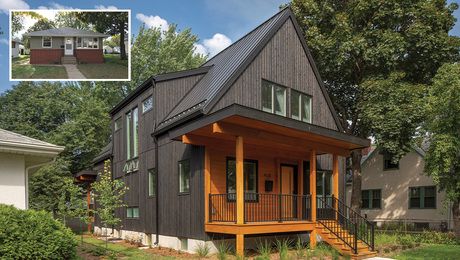
Kitchen and Bath Contest Winners
We asked for photos of your best kitchen and bath remodels, and you delivered
Within 24 hours of announcing our “What’s Old is New Again” kitchen and bath remodeling contest, readers had posted almost three dozen ick-to-slick transformations on our online Project Gallery. One month and almost 150 entries later, the Fine Homebuilding editorial staff selected our five favorites, no easy task because there were some great ideas in every post. To see if you agree with our choices and to submit your own project to our current contest, visit the contest page in our Project Gallery.
Down with the brown
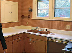
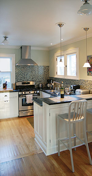
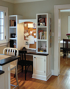
Knocking down a wall that divided the kitchen and the dining area was a no-brainer; it’s how the homeowners used the new space that got our attention. Along with ample light and more elbow room, this kitchen remodel yielded a breakfast bar, a home office, and additional storage— and the new color palette is much more inviting. We were impressed with the homeowners’ ingenuity in using scrap pieces from the soapstone countertops (the desktop is the rip from the bar top and the cutout from the sink). What really won us over, though, was the quality of work and the attention to detail. Not only did the homeowner build all his own cabinets, but he also made sure they complemented the style of the original built-ins throughout the house.
Design, construction, and photos: Nate Gubin, Milwaukee, Wis.
Cool contemporary becomes warm Craftsman
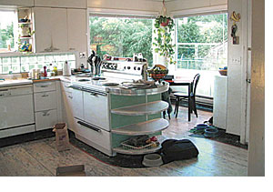
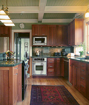
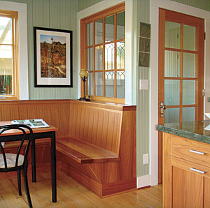
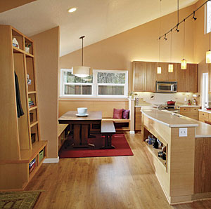
A late-1940s modernization removed most of the style and charm from the kitchen of this 1915 home. We were delighted to see that the architect/homeowner was sensible enough to return the kitchen to its Craftsman roots. Replacing wall-size panes of glass with walls, windows, and a built-in bench transformed the goldfish bowl of an eating area into a warm, inviting dining space. Red-oak flooring, granite countertops, custom eucalyptus cabinets, and a coffered-beadboard ceiling all add up to an elegant kitchen that looks as if it had been part of the home’s original design.
Design and photos: David E. Jensen, Architect, Long Beach, Wash.; Carpenter: Robert Bredfield; Cabinetmaker: Ed Overbay
From dark and cramped to bright and clean
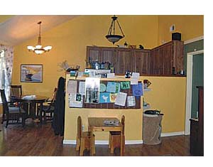
The kneewall capping a run of cabinets just wasn’t working hard enough for these homeowners. Replacing it with an island was the first smart move we noticed. It added a bar-top counter area and created a more pleasing flow to the space without sacrificing cabinets or work-surfaces. A new drop zone and built-in benches added storage and seating, which the old space lacked. But the jewel in the crown of this kitchen makeover is the abundance of natural light that flows in from the new door to the backyard, a window above, and another in the eating area.
Design and construction: MAK Design + Build, Davis, Calif.; Before photo: Anthony Anderson; After photo: Dave Adams Photography
Cold concrete melts into spa bath
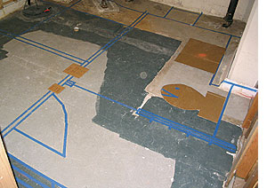
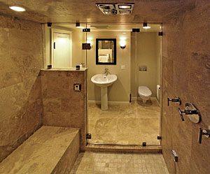
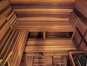
Mapping the floor plan of this 140-sq.-ft. bath with blue tape was a clever move by this craftsman. It helped his clients to visualize the final footprint and helped him to troubleshoot the layout of four separate areas: a sauna, a steam shower, a bathroom, and a foyer/changing room. Removable floor panels in the cedar sauna make cleaning the travertine tile easy. The frameless glass shower door, the ample use of well-placed lighting, the dual-flush wall-hung toilet, and the pocket door maximize the space and prove that this is a well thought-out and carefully constructed project.
Design and construction: Paul Johnson, Paul Johnson Carpentry and Remodeling, Portland, Ore.; Photos: Paul Johnson and Nina Johnson
From avocado to awesome
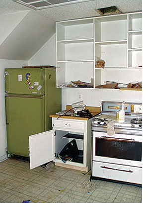
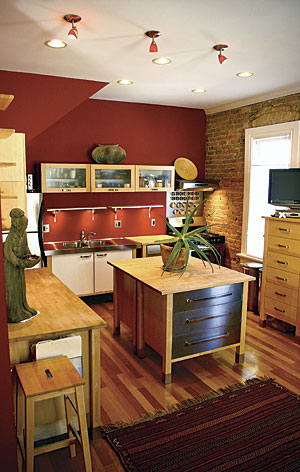
We vaguely remember when painted white cabinets and avocado appliances were cutting edge in kitchen decor, but mercifully, those days are long gone. In this project, sleek Ikea cabinets team up with vibrant scarlet paint and an exposed adobe-brick exterior wall to transform the look and feel of this kitchen completely. Slightly reconfiguring the appliance layout, removing a wall, and getting rid of a drop ceiling created three distinct areas for cooking, eating, and entertaining—perfect for relaxing and partying.
Design, construction, and photos: Weston and Amy Noyes, Salt Lake City
