Use Dyes to Transform Poplar into Cherry
Achieve an even-colored finish on dissimilar woods and species using dye stains
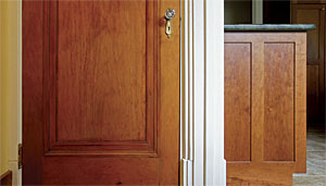
When we updated the kitchen in our 1920s home, we decided the cabinets should be made of cherry. However, I wanted everything else to be visually in tune with the new cabinets, and an adjacent door happened to be made of clear-finished poplar (a common choice back then). My solution was to turn the poplar into cherry. Historically, furniture makers also used stained or dyed poplar as an inexpensive alternative to the more desirable cherry. Using a sample cabinet door, I’ll show how I transformed the color. You can use the same techniques to change the color of almost any species of wood.
Although close scrutiny will always reveal the poplar’s grain pattern to be different, matching the color fools the eye into believing it is seeing cherry. The easiest way to begin the finish is with a dye; unlike pigmented stains, dyes are transparent and won’t muddy the surface of the wood. I prefer to make dyes from water-soluble powders. If the color is too weak at first, I can easily add more powder to intensify the color. Water-based dyes are also extremely economical. You can make a gallon of color for as little as $20, and it goes a long way.
The only problem with a water-based dye is that it will raise the wood’s grain, so before applying the dye, I sand, lightly dampen the surface, let it dry for 10 minutes, and then give it a final sanding. Another option is to dye the wood, wait until it’s dry, then seal the surface with a thin wash of shellac. The raised fibers will be locked in the sealer and can be easily sanded smooth without affecting the color.
Make color samples first
The biggest mistake many people make is trying to get the right color in one shot. I make a color sample in four steps. First, I pick the general color range (yellow brown, red brown, deep brown, etc.), and then dye a sample piece of the same species. I put the sample next to the color I want to match. If my sample looks light or washed out, I add more powder to the dye mix and adjust the warmth or coolness as required. Next, I adjust the color depth by making sure the value (light or dark) matches. Finally, I apply a coat of the clear finish I plan to use, which enlivens the color.
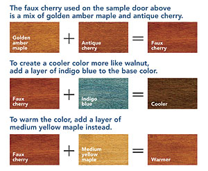
For these samples, I used two colors, both from W.D. Lockwood (www.wdlockwood.com): golden amber maple and antique cherry. A small scale is handy for weighing exact amounts of powder, but for this project, I measured by volume. I mixed about 2 oz. of powder into 16 oz. of water. As I mixed the dye, I put some on a white paper plate to see through the color. If it looked weak, I added more until it looked correct.
Apply a base layer of color
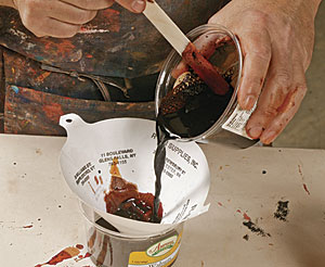
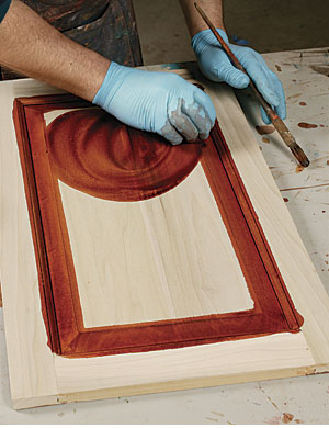
Mix dye powder into hot distilled water, and let it cool. Check the strength of the dye on white paper, and adjust accordingly. Just to be safe, strain any undissolved dye particles with a fine paint filter. Flood the surface with dye, starting with the panel and progressing to the frame. Allow it to sit, and wipe off any excess.
Catch drips before they start
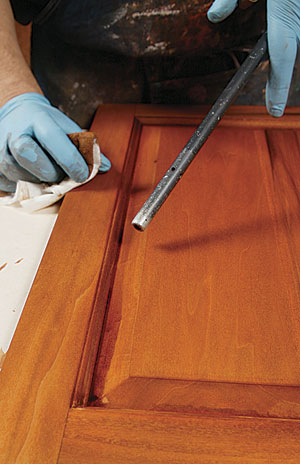
When finishing paneled doors, it’s a good idea to blow a little compressed air around the hips of the panel to force out the dye that has migrated behind the rails and stiles. Otherwise, pooled dye will dry and create a halo along the hip.
Add more dye until the color is right
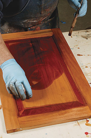
After the first layer of color is dry, a second dye can be applied to modify the color further. When that’s dry, brush the surface with a thin wash coat of shellac. The color can be tweaked further with a layer of stain before the final top coat is applied.
Move the process along
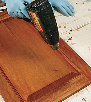
Because the dye doesn’t have a flammable base, you can use a heat gun or hair dryer to speed up the drying time between coats.
Top coat ready
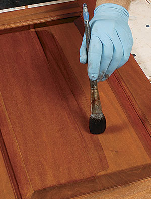
When the color closely resembles cherry, the clear finish can be applied, which adds the final depth to the color.
Trick of the trade: Dialing in color isn’t a long-distance call
Start the matching process with a sample of wood and a dye color close to the wood to be matched. Adjust the finish with second or third colors as necessary. Colors dominated by reds and yellows are considered warm, and those with greens and blues are cool. For example, maple dyes are generally warm yellows. Some, like honey amber and golden amber, lean more toward orange-yellow. If you need to neutralize the orange, add a small amount of its complementary color, which is blue. (Complementary colors sit opposite each other on the color wheel.) Other colors, such as mahoganies, tend to run the gamut from orange-red to purple-red and can be used to warm a color as well as change its value (the light or dark aspect). Walnuts lean toward the cooler green-brown side of the spectrum and are useful in balancing a dye that is too red.
Photos: Charles Bickford
