A Curvy Booth Improves a Kitchen
A dated ranch house gets a new kitchen built around a great place for the whole family to hang out.
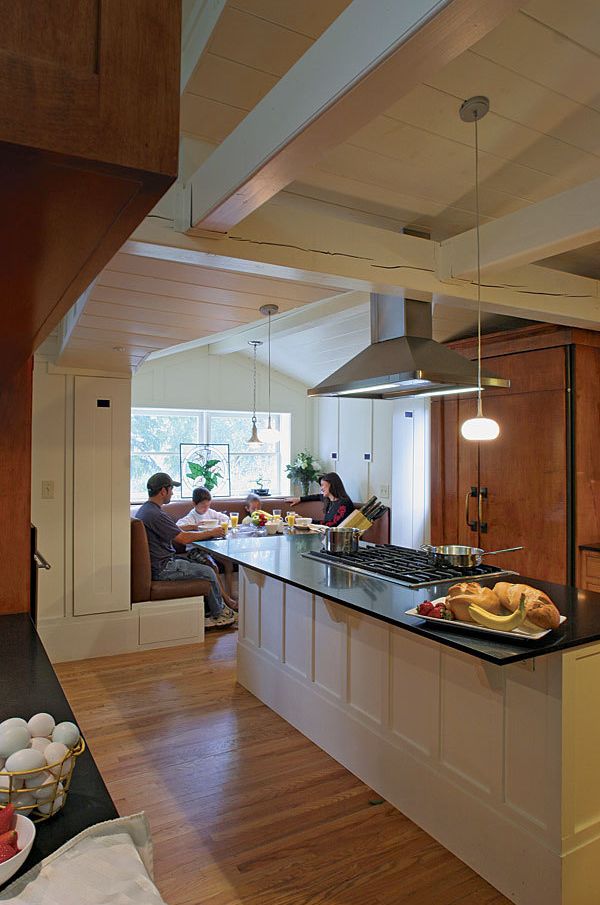
Synopsis: The old kitchen had way too much floor space and not enough counter and sit-down space. The adjacent dining room, on the other hand, wasn’t quite big enough. Once the homeowners solved those problems, they could tackle the others: fussy finishes, not enough storage, no connection between rooms, and a dark, gloomy ceiling. Along the way, they made some unique choices, including a cabinet-style partition, a family-size breakfast booth, and a built-in dog-kibble drawer.
Architect Dulcie Horwitz and her husband, Howard, live in one of those exuberant Southern California ranch houses that manage to wrap the look of mid-’50s futurama technology in a blanket of Bavarian detail. Charming, quirky, and not exactly suited to the family’s needs, the house is a work in progress.
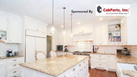
The original kitchen had an odd problem: It returned too little utility for the amount of space it occupied. Galley style, with 6 ft. between opposing counters, the old kitchen had way too much floor space and not enough counter and sit-down space. The adjacent dining room, on the other hand, wasn’t quite big enough. As shown in the floor plans, the Horwitzes’ first move was to expand the dining and living areas toward the backyard. This allowed the new kitchen to claim a bit of the dining room, eventually making room in the kitchen for a central island.
Dulcie’s tastes tend toward light, openness, and vaulted ceilings. Howard favours the warmth and atmosphere of a timber frame hunting lodge. Both got their wish. White surfaces are predominant, punctuated by deep cherry stained cabinets built by Howard and decorated with details inspired by the great Scottish architect Charles Rennie Mackintosh.
“Aha!” moment
Cozy corners under dormers are in short supply in the ranch-house suburbs of Southern California, but this house had one on the south side, overlooking the big downslope backyard. Architect Dulcie Horwitz tinkered with the space, inspired by the proportions and style of the booths in a favorite San Francisco bistro. Adding storage cabinets to each side of the alcove dialed in the dimensions for a welcoming booth with comfy cushions. This is where the kids do their homework, guests hang out, and the family takes most of its meals. Once this space had been thought out, the rest of the kitchen fell into place.
For more photos, drawings, and details, click the View PDF button below:

