Cathedral Ceiling Kitchen
Tearing out the old flat ceiling helps a closed-in kitchen live and breathe easier.
Synopsis: White cabinetry and white walls had made the kitchen of this midcentury Connecticut Cape light, but it was still tight. For architect Duo Dickinson, the challenge was to break out of the mold without breaking the homeowners’ small budget and without moving any walls. Among the problems he solved were an oppressively low ceiling, lackluster details, too little counter and storage space, and an uninviting, dysfunctional entry. The “aha!” moment? Vaulting the ceiling but keeping the skylight, resulting in a light-filled canopy over the kitchen.
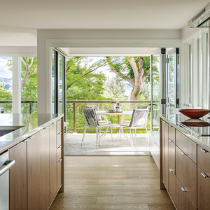
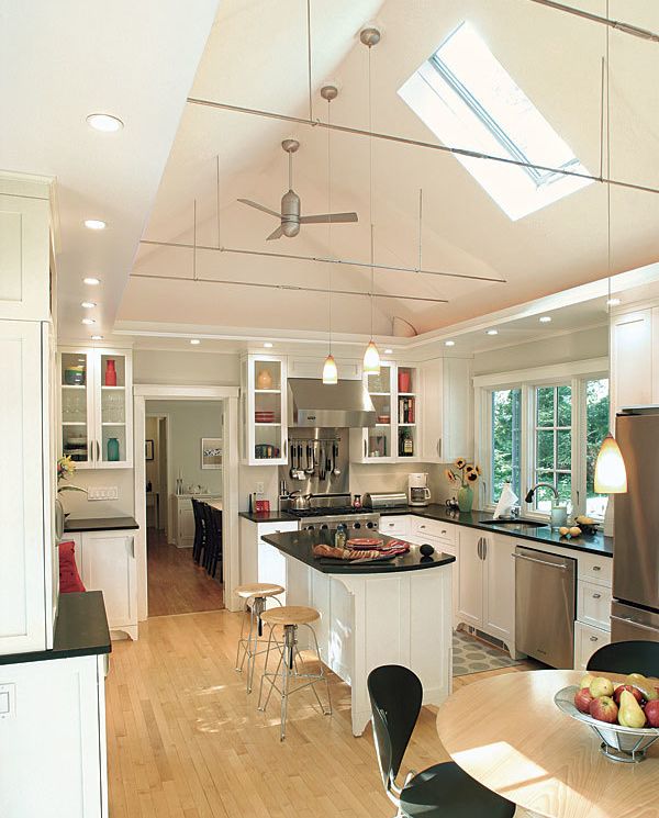
Architect Duo Dickson opened up this tight kitchen without breaking the homeowner’s budget and without moving any walls. He did this in a most dramatic way by opening the space above with a vaulted ceiling rimmed with a thin soffit. Light fixtures above the soffit wash the ceiling, while mini can lights set in the soffit provide task lighting for workspaces below. New wall cabinets with glass fronts and sides and larger windows on both sides of the kitchen also lend the room a fresh air of transparency.
Rethinking workspaces and storage areas also meant centering the stove on its own little run of cabinets and placing an island where a table once stood. (The owners mocked up the island first to make sure it wouldn’t get in the way.) Although the room’s basic window and door locations were left unchanged, Dickinson was able to build in a long closet and bench/coat-hanging area on the wall between the dining area and the garage, creating a functional mudroom just steps from both the garage and kitchen entries. Under the front window, a built-in storage bench topped with spalted maple provides extra storage as well as a comfortable seat. Black granite countertops balance the bright white cabinets, while the stainless-steel finish of the appliances, stools, and hardware adds visual spark.
Problem: A limited budget
Solution: The homeowners saved with simple wood floors and painted cabinets, and by purchasing millwork, countertops, and appliances themselves. Reusing the old skylight and not moving windows or plumbing saved money, too.
Problem: Oppressively low ceiling
Solution: Vaulting the ceiling brightens the entire space. A soffit added around the edge provides a place to mount task lighting, and pendants over the island lighten the space even more.
Problem: A busy entrance with no drop-off facilities
Solution: Built-in closets, a bench, and a seat offer assistance to those unloading as they come in the side entry and the garage.
Problem: Lackluster details
Solution: Small details, such as the decorative feet on the cabinetry and the use of surplus spalted maple as an accent material, lend the kitchen an element of surprise. The light industrial style of the tie-rods, ceiling fan, stools, and cabinet hardware gives the space an unexpectedly techie edge.
For more photos and details, click the View PDF button below:
