Budget Bungalow Update
A young couple with a growing family updates their humble house with a pitch-perfect blend of pragmatism and delight.
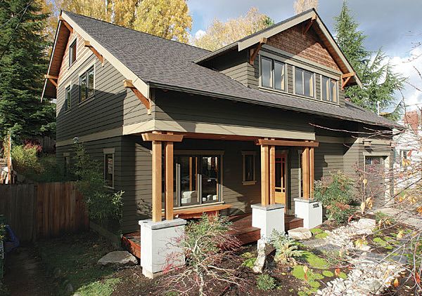
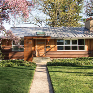
Synopsis: After reading an article from a 2005 issue of Fine Homebuilding that described the transformation of a nondescript ranch house into an attractive bungalow, author Leo Artalejo and his wife were inspired to embark on a similar project for their 1942 war box. Conversations with their architect yielded four guiding principles: (1) reconfigure and expand while staying in scale with the neighborhood, (2) orient the house toward the landscape, (3) maximize natural light, and (4) focus on energy conservation, efficient use of space, and natural materials. They worked within the house’s original footprint and kept room sizes modest, but they splurged on radiant floors, a rock garden in the backyard with foldaway doors leading to it, and a double-height ceiling above the dining room. Artalejo, an amateur winemaker, celebrated the finished house with a wine made especially for the occasion: Remodel Red.
When our first child arrived, my wife and I quickly realized that our family was outgrowing our little house. The idea for remodeling popped up one night while having dinner with our neighbors. They had recently added a second story to their house, and survived. We loved our neighborhood, but we couldn’t say the same for our 1942 war box.
We knew we needed more space in the long term, but we weren’t sure how to get it. We talked with our neighbors in depth about the pains and pleasures of remodeling, and they sent us home that night with a stack of Fine Homebuilding magazines. We found an article in the summer 2005 Houses issue entitled “Ranch Makeover, Bungalow Style,” which excited us because the house had been wrapped in what we referred to as a bungalow-roof “comb-over.” The article featured a fairly nondescript house that had been completely transformed into a bungalow with great curb appeal. Maybe it was possible to stay in our neighborhood, keep the good parts of our existing house, and add some missing elements.
Our design process started with an empty photo album and a stack of shelter magazines. My wife and I would open a bottle of wine and start pasting in clippings of rooms and details that we liked. We also kept notes on things that we didn’t like. This process equipped us with a visual language that allowed us to engage architects and builders in initial conversations.
After interviewing three different architects that had been recommended by friends and whose websites appealed to us, we settled on a small boutique outfit in Seattle called CAST Architecture. We were impressed with their ability to balance contemporary uses of space, light, and materials in traditional houses. Our conversations were quickly distilled into four guiding principles that would inform the design of our home: Reconfigure and expand while staying in scale with the rest of the neighborhood, orient the house toward the landscape to connect the living spaces with the yard, maximize natural light to help offset the gray days of a Seattle winter, and focus on energy conservation, efficient use of space, and natural materials.
What to keep? What to toss?
We liked some parts of the original house and, for both financial and environmental reasons, wanted to keep them. We were pleasantly surprised to learn that the foundation was sturdy enough to carry a second story. We were happy with the size of the bedrooms, the hardwood floors, the layout of the bathroom, and the fireplace in the living room. But we wanted the new spaces to emphasize big changes, such as combining the new kitchen with the dining and living area for long diagonal views.
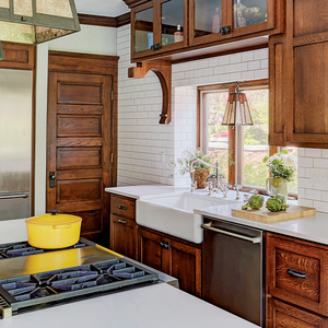
The reconfigured plan retains the southern half of the original house and radically rearranges the northern half. What used to be the back of the extradeep garage became space for a new kitchen. We made up for the annexed garage territory by pushing it 8 ft. toward the street to the setback line. The front door, which used to open unceremoniously into the living room, now leads from the side of a small porch into an entry that includes an art niche, a closet, and a small bench.
For more photos and details, click the View PDF button below:
