Home-Office Design Guidelines
Make the most of a small space by getting furniture and cabinet dimensions right.
Synopsis: No two home offices are alike or are used in the same manner, yet every good home office has some things in common, such as good ergonomics, thoughtful hardware management, adequate storage, and functional flexibility. Author Mark Dutka offers guidelines on getting those things right, such as how to position a computer monitor, mouse, and keyboard on a desk; how to choose a chair; how to organize electrical cords; how to hide electric components; and how to place everything in the room.
In the 15 years that I’ve been designing home offices, I’ve yet to come across two projects that come even close to being the same. No two are alike, and no two are used in the same manner. Some home offices are for full-time work; others are for occasional bill-paying. Some clients use them as part-time guest rooms or as multimedia spaces, accommodating one or two people or perhaps a whole family. And, just like their occupants, they come in all shapes and sizes.
Your perfect office is going to be a reflection of the way you plan to use it and any special equipment it will take to make that happen. Every good home office has some things in common, such as good ergonomics, thoughtful hardware management, adequate storage, and functional flexibility. I’ll offer some guidelines to help you get those things right.
It all starts with ergonomics
Ergonomics is the science of adapting the work environment to the needs of each worker. It plays a role in everything from desk height to the selection of the right chair. To ignore ergonomics is to tempt fate. Over time, poor ergonomics can lead to back, wrist, spine, or neck pain, affecting your productivity and quality of life.
1. The monitor and document holder
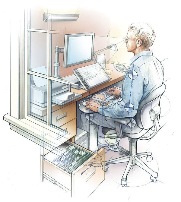
To minimize neck strain, the monitor always should be centered in front of you, never to the side. Place it about an arm’s length away, with the top of the screen ideally located on a slight downward angle from your eyes. The objective is to prevent looking up at the screen, which can contribute to neck problems. This is why it’s a bad idea to place the monitor on top of a horizontal CPU.
Glare on a monitor screen can cause eyestrain. If possible, the monitor should be perpendicular to a window to minimize glare. If positioning the monitor in front of a window is the only solution, use a bottom-up shade to allow natural light into the room above eye level while blocking light on or behind a screen.
A monitor arm delivers both practical and ergonomic benefits. It allows you to move the screen quickly for easy access to the desktop, which is especially useful in tight spaces where a multitude of noncomputer tasks need to be performed. An arm also allows easy screen adjustment for quick viewing by others who may not be seated directly in front of the monitor. A good monitor arm adjusts vertically, has an arm sufficient in length to move the screen out of the way, and supports the weight of the monitor.
To prevent neck pain and eyestrain, it is also important to place the document holder in front of and not to the side of the monitor. Adjustable holders that don’t block the screen are on the market.
For more photos, drawings, and details, click the View PDF button below:


