Deck Design Tips
Railing designs and deck-board patterns can improve the view from (and of) your deck.
A deck extends your home’s living space to the outdoors, creating a backyard oasis for grilling, dining, reading, or socializing. Although building codes tell us how to build a safe deck, there’s no guarantee that it will be pleasant to look at or enjoyable to use.
Shaping the view from your deck improves the experience: If there’s a great view, you want to take advantage of it. If you’re not overlooking a bucolic backyard, you might need to direct people’s gaze away from an urban scene or shield the deck from passersby.
Deck-board patterns and railing designs have a tremendous impact on the view. Together, these features either guide your eyes outward to the landscape or focus them inward.
Choose a focal point
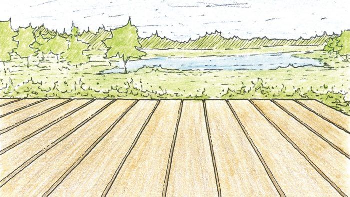
You can use the orientation of the decking to manipulate where people look when they’re on the deck. Whether the wood is warm, rich ipé or utilitarian pressure-treated southern yellow pine, our eyes are drawn unconsciously along the length of each board. To direct eyes to a particular view, orient the boards in that direction. Be careful with long, narrow decks running the length of the house, however. Such decks often feel unnecessarily claustrophobic because the long run of each course creates a tunnel-like effect extending to the horizon.
If the view is unappealing or if you want the deck to feel smaller and roomlike, you can employ patterns to make the decking a focal point and borders to keep a person’s gaze from wandering beyond the edges of the deck. Use simple patterns on smaller decks (under 300 sq. ft.) so that they aren’t visually distracting.
Decking patterns also can help to integrate the deck and house. In the Pacific Northwest, where I live, a common siding pattern alternates the exposure of each course of shingles or clapboards, creating wide and narrow bands on the wall. Adopting alternating widths for decking boards, particularly on a ground-level deck, connects the deck to the house.
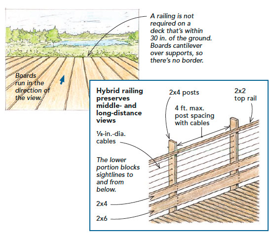
Point decking toward great views: If code allows, skipping a railing is the best way to take full advantage of the view the decking points toward.
Decks above 30 in. require a railing and a balancing act between two conflicting goals: preserving the view and protecting people from falling off the edge. At 36 in., use cable railings, which don’t feel intrusive. Other options are glass, pipe, and reinforced wire mesh. A thin cap, or top rail, encourages you to look beyond rather than providing a resting place for the eye as a heavy cap would.
If you want to block an unappealing view below or views to the deck from below, a hybrid open-closed design railing (see bottom drawing) is an option.
Match the railing to the view
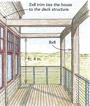
The railing is an opportunity to define the deck as an outdoor room by providing scale, adding boundaries, and offering a sense of security. Although I like to keep its height at the code minimum, I sometimes use the posts to support an overhead structure or trellis, adding a human scale that makes the deck more intimate.
The railing design should be determined by how you want to experience the view, something you’ve already considered in the decking pattern. If the decking draws the eye outward, a relatively transparent, open-design guardrail takes advantage of the view. When you want to blur the end of the deck to the space beyond and the deck is within 30 in. of the ground, skip the railing (but check your local code first).
A closed-design railing with substantial elements will block the view—from inside or outside the deck—strongly defining the deck’s border and serving as a privacy screen. This type of design typically relies on wide balusters with narrow spacing, but planters also can be incorporated to add privacy.
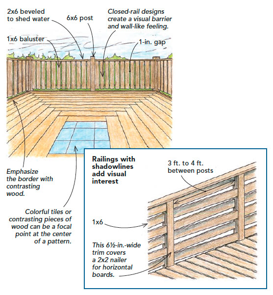
Create a focal point with patterns and railings: Breaking the continuity of decking lines de-emphasizes the view beyond the deck. To focus the eye inward, use a pattern to create a focal point on the deck. On small decks where a pattern might appear too busy and on low decks without a railing, a strong visual border made from a contrasting wood will catch the eye and focus it inside the deck. Railings are another way to screen views from the deck or to the deck. The traditional closed-design railing shown here effectively limits views and is easy to construct. Patterns with more depth or decorative cutouts create shadowlines that engage the eye, like the woven pattern in the drawing below.
Consider views of the deck from the outside looking in
The view from the deck isn’t the only design consideration. Even a small deck with a railing is likely to be the most prominent feature on a house, so it will affect views of the house.
The style of the deck needs to be congruous with the style of the house. Wide-board balusters with fanciful decorative cutouts will look out of place on a glass-and-steel modern house. If you need a closed railing for this style of house, consider panels of finished wood, metal, or obscure glass.
As you plan railing sections, take into account the location of windows and doors. Rather than falling haphazardly across the facade with posts appearing in front of windows and doors, they should frame these openings. Also, give some thought to the space under the deck. On low decks that don’t require a railing, I like to define the borders with plants to block dark views underneath. The plantings also soften the edges of the deck and tie it to the yard. If the deck is well up off the ground, stout supports look better than spindly posts that meet engineering requirements but are visually inadequate.
Change the scale of narrow decks: 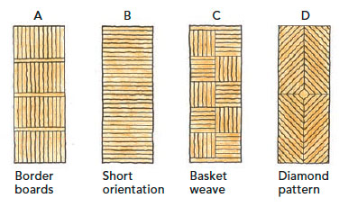
Long, narrow decks running along the length of a house can look and feel like a bowling alley. Some options for overcoming this effect on a 6-ft. by 16-ft. deck include interrupting the length of the deck with border boards (A), which emphasizes the decking joints and breaks the deck into sections. Simply orienting the decking in the shorter direction (B) de-emphasizes the length of the deck in an understated way. If you want the deck to be the center of attention, designs such as a basket weave (C) or diamond pattern (D) provide visual interest and draw attention away from the long, narrow aspect of the deck.
Fine Homebuilding Recommended Products
Fine Homebuilding receives a commission for items purchased through links on this site, including Amazon Associates and other affiliate advertising programs.
FastenMaster Screw Bolt Fastening System

Metal Connector Nailer

Flashing and Joist Tape
