Local Color
A California designer looks to the Golden State’s beaches, hills, and forests for this kitchen’s shimmering palette.
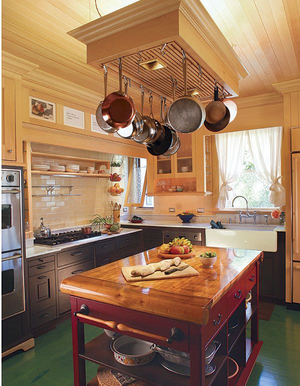
Synopsis: Alan Jencks was hired to design a new and larger kitchen for a house that had undergone at least eight alterations, resulting in the kitchen’s being boxed in by a couple of additions at the back of the house. Originally designed as workspace suitable for the usual one-woman workforce of its day, the kitchen had since become part hallway. Jencks had the twin tasks of designing something new while maintaining the spirit of the house—a simple, old Craftsman bungalow. His first step was to find some extra space, which he did by removing the thick wall between the kitchen and dining room and then creating a 6-ft.-sq. addition for a booth. Working with the client, he then created a palette of light-infused, high-contrast, colorful, and diverse local colors that led to the use of, among other things, golden Nootka-cypress cabinets, crackle-glazed yellow wall tile, and floral-tooled cognac-leather booth cushions. Three layers of artificial light complement the new natural light introduced by the booth windows.
Budget-built in 1908 for a young couple who lost their home in the San Francisco earthquake, Judy’s little Berkeley bungalow once overlooked the local farmlands and a distant glimpse of the bay. Now, 100 years later, the house sits snugly in a compact grid of closely sited houses of various ages and eclectic architectural styles. And though the farmlands are long gone, much of the city and neighborhood retains its verdant, charming nature.
Maintaining the spirit of this simple old Craftsman house was our first goal in designing Judy’s new kitchen. The house had undergone at least eight alterations, and the kitchen had been boxed in by a couple of additions at the back of the house. Originally designed as workspace suitable for the usual one-woman workforce of its day, the kitchen had since become part hallway. Dog-eared and dark, it needed a 21st-century dose of function and light.
First, find 60 sq. ft.
Judy’s list for the new kitchen was short but challenging. First, the new kitchen had to be easier to use, and it had to include space for a small island and a table that could seat up to six. Second, the kitchen needed daylight and details that reflected the local countryside.
It came down to only two places where we could realistically gain some space for a larger kitchen. As shown in the floor plan, the thick wall between the kitchen and the dining room, with its pass-through, dumbwaiter, and masonry fireplace, could go. That freed up 22 sq. ft. — and eliminated the chimney, a 6-ton clinker-brick seismic time bomb.
But we still needed to find space for a table or booth, and gaining it wasn’t easy. We went with the booth to conserve space, and we created a 6-ft.-sq. addition to accommodate it on the location of the former stoop to the backyard. Implementing this plan meant completely rearranging the existing laundry. This was unfortunate, in that the laundry, stoop, and door were all perfectly satisfactory. On the other hand, after playing with various floor plans and configurations, we realized that the existing location of other appliances and fixtures didn’t need to be changed. Also, acquiring the additional space made room for an island as well as the booth.
The color of geography
With the broad strokes of the floor plan sketched out, we set about creating a palette of light-infused, high-contrast, colorful, and diverse local colors. We revisited Judy’s favorite California places, in person and from memory, and began collecting samples, shapes, and textures that expressed them.
I built a 2-ft. by 3-ft. canvas-covered storyboard for the lightweight samples. Heavier hunks of wood, stone, and glass went into a shallow cardboard box. To the storyboard, we applied pieces of tree bark, leaves, lichens, rocks, flowers, paint samples, and fabric and leather swatches. To the box, we added granite, marble, and synthetic countertop materials; stained glass; textured glass; and ceramic tiles. We interchanged and rearranged the many pieces, seeing which items interacted well and supported one another in fleshing out the theme.
For more photos, drawings, and details, click the View PDF button below:
