Master Bath Floats Anew
An old bath and an unused porch are reborn as a modern master suite.
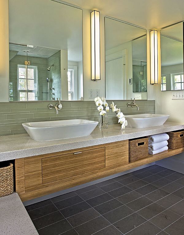
Synopsis: Sacrificing a sleeping porch offered plenty of space for architect Stephanie Horowitz to design a functional, light-filled master bath for her clients without adding to their house. The new layout uses a walk-through closet as a buffer between the bedroom and the bathroom. With a floating vanity with double vessel sinks and a separate shower and tub, the space has all the amenities of a modern master bath squeezed into a narrow room. A simple material palette keeps the room from feeling busy. Glass tile wraps the shower, the tub deck, and the backsplash to the vanity. The same stone tile is used on the floors of the bathroom and the shower, and the same quartz material is used for the vanity top, the tub deck, the shower threshold, and the windowsill.
For a few months every year, a sleeping porch is the perfect place to spend a New England night. But when asked to choose between a part-time porch and a full-time, first-rate master bath, the family that owns this historic home in Newton, Mass., didn’t hesitate to appropriate the porch.
Fortunately, sacrificing the sleeping porch offered plenty of space for architect Stephanie Horowitz to design a functional, light-filled master bath without adding to the house. The new layout uses a walk-through closet as a buffer between the bedroom and the bathroom. With a floating vanity with double vessel sinks and a separate shower and tub, the space has all the amenities of a modern master bath squeezed into a narrow room.
“Aha!”moment
Removing the door from the bedroom to the old sleeping porch and converting the existing bathroom into a walk-through closet with the sole entrance to the master bathroom is what made the space work. (It also allowed the bedroom to accommodate a king-size bed, a top priority for the homeowner.) But the bath was still narrow.
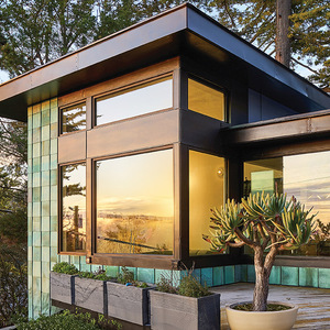
Designing a floating vanity helped to open the space. Below the vanity is a great place to tuck a basket of towels. A roofline encroached on the space as well, which drove the placement of the tub. The existing space had a double window that didn’t work with the proposed bathroom layout. Removing the double window and replacing it with two smaller windows that match the existing window in the walk-through closet helped to tie together the exterior elevation as well.
For more photos, drawings, and details, click the View PDF button below:

