Signature Trim Details
See how designers and builders are stretching the traditions of trim in this gallery of custom ideas for casing, crown, base mold, and beyond.
Synopsis: It may be among the final things a finish carpenter places in a home, but the interior trim is often the thing that helps to make a first impression of a house. Here, senior editor Charles Bickford provides a look at seven examples of distinctive interior trim details, including close-up photos and drawings illustrating construction details. The trim examples include an entry hall, a built-in recess, a door jamb, windows, a sliding door, and a fireplace mantel.
When you build a house, the interior trim is one of the last things to be installed, but one of the first things you notice after it’s complete. Because it’s always visible, interior trim deserves a fair amount of effort in both design and execution. For the designers who drew the plans and the carpenters who installed it, these details showcase their craft to an audience every day, a calling card of sorts. For those chronically afflicted with SRS (serial remodeler’s syndrome), a new trim scheme is a great excuse to set up the miter saw.
As building science matures, it’s getting harder and harder to build a house, let alone build one that has personality and a unique sense of character. But of all the materials used to build a house, the trim can be one of the least expensive and the easiest to customize.
Here, we’re featuring a gallery of ideas that show how some designers and builders are stretching the traditions of trim. We’re hoping to inspire new projects out there, too, so we’d like to invite you to go to our Project Gallery to share images of your custom trimwork.
Reinterpreting tradition
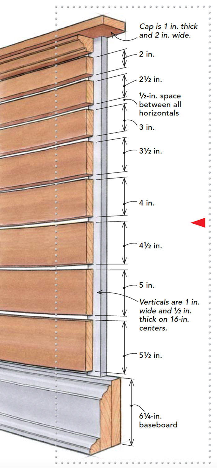
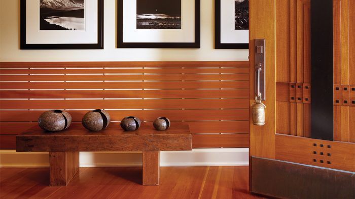
Bernard Wharton planned his house on Narragansett Bay with both a sense of tradition and a desire to experiment. He says, “You want a sense of timelessness… a strength through simplicity.” Taking his cue from both boat-building and Shaker furniture, Wharton drew up plans for the wainscot in the entry hall. Like a Shaker chest of drawers, the horizontal boards get progressively narrower and give the wainscot a certain lift. The overall lightness and depth is increased by the airspace between the wall and the mahogany boards.
A recess where trim meets furniture
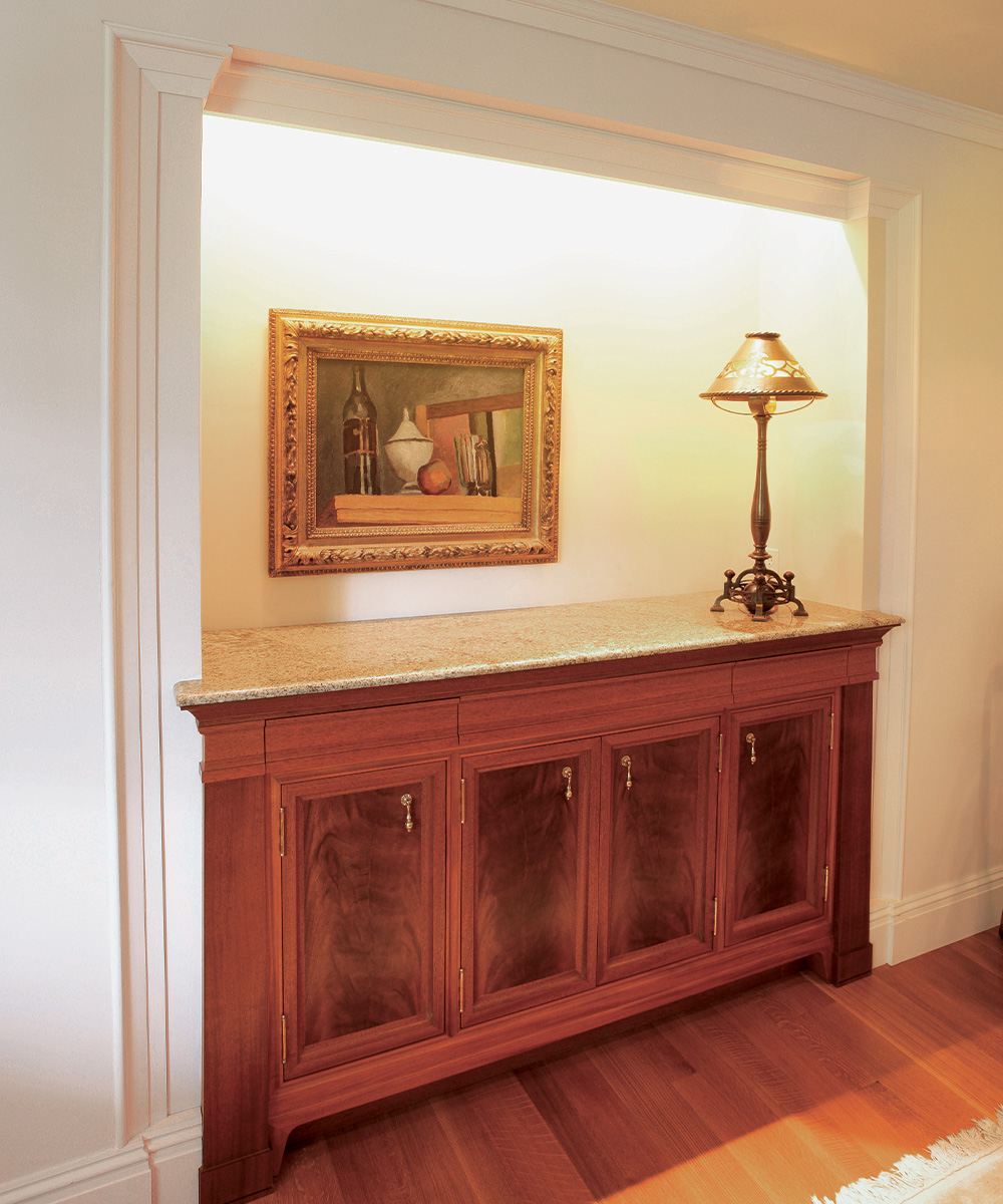
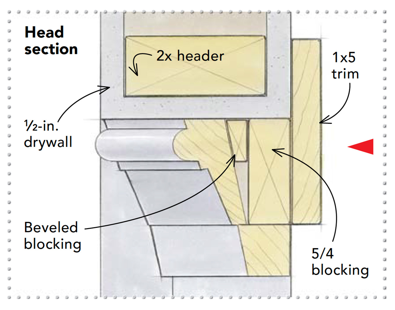
Built-ins walk a fine line between furniture and trim; they should both blend in and stand out. Here, a dining-room sideboard was built into a recess framed by a two-part molding. But instead of applying the molding over the drywall, the designer first placed flat drywall pilasters that were recessed back from the main wall plane. He then added the molding along the perimeter that’s just proud of the wall surface. At the head, it folds in and becomes a valance across the opening.
 |
 |
Straight and narrow
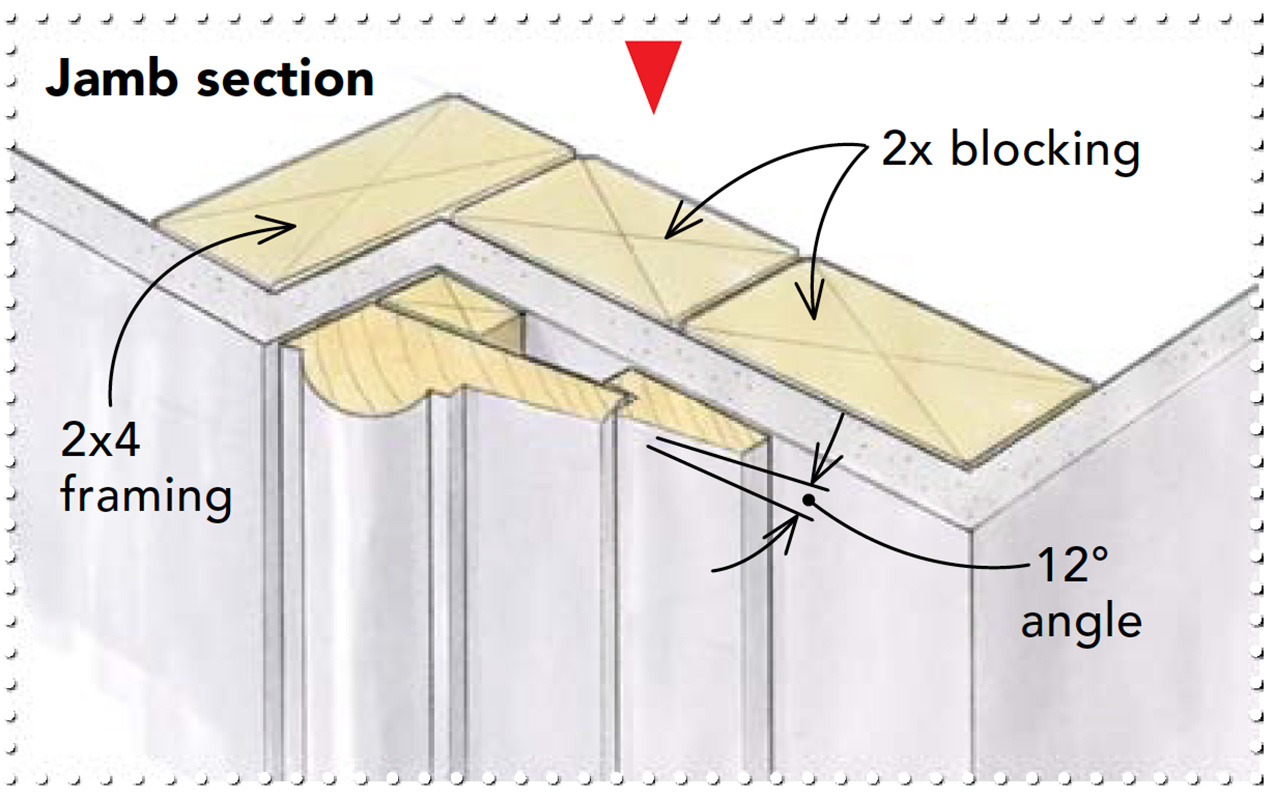
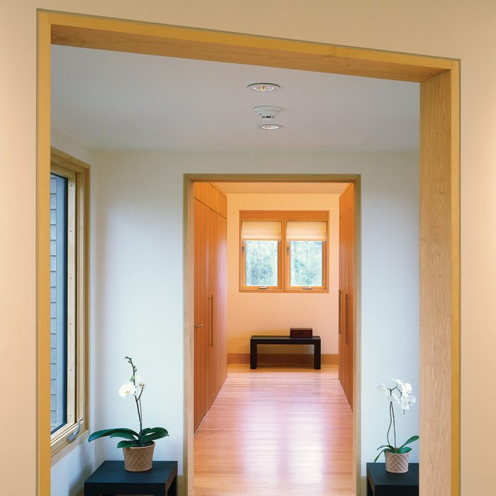
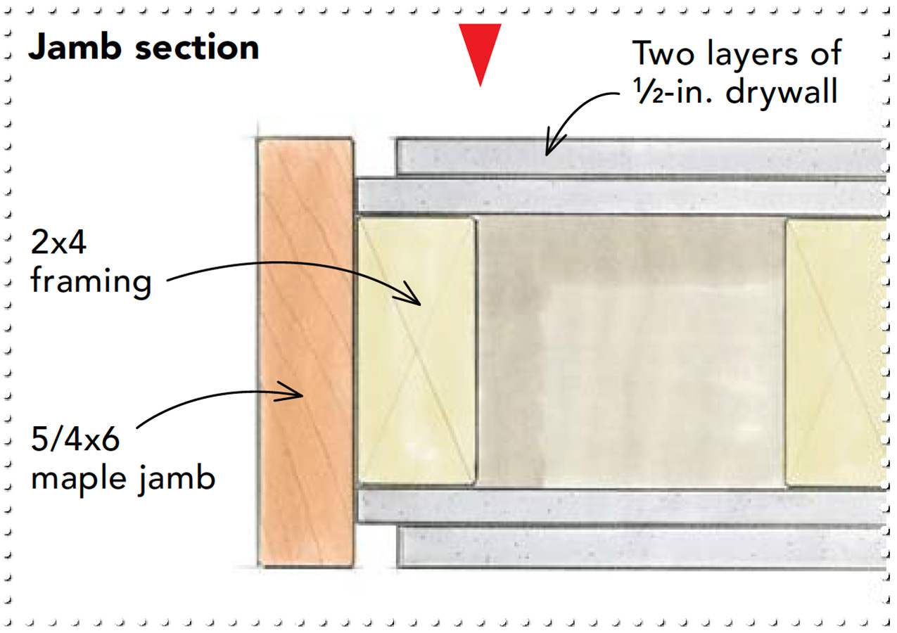
Modern design often reveals a different path to interior trim, relying on the structural elements instead of ornate moldings. Richard Olcott of Ennead Architects designed this house around the concepts of clean lines and space. Where casing would cover the seam between jamb and drywall, a 1/2-in. reveal creates a clean shadowline. The head and side jambs are joined with a simple rabbet.
 |
 |
When less is more
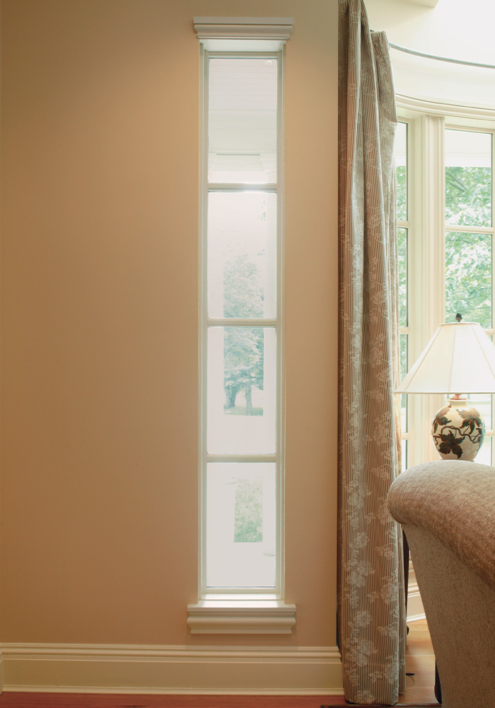
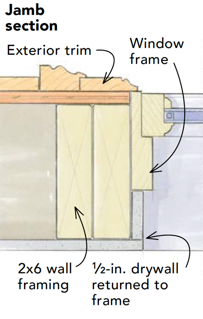
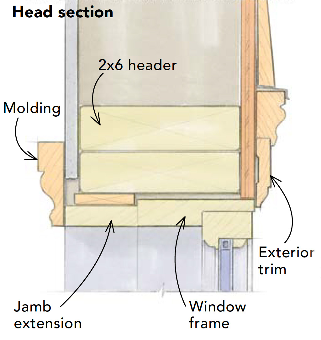
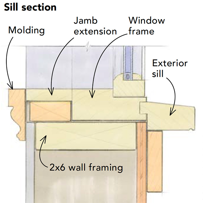
Sometimes suggesting an interior trim detail is enough to get the idea across. Minimal ornamentation often reveals the lines of the structure itself, and the geometry of the building becomes its own decoration. Around these skinny windows, the drywall butts directly to the window frame at the sides of the jambs. Only the sill and head are cased. This treatment may be preferred for its clean look, but it also makes sense in situations where curtains or drapes would cover up whatever decorative trim had been applied.
 |
 |
 |
 |
Looking to the east
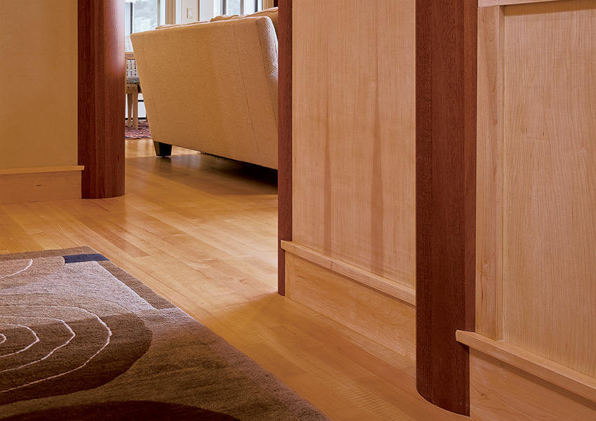
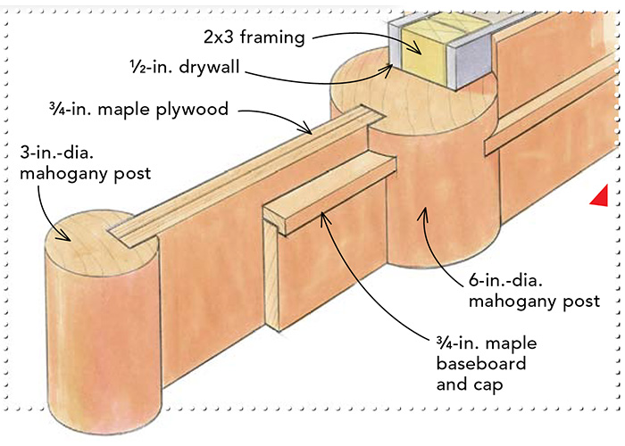
On a trip to Japan, Scott Simons toured centuries-old tea-houses and temples, and was so taken by the designs that he sketched details and faxed them back to the office as he went. It wasn’t long before he had a project where he could marry a modern design with a Japanese aesthetic. Here, plywood panels are used as a Western take on the traditional Japanese shoji screen. At the floor, maple baseboards are scribed into round mahogany columns that punctuate the flow of this hallway. A flat horizontal cap accentuates the base.
 |
 |
Frame the art, not the window
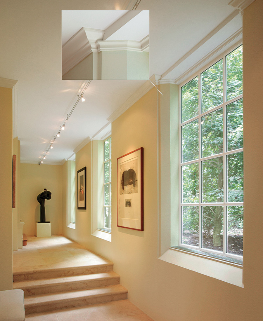
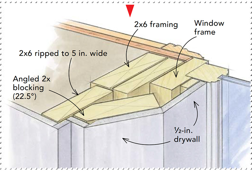
Windows are usually picture-framed with trim, but in this space crafted to display artwork, the designer decided to save the frames for the paintings. Architect Daniel Colbert says that the shadowline makes the windows recede, while the thicker wall becomes “a more substantial ground for the art.
This detail is accentuated by a narrow fold in the drywall that creates a shadowline. A continuous line of molding carries across the window tops, visually connecting each window to the hallway.
 |
 |
The contrast of a single curve
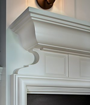
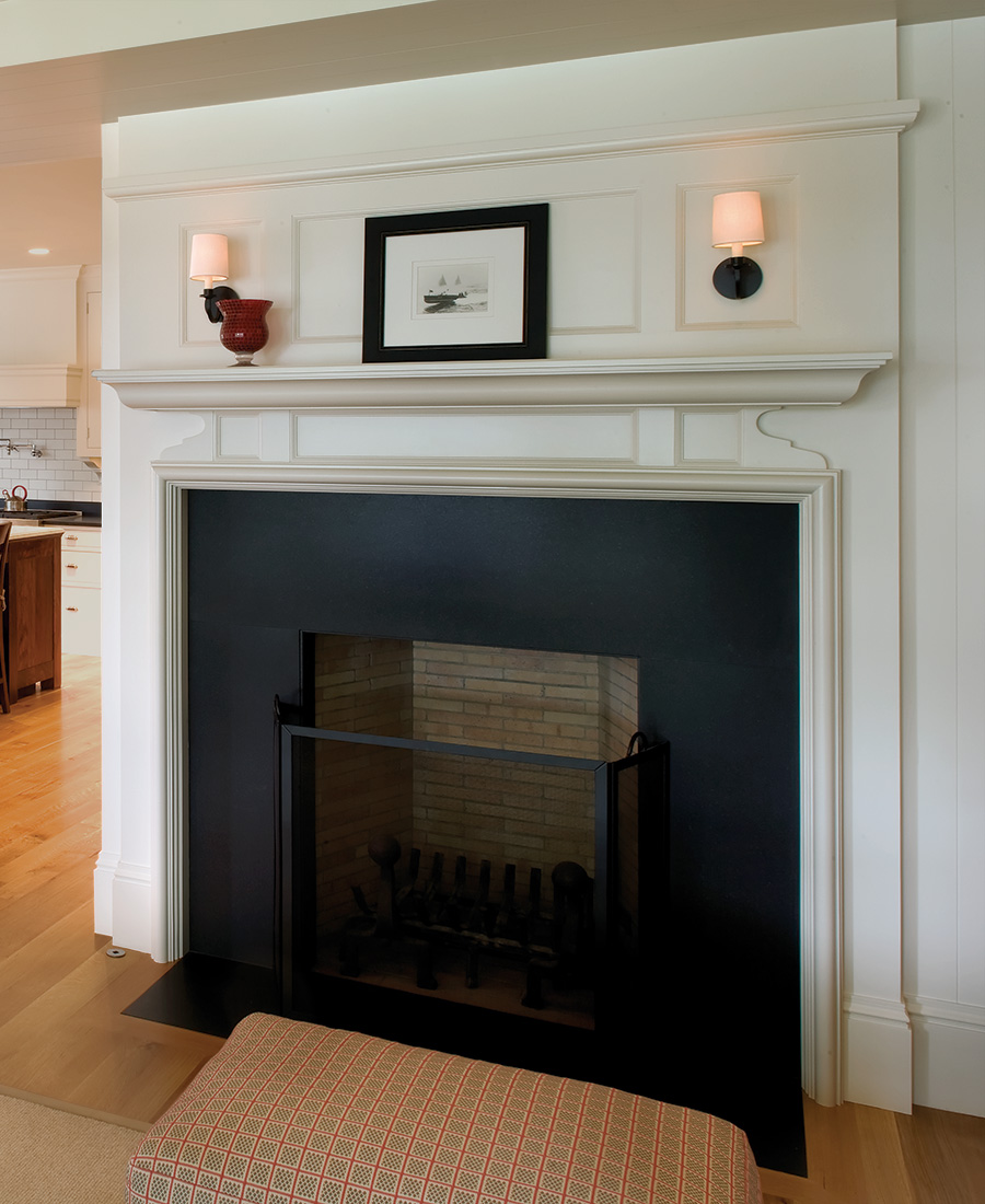
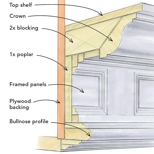
Houses are full of trim. There are windows, doors, and baseboard in just about every room. Overdoing these details can make a house busy and uncomfortable. On the other hand, a fireplace mantel is a great place to have some fun. An eye-level detail, a mantel deserves and receives a level of attention enjoyed by few other elements. While designing a guest house on the Willamette River near Portland, Ore., Leon Trice thought that “things get repeated too much” in general and didn’t always want to rely on geometry. Instead of a stock profile below the mantel, he hand-drew an irregular curve that echoes the crown above yet has a graceful flow all its own. The curve’s sweep is accentuated by slightly thicker stock. He used a similar design on another mantel (photo right) on the same project.
 |
 |
Charles Bickford is a senior editor. Photos by the author, except where noted.
From Fine Homebuilding #216

