Contemporary Courtyard
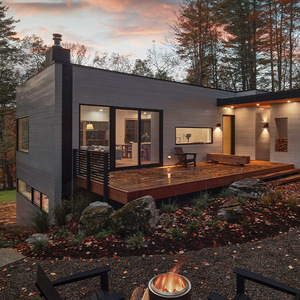
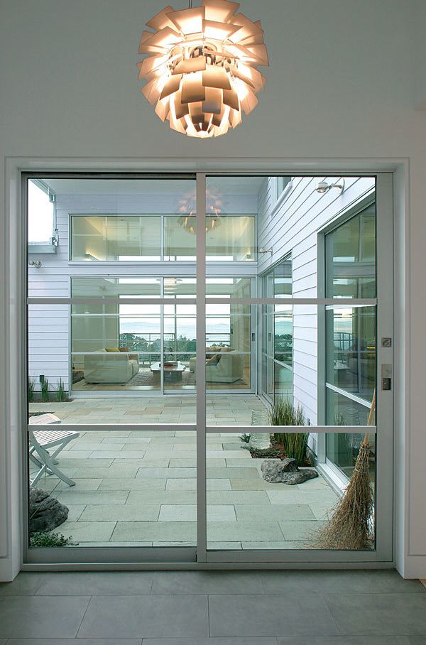
Overlooking San Francisco Bay, this house wraps around a protected courtyard that soaks up the sunshine.
Synopsis: When you’re designing for a building site that overlooks San Francisco Bay, you get to take advantage of one of the country’s most beautiful urban views. That opportunity wasn’t lost on architects Helen Degenhardt and Max Jacobson when they worked on this home, which indeed has a magnificent view of the bay. Designed to reflect the wishes of a client who appreciates architecture, the house uses rectangular shapes and clean lines. Wrapped around a courtyard, the house is flooded with daylight but isn’t overwhelmed by it. Construction techniques and materials minimize sound transfer within the structure. This house was the first in Berkeley to take advantage of the city’s new code permitting rainwater-catchment systems.
If you’ve got a ridge-top lot in the East Bay Hills overlooking Berkeley and San Francisco Bay, you’ve got two sure things: one of the most spectacular urban views in the country; and a prevailing wind so robust and reliable that a nearby science center installed a “wind organ” on the adjacent hillside. It howls here, folks. And yet the mild temperatures and crisp, ocean-washed air invite outdoor living if you can get out of the wind.
Creating a sheltered outdoor space was at the top of the list when architects Helen Degenhardt and Max Jacobson began their design for this house. It’s for a Danish woman who appreciates architecture with clean lines. She wanted the house to be peaceful, quiet, and restful, but at the same time to invite delight at subtle colors and beautiful materials.
Layering the view
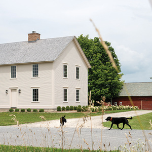
The owner values her privacy and likes to keep a low profile. The exterior reflects this, with frosted-glass windows at the entry level in a facade of simple rectilinear shapes that step back from the street. The walls are clad with fiber-cement clapboards, painted white with just a hint of lavender.
It’s a downslope lot, with the entry to the house on the middle level, the main floor. Just inside the front door, which is recessed into a sheltering notch in the east wall, the view hits you smack between the eyes. On the far side of the courtyard, you can look right through the living room to a view so distant and layered that the Bay Bridge is just the opening act.
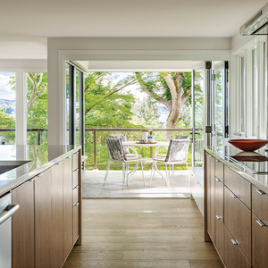
Seen from the dining area, the courtyard reads as an extension of the living room. It’s a connection made more emphatic by the 8-ft.-tall sliding doors that open the corner by the kitchen. The southern courtyard boundary is sketched out with a planter box and a beam that ties the two wings together. A downspout that includes a recirculating pump does double duty as a fountain, bouncing water music around the courtyard and into the house.
The main floor is wheelchair accessible. A clever ramp negotiates the 3-ft. 9-in. elevation change from the garage to the main floor by way of a path that leads from the driveway along the south side of the house to the courtyard.
The lower level of the house contains the mechanical room, a full bath, and a pair of guest bedrooms. This floor was designed to be converted into a self-contained flat if a live-in caregiver is ever needed.
Balance the daylight
This house is flooded with daylight, but it isn’t blasted by it. Instead, its architects used a combination of strategies to get light where they want it and to control it where they don’t. Here’s how.
For more photos and details, click the View PDF button below:
