There are many ways to improve the exterior attractiveness or “curb appeal” of a home while creating a positive, welcoming impression and increasing the home’s value. Even minor improvements to facades can transform the character of a home, whether it’s an older house that has lost its personality as a result of misguided renovations or a house that was built in a period when a mismatch of materials was common but now feels dated. Facade improvements can also benefit houses that were built either for economy or when architectural styles were in transition; such houses often have no clearly identifiable style.
When approaching facade improvements, I find the following design practices especially useful.
Identify what to keep and what to remove.
First, determine if the house was originally built in a recognizable style that has been concealed or altered over the years. Pay attention to building features such as the entry, window and door openings, roof forms, siding, and details. Doors and windows are prominent visual elements, and their authenticity is important.
For older houses, similar examples in the neighborhood can provide clues on style and help you accurately restore details that are missing or altered. Many houses, for example, have had their original windows replaced with lower-quality vinyl or thin-frame aluminum windows. In some cases, original siding may be hidden beneath present siding.
For newer homes, examine the proportions and locations of the window openings. Landscaping also plays an important role, serving as an additional welcoming layer and a buffer from the street. Using plantings consistent with the style of the home reinforces the architectural character. Palms and olive trees, for example, go well with Mediterranean-style homes, while maples complement Craftsman-style homes.
If the house has no identifiable style, you’ve got the green light to propose a design that has consistency with the general building massing or roof pitch and forms of the house
A House with a Dated Design
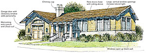
Before: This corner-lot house has had a series of renovations that do not match the original style. Its long horizontal proportions, low-pitched roof, and L-shaped configuration is typical of a single-story ranch-style house. The horizontal bay in front appears to have been added as part of a renovation. The minimal window openings, understated entry, blank garage door, and side elevation are features that most need to be addressed.
After: The first step was to remove the horizontal bay at the front and introduce new window openings. Shown are grouped windows with large, vertical openings that increase the amount of incoming natural light and add transparency. Stucco provides a base treatment for the new siding above that articulates the volumes and provides continuity on the facade. Fiber-cement lap or wood siding with a 6-in. to 10-in. exposure works well with the architectural style. A new entry porch with a shed roof clearly identifies the entry, creates an inviting place for visitors, and breaks the long horizontal volume. The redesign of the garage door with a clerestory window above creates a prominent feature on the facade and reduces the amount of blank surface.

A House with Inconsistent Renovations
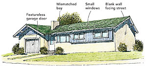
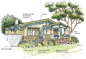
Before: This house has a predominant historic style, but many years of renovations have obscured its original character. Its low roof slope, bracket details, large overhang, and volume configuration are indicative of a Craftsman-style home. But the front porch has been enclosed, and the traditional entry steps have been relocated to the side. The house also has been outfitted with newer aluminum windows. Recommendations include restoring the original details and adding facade features that are characteristic of the Craftsman style. This includes rebuilding the entry porch in a manner that is likely similar to the original design, replacing windows, and adding a new base treatment.
After: The new entry porch has partial-height, tapered, woodcladded columns over heavy squared piers and a railing with closely spaced square wood pickets. A plank railing with cutout motifs is also appropriate. The front door is replaced with a wood door with glass panes and square sticking, and the steps are reoriented to provide direct access to the entry porch. The front windows are replaced with divided-lite Craftsman-style windows. Wood windows with true divided lites are preferred, but another good option is fiberglass windows with integral color. Green, red,or putty colors often work well with Craftsman color schemes, in which earth tones predominate. Window surrounds are made from 1×6 wood trim with square edges.
In a Craftsman-style home, cladding materials in their natural state—such as wood shingles or stone—are recommended. For this scheme, a combination of a primary stucco wall with contrasting wood shingles is used as a base treatment. Earth tones are recommended for the primary wall cladding, with complementary colors for trim and window sashes.
Select materials, add or restore building details such as cladding and windows, and choose a color scheme.
Materials and details should be consistent with the style of the house. If it doesn’t have a predominant style, a comprehensive design motif is important. Regardless of the level of improvements, use high-quality materials to add value to the home, and avoid plywood or synthetic sidings and materials. Texture is also important. Traditional-looking houses tend to have more texture; smooth finishes are more common with modern designs. In particular, avoid using synthetic materials that imitate natural textures.
The color scheme should be visually interesting, with a predominant color for the body and a secondary color for the trim. A third color can be added to details as an accent.
The examples shown here demonstrate how facade improvements can update and restore a house, increasing its visual appeal and value. Each pair of drawings offers a before and an after view of how a facade improvement might be addressed.
A House with No Identifiable Style
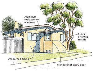
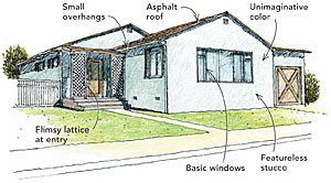
Before: This house appears to have been built for economy, with minimal detail and no distinctive style. Based on the roof form and window openings, this house could be improved to be consistent with either a Craftsman or Mediterranean style. However, because of the small roof overhangs, stucco, and window openings, the proposed improvements allow for a simpler transition to a Mediterraneanstyle home.
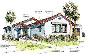
After: Proposed facade changes include adding a new entry porch and replacing the asphalt roof shingles with tile. As the primary facade element, the front window is treated as a focal point, its horizontally proportioned opening enhanced by a grouping of three vertical windows with evenly divided lites. The new entry porch has terra-cotta roof tiles, columns, and a woodpaneled door with iron details. The columns are placed to frame the door and may be either timber or of a simple classical order such as Tuscan or Doric in cast stone or concrete. Decorative Spanish tiles may be used on the step risers. Barrel tiles are the preferred treatment for the roof, but depending on its structural capacity, another option is to add barrel tiles at the edge of the gable ends, with clay-colored asphalt shingles on the existing roof and barrel tiles at the new entry porch. The existing attic vent at the gable end is highlighted with a simple wrought-iron detail. Colors for Mediterranean houses vary from white or off-white to earth tones such as ochre or terra-cotta. Complementary colors are recommended for windows, doors, railings, and columns.
Drawings: Roxana Vargas-Greenan
