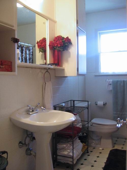
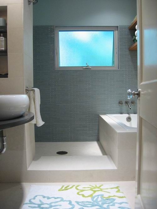
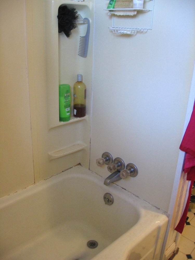
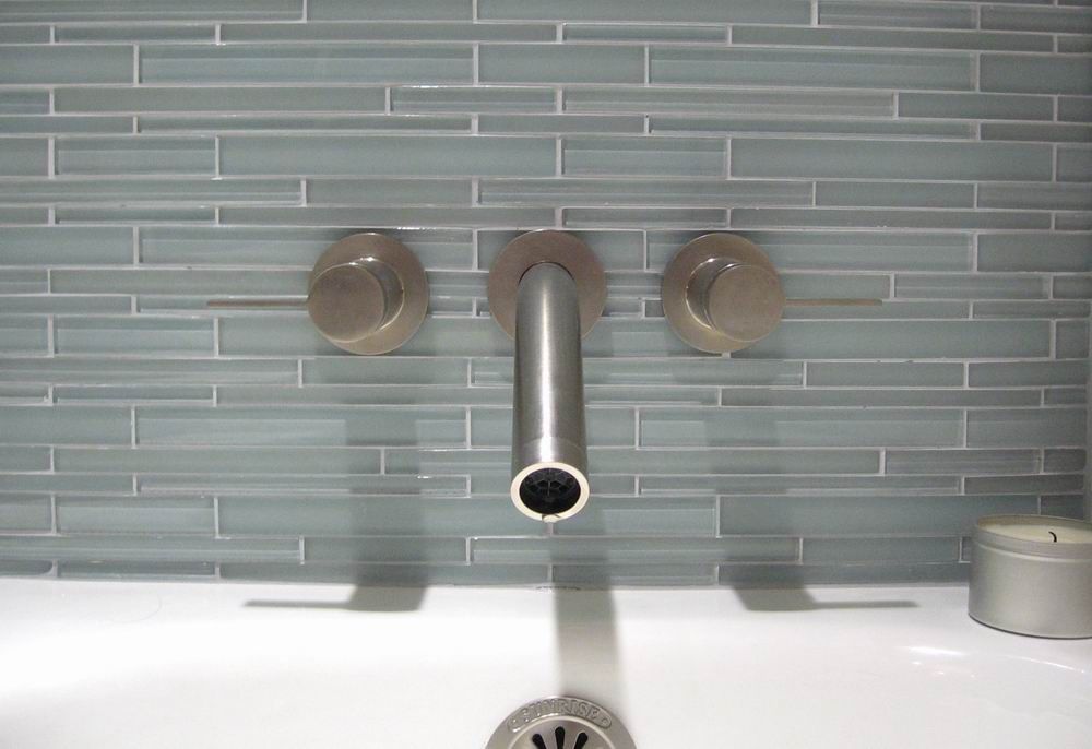
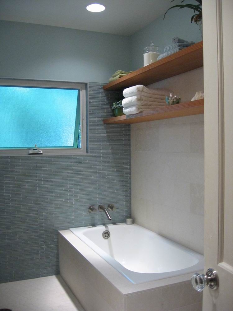
Whether you’re the one setting the tile or the one who’ll be soaking in the bathtub, there’s something about seeing a bathroom go from dull and dysfunctional to smart and serene that can’t be beat. Bathroom remodels offer up all kinds of challenges, and this one, designed by Austin architect Cindy Black and remodeled by David Wilkes had the added twist of being the only one in the house. That didn’t stop Black from calling for the fairly major move of relocating the toilet out of view of the doorway and using the space it had occupied to create a wet area that added a separate shower to the mix. That in itself cures a lot of this bath’s ills, but what really makes it work for me is the tranquility invoked by the materials Black introduced—from the blue glass tiles to the egg-shaped sink resting on the floating vanity counter. There’ll be floor plans showing the changes and more photos to sigh over in our upcoming Kitchen & Bath issue, mailing out (and on newsstands) in October.
Fine Homebuilding Recommended Products
Fine Homebuilding receives a commission for items purchased through links on this site, including Amazon Associates and other affiliate advertising programs.

Get Your House Right: Architectural Elements to Use & Avoid

Graphic Guide to Frame Construction

A Field Guide to American Houses










View Comments
The wet room featured here has been a standard in my stable of homes design for 15 yrs. The waterproof side of things requires more details. Overall the concept is a great way to add pizzazz whilst utilizing limited space. Very exciting to see this in a national magazine.