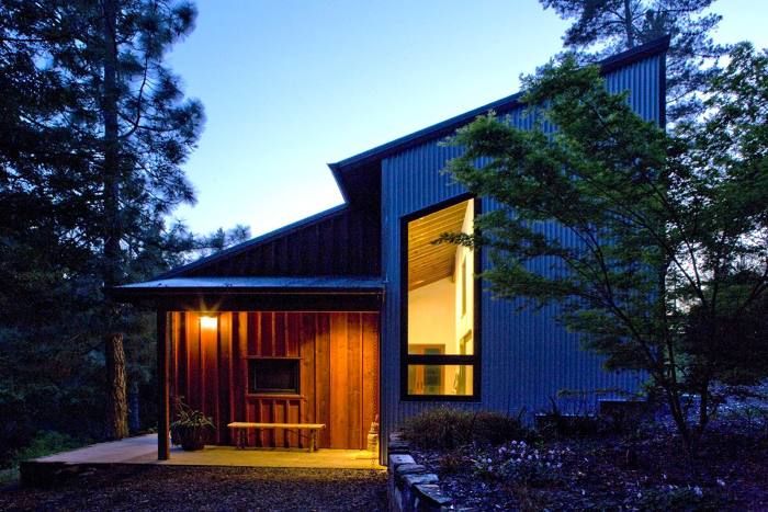
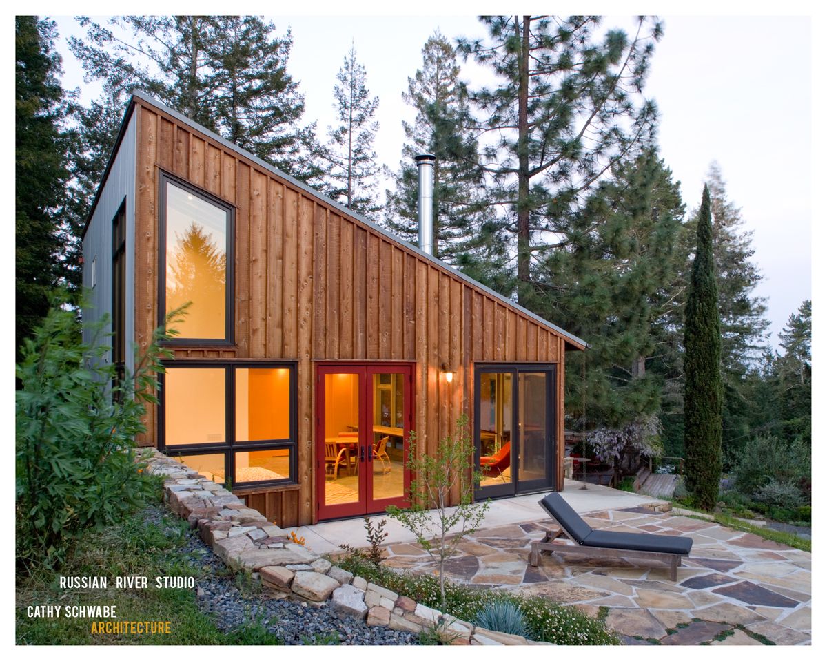
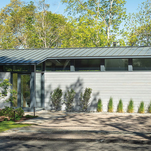
The Russian River studio designed by architect Cathy Schwabe serves as a workspace and guest house. Her clients, a photographer and a writer, also use the space to host workshops and large group meetings. With such specific demands placed upon a studio, it might be easy to ignore the relevance of such a project when considering a whole house design. However, looking at projects within a different context, and with such different goals, can often provide inspiration and insight into strategies not easily found in more literal project comparisons.
Recently, I asked Cathy to elaborate on the some of the major design strategies used in this project, but with an eye towards those that can be replicated in other house designs. Here, in her own words, are the most noteworthy:
One Big Room:
Almost all residential clients share the same three goals. Their project design needs to be comfortable, functional and beautiful. The idea of using one shared space for a combination of functions is an increasingly common method of responding to all three goals, whether at the scale of the main space in this small studio or the more familiar “great room” within a larger dwelling.
The specific functional requirements for each “big room” will not always be the same, yet they will present similar design challenges:
- Since there is no longer a place for everything, they need to be thoughtfully designed so that there is a space for everything.
- They will need some degree of flexibility to accommodate multiple uses.
- They will need to work well for a group of people and yet still feel comfortable for just one person.
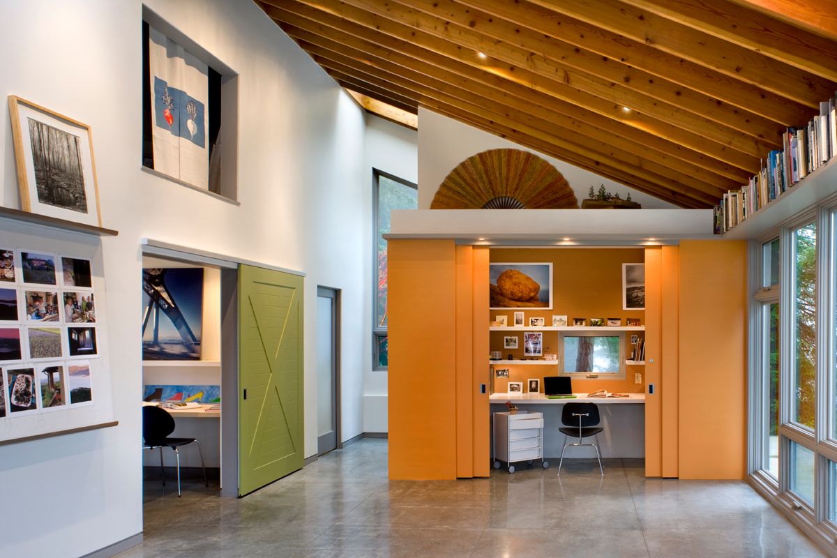
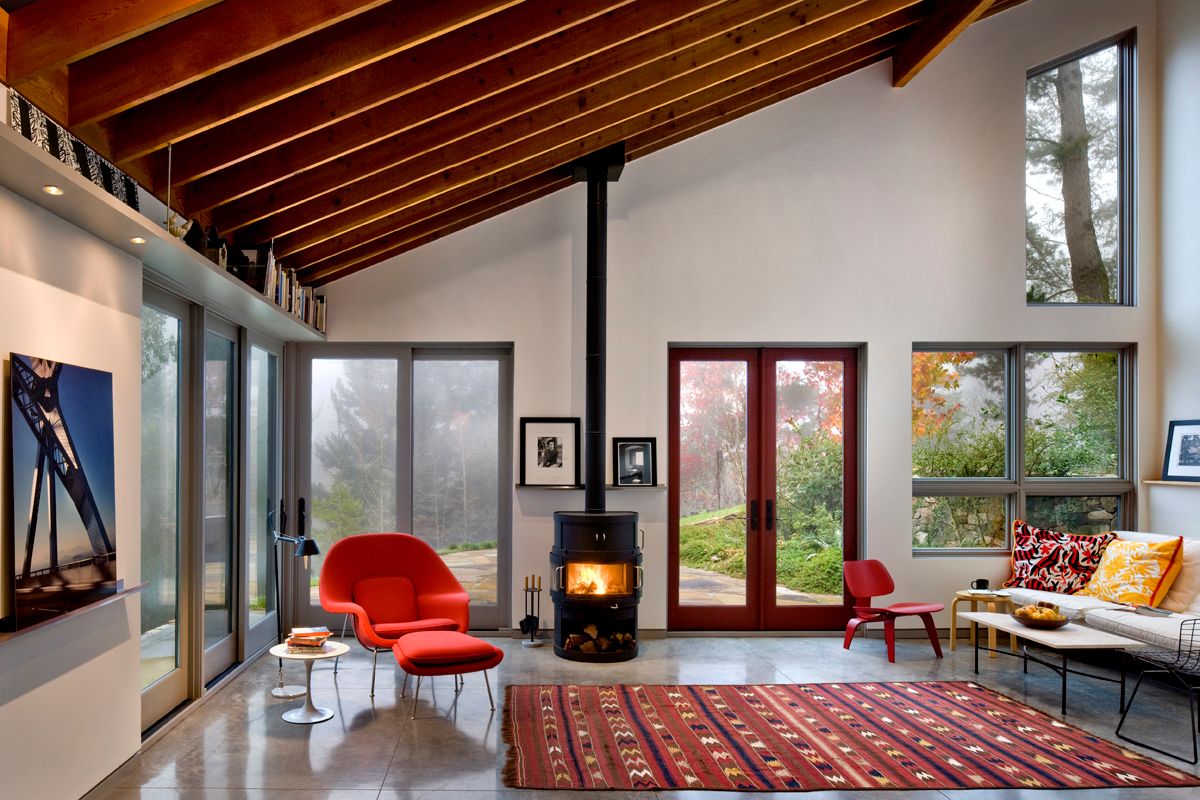
The “big room” in this project is essentially a rectangle whose corners and one side have been pushed and stretched to include three saddlebag-like alcoves. Two of the alcoves can be open or closed to the main space with easy-to-slide, brightly colored panels. The panels, when open, reveal the two individual workspaces. Each has its own window. Though small in size, they are comfortable to work in since they borrow space and light from the main room. When the panels are closed, and therefore appear as colorful wall elements, the shape of the room becomes that of a simple rectangle with an open corner alcove and one fixed interior element, a wood burning stove.
The room as a whole lends itself easily to the flexibility of furniture arrangements the varied group functions require. The wood stove provides both a heat source as well as a focal hearth element for the room. This works well for a group, but it also provides an element next to which one or two people can sit and feel they are within their own personal space. The design of the open alcove and southwest corner framed with glass doors share an intimacy of scale and a sense of protected enclosure. When you’re within them, these two corners allow the option for no, limited and/or more active interaction with the rest of the space, which itself might or might not be filled with other people. It is the combination of the woodstove, connection to the outdoors, scale, enclosure and choices for interaction that allow a space large enough for 20 to 30 people to feel small enough for just one or two.
The Indoor/Outdoor Connection:
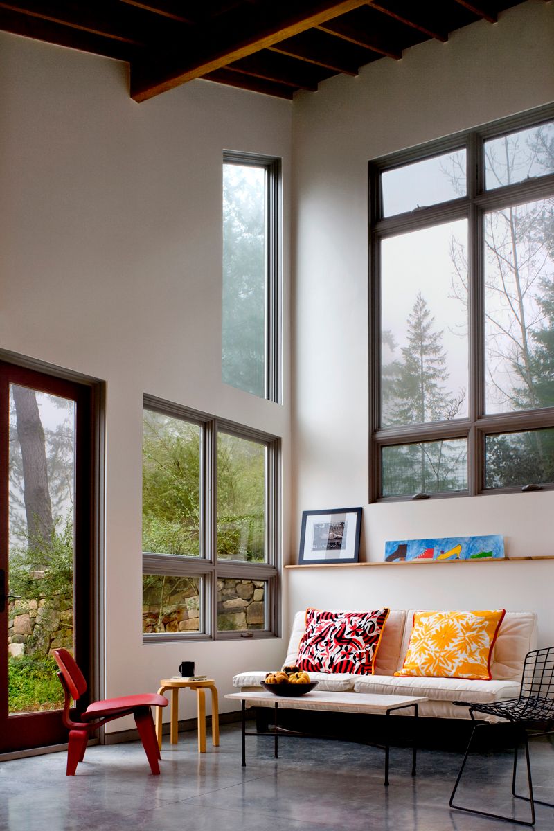
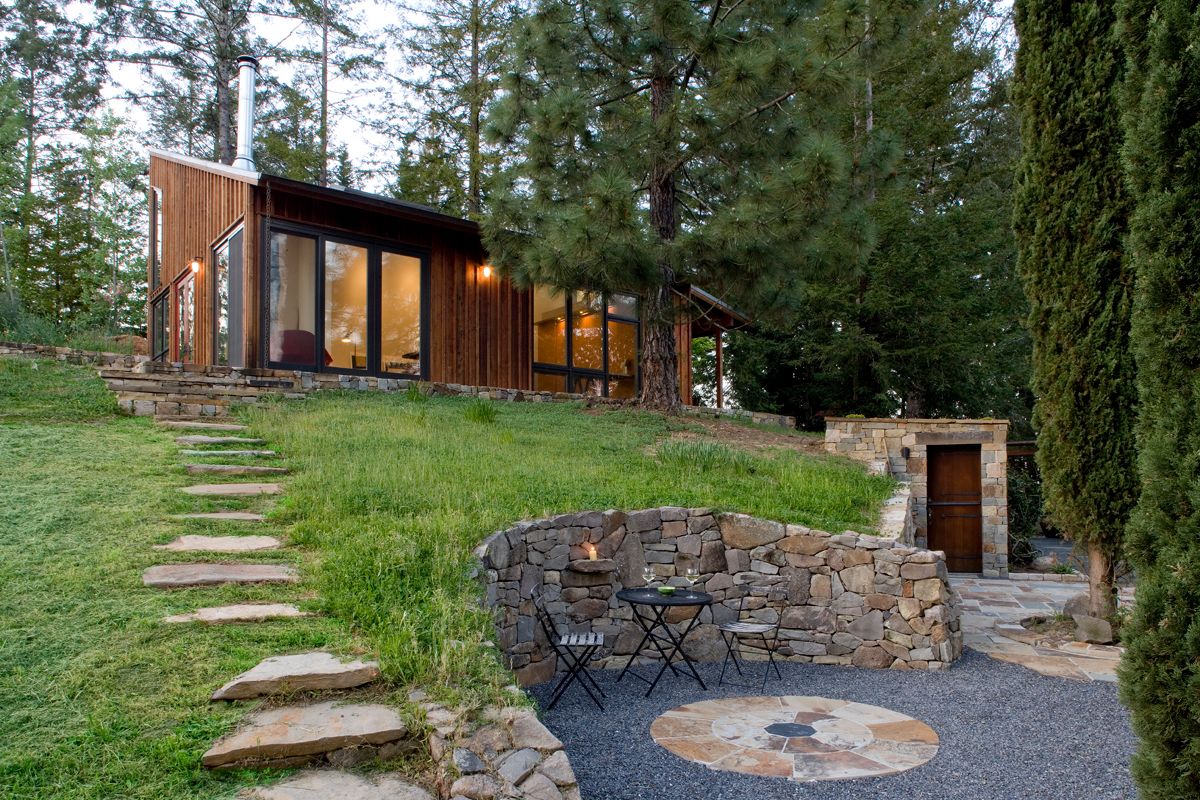
Maximizing and providing options to take advantage of the indoor/outdoor connection is part of almost every residential design at some level. This studio has a lovely site: set in a rural area, slightly cut into the top of a hill with open views across an open grass land. The abundant sunlight, seasonal fog and natural breeze allow the outdoors to be used as a natural extension of the interior space for most of the year. In the hot summer, which is the most challenging part of this climate, the natural ventilation through operable low southern and high northern windows, and the shade from the roof overhangs and the trees, keeps many of the exterior and indoor spaces cool.
The pavilion-like main space is visually and physically open to the outdoors through the many windows and doors. The 1-inch difference in floor elevation from the concrete floor of the interior as it becomes the concrete paving of the adjacent exterior spaces creates a near seamless link as you enter and exit the studio. The paved southern exterior edge is experienced as a narrow porch or walkway element, while the windows above it increase the perceived size of the interior space. The concrete paving transitions to stone at the western end of the building to form a large terrace bounded by plants and a stone covered retaining wall. The retaining wall continues through the length of the building and is capped with wood in the interior to become a shelf. Sitting against the wall, either inside within the alcove or outside on the terrace, you feel nestled into the hill with a sense of being visually and physically linked.
Daylighting:
The visual comfort of daylighting comes when the contrast between the natural light within a space and the light outdoors is reduced sufficiently to feel balanced within the eye. When this occurs, the eye’s natural adjustment to changing light levels becomes imperceptible as one moves or looks from the outside to the inside. There is no glare, no resulting eye strain, and one can see clearly at all times of the day.
Light in the main studio space is brought in from windows and doors on all four sides, as well as through skylights. Openings are placed within reasonable proximity to one another, but on separate walls to take in light from more than one orientation at the same time. This helps balance light within the eye itself as the direct light coming from one window or door is offset and balanced by the indirect light coming in from another. Other openings are set perpendicular to a light colored, solid surface—a wall, the floor or a desktop. This placement helps to direct light deep into the interior and reflect the light onto other surfaces. For example, the surface of the main interior wall and that of the skylight shafts above are in one continuous plane. Light coming through the skylights washes down the wall, which is then reflected by the wall into the room and back up to the ceiling plane. The ceiling then reflects the light down to the space below. Using a perpendicular surface as an indirect light source helps raise the interior ambient light level and draws light more fully into a space than would be possible if the skylight were just floating in the ceiling plane.
Planning for change:
Not all projects are completed at one time. Sometimes the design itself has a more open ended quality and the completed building will accommodate certain uses that cannot become evident until after the space is in use. Cost-based phasing and planning for anticipated future uses can usually be solved with a few practical moves. Nevertheless, planning for what you don’t yet know is an interesting challenge.
The design of the bathroom/laundry area is a good example of cost-based planning. The room began with a toilet, a floor drain set into the concrete, and a sink mounted into a long counter under which there was a base cabinet and a space that housed power and venting for a washer and dryer. Though not necessarily a desire among the clients during the design phase, the washer and dryer were eventually added later, as was a tiled shower.
The larger closable workspace as well as the loft space that runs above it were also designed and built to meet anticipated future needs. The workspace, designed first as a darkroom and photo storage space, was also envisioned as an additional workspace with a smaller darkroom, which it became almost immediately thanks to deliberately placed walls, utilities and a sliding door opening. The loft space is currently accessed by a ladder in front of a high interior opening. It was designed with many possible future uses, which include a more easily accessible storage area, a workspace and or a sleeping space that could be accessed by an exterior stair, an interior rolling access stair ladder, or both. The floor was framed to accept the load for all of these options, and the exterior window was framed so that it could become either a door or a much larger window for improved light, air and access depending on the use of the space.
If a space works well for a list of defined yet different group and individual uses, it will probably also work well for uses that have not yet been imagined. And so far this has proven to be true. Added group functions have included several musical performances, various types of workshops, a wedding and a memorial service. The advent of wireless, not yet commonplace during the design phase, along with the use of smaller laptops or tablet devices, has affected the individual work patterns in particular. The creative workplace shifts often away from the tether of a fixed work surface and storage space and into comfortable chairs both inside and out. When the work needs to be put to one side, the device is closed and returned to the workspace or left on a side table like a book.
Architect: Cathy Schwabe www.cathyschwabearchitecture.com
Fine Homebuilding Recommended Products
Fine Homebuilding receives a commission for items purchased through links on this site, including Amazon Associates and other affiliate advertising programs.
A House Needs to Breathe...Or Does It?: An Introduction to Building Science

A Field Guide to American Houses
Musings of an Energy Nerd: Toward an Energy-Efficient Home








View Comments
Sounds as though one step forward, two back. Use of space, natural light, wood stove, on and on, cooling ventilation through windows in low southern walls, high northern walls. Intuitively, a south facing roof slope From the photos, one large rectangle of sloping, southern exposure. No mention of any use of appears a huge solar opportunity wasted. Maybe later?
Attractive in appearance, but is it a living space? It looks like the building was over-designed with an emphasis on expensive custom windows and doors, and no real emphasis on long term occupation. Sure, it would be nice to visit, but I wouldn't want to live there. There are numerous approaches to designing one room/divided buildings, and this one looks nice, but it's a Starbuck's, not a home.
I hope it never snows where this building is built...
Thank you both for your comments. Lash66, I don't think the site is as ideal for PV as it might seem. Cathy will know more and might post. If not, I'll find out for you. Goalieump, you make some interesting comments. I feared that people might look at this project and not get it. No, it's not a living space with "long term occupation in mind". It's a studio used as a work space and as a guest house. There are good lessons here that can be replicated in "homes", though. Also, the windows aren't custom. Cathy can weigh in here as well, or I'll get more details. I'm with you, though. They do look custom.
Thanks to both of you for your comments and for taking the time to write. I'll try to respond.
Lash66:
Regarding the opportunity to use PV's and whether this was considered:
The site has quite a few mature trees which shade parts of the roof much of the day. This made using a single zoned array problematic - and a multi-zoned array would have been prohibitive. The electrical demands of the building are also really low and the budget was limited so even if we had no shading issues the cost benefits of PV would not likely have penciled out.
However,as PV panel designs improve in efficiency and with net metering now available in this area as well as new local opportunities for solar + or energy related rebates this is something that may well be explored in the future, especially when the clients are able to live there full time.
Goalieump:
Are these custom windows?
As Rob noted, the windows are not custom. There are a lot of them for sure - but they are standard sizes by Marvin and all of the components can be found in their catalog. Marvin will work with you to combine various operations and they offer shaped tops -- if you don't want everything to be parallel. The interiors came primed and the owners painted them the colors you see. Both of the exterior aluminum cladding colors are also standard. The windows are trimmed out on the exterior with the battens used as part of the siding at the jambs and use a shaped head and sill trim made of the same western red cedar. The shaped pieces of trim were run by the mill and then field cut as the units were installed.
Designed for snow?
It does not snow on this site -- well I suppose it might get a light dusting on a rare year but there is no snow load.
Is this a living space?
Wanting a good and flexible working space for two productive artists as well as a living space that would on occasion be a guest house won't be on every homeowners list - and a shift in emphasis would result in a different design and a different kind of "living" space. I got an email from someone today asking about this very issue - they liked the studio a lot but wondered if I had ever designed a version with bedrooms and or had integrated a more standard approach to heating than a wood stove.
Home or Starbucks:
I have tried to respond to your last comment several times but have deleted each effort because other than understanding that this does not read as "home" to you, which is fair if it doesn't, I am having to guess at your full meaning and intent.
This is a wonderful project! While conceived as a studio - clearly with great flexibility and opportunity for changes in the future - I think it's a provocative example / model also for a weekend home for 1 or two. It's simple yet sophisticated; it's homey yet elegant. From reading the text, it appears that this was a thoughtful collaboration between architect & client. Of course it may help that the clients are artists but I think for many getting help articulating what we want and working with an architect to refine & achieve our priorities AND getting great design too is the ideal. One specific aspect I'd like to comment on is the 'main space'. I have toured many homes and seen countless projects in magazines that include a 'great room' -i.e. the 'main space'. I find that many of these, while providing lots of room, fail miserably. They fail because they're too big, the proportions are all wrong, there's no specialness or change in scale (such as the alcove in this project), etc. In this project, I think this concept really works! I would move in tomorrow! Thank you for posting this project.
I have spent a lot of time in this space, and it's amazingly versatile, comfortable, and well designed. I have attended a live concert here (the acoustics are wonderful) and a memorial. I have had weekends here alone working on a book project. I also lead all day writing retreats here, so I have had the opportunity to see how the placement of windows and doors allows many variations for air circulation and comfort--including a nice cross breeze, or some fresh air coming in from the lower windows while the wood burning stove is fully stoked.
Having slept here MANY times as well, I can attest to the kind of flexible space this is. I could easily live here, and just as important, I can appreciate the thoughtful design of this architect when considering future additions. This building has the potential to grow and change--right now and also in the near future. It is dynamic, as all well designed buildings are.
TheCatalyst, thanks for posting. It's great(and surprising) to get the perspective of someone who has actually been to the studio. Though I didn't state it in my text, I find that these sort of projects make you question the way you live in your existing home. What's necessary. What's possible. I can actually see myself living in this space as well, but I'm personally drawn towards smaller homes in general.
This is a rare residential buildings with a public/private program. I have attended concerts for several dozen, a writing workshop for 10, and stayed over with just my partner. It is rare to find a space that can work at all those different levels. Beyond the spatial experience it is also incredibly comfortable in the summer heat. In that way it works perfectly as a passive solar structure. Didn't get the Starbucks comment. If only Starbucks were so comfortable. But they do have wifi!
(http://top4biz.com )
Online Store,Get Name Brand Fashion From 12USD Now!
Lv,Gucci,Prada,Coach,Chanel Women sandal is $30
As one of the owners of this studio, I am thrilled to see it featured on your blog. It was an amazing process to envision this with Cathy. Since we have a primary residence 40 feet away, this was always seen as a studio/workspace/ guesthouse when needed. She spent time with us exploring both of our needs and desires and took such great care creating a remarkable space for us. We wanted a space where we could do our own individual work. I am the writer, my husband, a photographer. We also wanted a place to daydream. Be inspired. The building was sited perfectly for the latter taking in the views and bringing the green countryside in. An aspect of our space that has not been discussed is the psychological impact when you enter. Immediately you are surprised by the volume, and combined with the view, you have the sensation of being safely perched in a tree looking into a forest. Sharing our space with others was equally important. I like to cook big and we have a long wooden table that we place in the middle of the space. It seats twenty and it will again be the location of our friends and family Thanksgiving this year. As others have written it has been used for writing and drawing workshops, a memorial and a classical guitar concert. We are imagining more uses. The couch shown in the photographs makes into a comfortable bed and the alcove becomes a cozy place for a sleep over allowing our guests to enjoy the stars before nodding off. It is meeting all of our needs and continues to inspire us. We are so grateful to Cathy.