Mosaic Kitchen
A dazzling backsplash crowns a kitchen that got better by getting smaller.
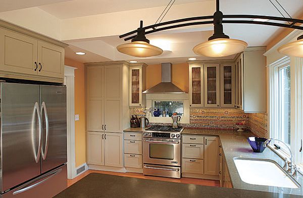
Synopsis: The kitchen in Alexandra and Thomas Immel’s house was great for their kids, who ran around the center island and played hide-and-seek in the base cabinets. As a place to prepare and serve meals, however, it left a lot to be desired. The island was an obstacle in the kitchen traffic pattern, and in-swinging doors and an extra deep breakfast counter encroached on the dining area. By removing the island, reconfiguring the counters, and rehinging the doors to swing out, the Immels created more workspace and allowed the dining area to expand to a comfortable size. Other enhancements included a coffered ceiling, a tall pantry, and a dazzling mosaic backsplash.
It’s not intuitive, but at times the best way to make a kitchen more usable is to make it smaller. That’s the approach Alexandra and Thomas Immel took when they recast the kitchen in their 100-year-old colonial revival in Seattle.
The kitchen they inherited from the previous owners was an amusement park for the kids, who ran circles around the little island in the middle of the kitchen and played hide-and-seek in the base cabinets.
For the parents, though, the island hub that so entertained the children was an obstacle in the kitchen traffic pattern. Also, the in-swinging doors and extra deep breakfast counter encroached on the dining area.
Alexandra’s new plan for the kitchen gives the dining area some breathing room by replacing the breakfast counter with a smaller one on the south wall. At 42 in. tall, this counter doubles as a screen to conceal the cleanup zone from the dining table. The sink is now in a counter on the south wall, overlooking a deck and the backyard garden. To the left of the sink, a splendid mosaic splash ascends from the counter like a tropical sunrise.
“Aha!” moment
The plan came together when the Immels realized that removing the island, adding tall storage for the pantry, and reconfiguring the counters would result in more workspace and storage as well as allow the dining area to expand to a comfortable size.
For floor plans and more details on this kitchen remodel, click the View PDF button below.
