When reviewing the submissions we received for this year’s awards issue, each of our five guest judges discovered a compelling project that didn’t quite fit as a category winner. We agreed that these projects deserved recognition in this issue as well. Featured here are those five homes, along with the judges’ reasons for believing them to be interesting, inspiring projects.
Handcrafted Northern California family home
by Jonathan Orpin, builder
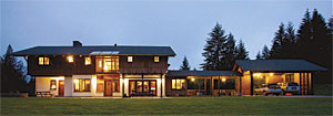
While filing through entries for this year’s Houses issue, I had to turn back and re-examine a few projects that quietly stuck with me. The Northern California home that Seth and Jaime Lancaster built for their family is one of those houses. It doesn’t immediately reach out to the visitor; rather, in evoking an Alpine demeanor, it makes you find the door yourself, as though its lower floors are covered up with big piles of snow—which may well be true come winter.
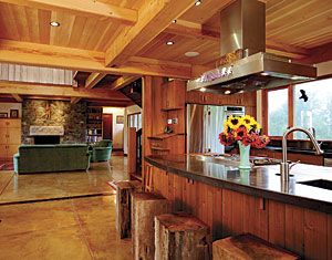
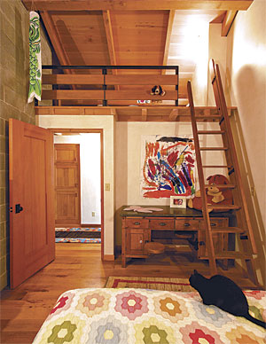
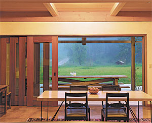
Once you find your way in, though, you’re welcomed into an articulate series of public and private spaces that look like a lot of fun to live in. All the good stuff is here: inside-outside dining, intimate rooms juxtaposed with some fabulous large spaces and their California views, and bedrooms with personal lofts. I’d be pretty happy to come home here from a long day’s work, or be a 9-year-old playing all day, waiting to welcome Dad home.
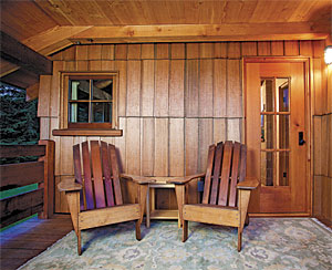
I’m a wood guy, so the cascading sensuality of the patterns, the grains, the joinery, and the luminescent finishes all over the house leave me with a faster-beating heart. Seth has used reclaimed redwood from an old wharf all over the place. From a distance, the long exterior shingles appear thatch-like in texture and are no less intriguing the closer you get. Interior trim, stair parts, and custom-made doors and entries suggest long hours in the shop. You know with certainty that this home was a labor of pure love.
Design, construction, and materials: Jim Groeling and Seth Lancaster, WharfWood, Kneeland, Calif.; www.wharfwood.com
Photographs: Chantele Leatherwood, Petrolia, Calif.; www.photosbychantele.com, courtesy of Seth Lancaster
Creekside
by Angie Lipski, architect
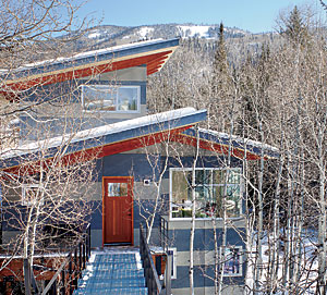
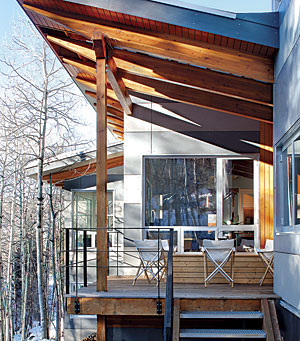
Constrained sites like this one can force atypical design solutions with grand results. The envelope constraints here are masterfully responded to in overall form, sense of movement on the site, and places of pause. Entering high within the treetops via the bridge reminds me of treehouses and the adventures of childhood.
The bridge clearly defines the entry and encourages a mental shift to weekend mode. Additionally, the texture and sound of the grate underfoot, the elevated plinth of the bridge, and the views across the setting sensually engage those who visit.
The modules of spaces both within the house and surrounding it create gathering spaces and places for reflection. The wonderful outdoor space between the two forms is well defined and provides a sense of protection and scale among the big skies, forest, and mountains. It provides refuge and an extensive view. It’s easy to imagine long, relaxing meals here and suiting up for the start of a new adventure. This space will be remembered by all who experience it.
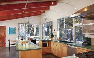
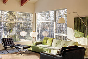
No materials in this house appear too precious. This allows people to relax and not worry about ruining anything, which is important when many different family members and friends gather together. Both interior and exterior detailing are clean, honest, and simple, yet there’s a sense of scale, intrigue, and soulfulness to the detailing and palette. The disciplined palette creates a visual peacefulness about the house. This allows the mind to be calm and to enjoy the forest setting among the treetops through the windows and exterior spaces. I’m certain that the passage of time and of the seasons is highly perceivable from this house. Additionally, the furnishings support a spaciousness and uncluttered feel. As a result of all the thoughtful, adventurous design decisions the owners made, this home surely provides the escape they were aspiring for.
Architect/builder: Tom Scrimgeour, Steamboat Springs, Colo.; www.tsarchitect.net
Photographs: David Patterson; www.davidpattersonphotography.com
Inside out in Palo Alto
by Tina Govan, architect
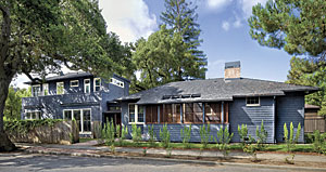
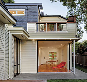
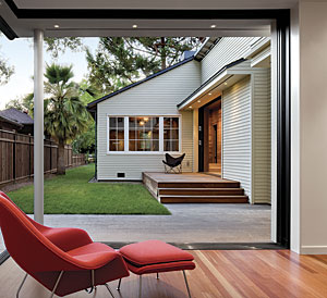
This project skillfully integrates a new addition with an 1899 house while maintaining the character of the original historic structure. This is no small task. The architect wisely chose to separate the new from the old with a simple breezeway so that the older section of the house could maintain its integrity as well as its status on the National Register of Historic Places.
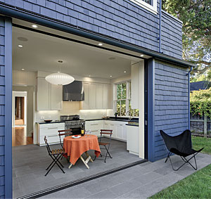
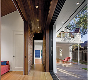
What makes the house such a delight is the way it opens unexpectedly in the back. With multiple sliding panels and disappearing walls, the outside and inside merge seamlessly around a hidden courtyard. Feeling simultaneously modern, historic, and Japanese, the house opens boldly to the outside both upstairs and down. As the architect describes it, the rooms lose their walls and become like porches.
As you move through the house, you discover a wide variety of wonderful outdoor spaces that you’d never guess were there, judging from the street. This welcoming relationship to the outside expands the spacious feel of the house, allows for more flexibility of use, and invigorates the older, original house. It is a house that doesn’t give itself away at first glance, but reveals itself in delightful, unexpected ways as you journey through it.
Architect: Cathy Schwabe Architecture, Oakland, Calif.; www.cathyschwabearchitecture.com
Builder: Young and Burton, San Ramon, Calif.
Photographs: David Wakely; www.davidwakely.com
Northwest next zero
by Michael Chandler, builder
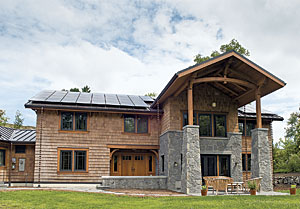
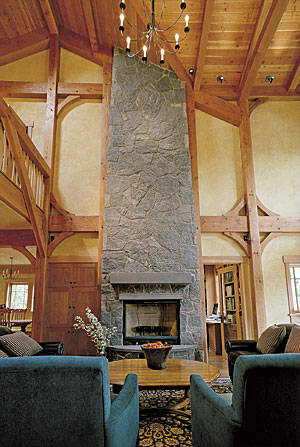
I love the way this project marries energy efficiency and green building with design and craftsmanship. I’m struck by the details in the main staircase with the waisted-plank balusters and the waisted-timber newel post. I love the repetition of the tapered stone columns on the southern exterior elevation in the tapered stone chimney mass in the living room. I love the idea of a net-zero house where SIPs are laid over a magnificent timber frame and the standing-seam metal roof supports a substantial solar array.
Little details—the way the handrail was applied to the loft ladder; the way the paneling, the doors, and the cabinetry were harmoniously designed; the way the heavy timbers were extended organically for the upstairs balcony railing—exemplify many levels of exceptional building and beautiful design.
Architect: Velocipede architects, George Ostrow, principal, Carrie Anderson, associate, Seattle; www.velocipede.net
Contractor: Thomas Jacobson Construction, Seattle; www.thomasjacobson.com
Photographs: Michael Hilliard/MHHM
Timeless character
by Sarah Susanka, guest judge
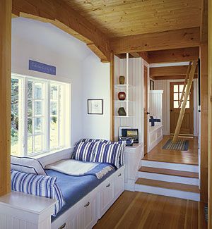
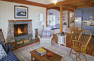
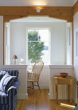
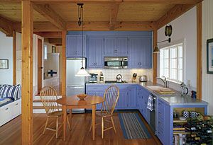
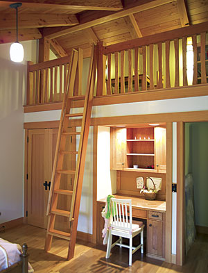
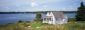
I instantly fell in love with this unassuming little cottage. It has a simple elegance and charm that is much harder to achieve than you might think. Beams, columns, white walls, and natural wood floors and ceilings express the structure without apology or embellishment. The super-simple brackets at each of the alcoves designate these alcoves as separate places while keeping them connected with the larger rooms they participate in.
Christopher Alexander published a book called The Linz Café in 1981, just a few years after his paradigm-changing book, A Pattern Language. A photo at the beginning of that book reminds me of the shot of the lovely office alcove. Indeed, the whole house exemplifies what A Pattern Language is all about: It has an effortless sense of place and a timeless character that will endear itself to its inhabitants for a long time. Although it was planned as a guest house and is only one phase of a larger project, I’m willing to bet that the owners have bonded deeply with this delightful cottage.
Architect: John Cole Architect, Arlington, Mass.; www.johncolearchitect.com
Builder: Nathan R. Powell Inc., New Harbor, Maine
Photographs: Brian Vanden Brink; www.brianvandenbrink.com
