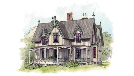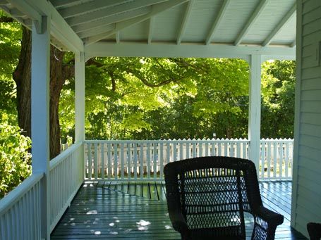
A porch like this invites you to linger. Your eye is drawn beyond to the lush green tree canopy while you take comfortable shelter in the porch’s dappled light. From this vantage point, time draws still as an endless summer awaits beyond the porch rail. You revel in that glorious in-between space, that’s neither inside nor out, where you can enjoy both.
How does it evoke such dreaminess? Really, quite simply. For one, the scale is right. The height of the beam that receives the rafters is just high enough above your line of sight to provide a feeling of expansiveness, but not too high to negate the sense of protected cover that the gently sloping ceiling provides. The width too is just wide enough for a seating arrangement and perimeter circulation. It would have sacrificed some of its relaxed ease had it been narrower. Because the porch wraps the corner, it leads your eye around to anticipate what the other side holds, which also appeals.
The exposed framing and ceiling boards, tidy linear balusters, along with the building’s clapboards, all in white, set a straight-forward tone, suggesting a deliberate simplicity. Trivial minutiae have no place here. It’s about stripping away complication and artifice. The order of the geometry, down to the floor-board pattern that mirrors the rafter configuration above, reinforces a clarity of purpose; this is a place where things make sense, and those that don’t, will have to wait.
by Katie Hutchison for House Enthusiast and SquareOne
Read more design snapshots by architect Katie Hutchison, and about integral entry-porches in Katie’s recent Drawing Board column in the HOUSES 2012 issue.
Fine Homebuilding Recommended Products
Fine Homebuilding receives a commission for items purchased through links on this site, including Amazon Associates and other affiliate advertising programs.

Not So Big House

Code Check 10th Edition: An Illustrated Guide to Building a Safe House

All New Bathroom Ideas that Work


