After three decades of looking at houses for a living, I still can’t stop. If I see a realtor’s open-house sign, chances are good I’ll pull over and take a walk-through for a little sport house-hunting. Last weekend, for example, my wife and I were driving up the Northern California coast when an open-house sign winked at us. The house had decent bones, and its perch above the coastal highway afforded an impressive view. Inside, though, it was utterly lacking in character: gray wall-to-wall carpet, white walls, and a U-shaped kitchen with unrelieved rows of white, plastic-laminate cabinets. It had all the charm of a lab coat, and it got me reflecting on how some kitchens and baths are inviting, functional spaces that are a pleasure to occupy, and others aren’t. It’s not a matter of expense. It’s that some designers can combine the same ingredients that make a dull, uninspired room and cook up a space that sings.
Boatloads of ink have been spent on the subject of kitchen and bath design; I’m not going to revisit those guidelines here. Experiences like last weekend’s, though, make me want to reflect on the many simple, ingenious, affordable ideas I’ve seen applied to kitchens and baths over the years. They provide the answer to that driving question in home design: What makes this space memorable?
When Outfitting a Kitchen, Don’t Forget the Cook
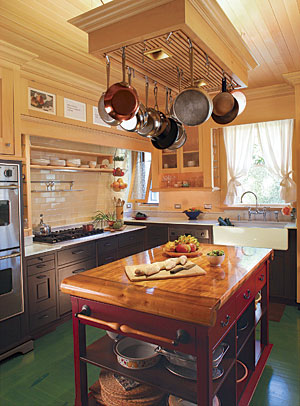
In my experience, the best kitchens reflect the people who cook in them, so leave some open shelves. Like a scrapbook, they’ll proudly display the cookware, crockery, and other personal favorites that make every cook—and you hope, every kitchen—unique. Hang favorite pots and pans from a rack. They’ll be easy to reach and will set the tone for what the kitchen is all about.
Thirty years ago, the superb English architect Johnny Grey shook up the kitchen-design world with the “unfitted” kitchen. (Read Grey’s take on kitchen design in “Tailgate”) Grey designed kitchens that had disparate parts: individual cabinets and counters of different heights and depths that read like pieces of furniture. It was an old idea made new again, and it makes sense both aesthetically and functionally. Here’s a secret: Counters don’t have to be 36 in. high. Mix them up. It’s often easier to roll dough, for example, on a slightly lower surface. Counters don’t have to be 24-in. deep, either. A 30-in.-deep counter will give you lots more workspace, and a 24-in.-deep counter with a 6-in.-deep shelf above its splash will give you a place to keep the olive oil and soy sauce out of the way.
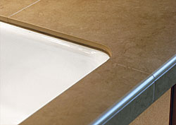
The granite invasion of the ’90s is still with us. Acres of granite now pave the base cabinets of America. Just how many places, though, do you need to put down a hot pot or roll out pastry dough? Yes, granite counters are available everywhere, and the cost has come way down. Use granite sparingly, though, and mix it up with other durable and beautiful materials, such as maple and stainless steel, that have specific functions in a cook’s kitchen. If you’re on a budget, consider using 2-ft.-sq. porcelain floor tiles for your counter. They are tough, easy to clean, and really inexpensive. I’ve even seen these tiles rounded over by their installers with polished bullnose edges.
The Inside Scoop on Cabinet Savings
One of the best-kept secrets in the cabinet business is that some cabinet shops sub out the making of their cabinets to specialty shops that make afford able carcases, drawers, and doors in every style and species of wood imaginable. Local shops order a la carte, then assemble custom cabinets for their clients. Anybody can do this, if you know how to sound like a cabinet shop. Read Sven Hanson’s article “Mix and Match: Mail-Order Cabinets” (FHB #159), to learn more about strategies and suppliers. Considerable savings await.
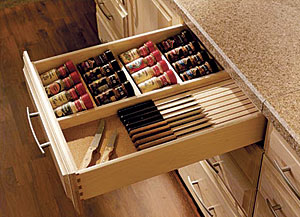
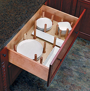
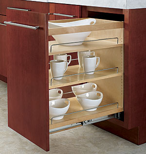
For easy access to cabinet storage, drawers are where it’s at. Use drawers everywhere you might have placed a cabinet shelf that requires knee-pads and a headlamp to find what’s inside. Install drawers on heavy-duty, full-extension drawer slides. Don’t skimp here. Also, don’t put drawers behind cabinet doors. Yes, people do this. It makes no sense.
A drawer with a notch in it to accommodate the drain line makes excellent use of the space under a kitchen sink. Tile the bottom of the sink base cabinet, and slope it toward the toe space. The plumbing will eventually leak, and you’ll need to know about it.
A base cabinet on wheels can be a roving work surface wherever you need it. Design it to tuck under a counter when it’s not in use. Kitchen islands on wheels add flexibility to a space. If they have a power strip plugged into a floor outlet, make sure the cord is long enough to move the island without tearing off the plug.
Timesaving Sinks and Space-saving Fridges
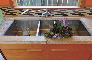
An undermount sink is a better choice than a drop-in sink, and you can make it even better by adding an integral drain board. If you can swing it, install two sinks, one for cleanup near the dishwasher and another near the food-prep counter. Use wall-mount faucets. They take up no counter space, look cool, and make it easier to keep the counter behind the sink clean. If you’re tall or if it’s getting harder to bend over, elevate the dishwasher with a pedestal.
Take a look at the three-bowl kitchen sink pictured here. Two of the bowls drain to the sewer, but the third drains to a gray-water system that irrigates the garden. This is over-the-horizon thinking.
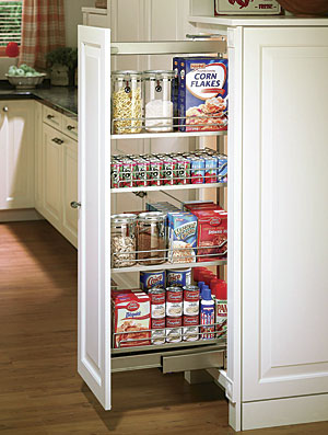
If you need a little extra space, tuck the refrigerator into the wall. Sometimes the 3-1/2 or 5-1/2-in that this gains will let you save a bundle by not having to buy a counter-depth refrigerator. Pantries are great, but don’t make their shelves so deep that stuff gets lost. Visit restaurant supply houses for amazing deals on cookware, sinks, stainless-steel tables, and a host of other heavy-duty kitchenware. While you’re there, get wall-mounted magnetic strips to hold all manner of kitchen tools where you can reach them easily.
Beyond the Basic Bath
When I was in college, I lived in a duplex with three other guys. We shared a bathroom a lot like the ones you find in a cheap motel: a fiberglass tub/shower enclosure with a flimsy curtain, and a commode in the corner. The sink sat in a clunky base cabinet lit by a ceiling-mounted fixture. Years later, when I hit the road for Fine Homebuilding to scout projects for the magazine and to photograph the best ones, I would see variations of our college-days’ bathroom, but all dressed up. Around the magazine, they came to be known as “onyx baths.” Each one would have exactly the same layout, but instead of a fiberglass enclosure and a shower curtain, there would be glass doors and a slab of expensive stone covering the shower walls. The big base cabinet would be made of a precious hardwood, and there would be a pricey chandelier illuminating it all from above. Don’t do this. You can do better with a little more targeted effort and less expense.
How? If possible, put a window in the wall opposite the door so that you can see it when you walk into the room. It will make the room seem larger. If daylight is in short supply in the house, consider a frosted-glass door to the bath. If space and budget allow, assign different bath functions to their own alcoves. Vary the ceiling heights to do this, and put the commode in its own stall.
When it comes to the bath, we can learn a lot from the Europeans. For example, waterproofing the entire floor and pitching it to a drain allows curbless showers without enclosures and eliminates any worry about getting the floor wet. Another European nugget is to put the shower and the toilet in the same space, and the lavatory sink just outside in its own alcove that shares the plumbing wall. Two people can use this arrangement without getting in each other’s way.
Little Things Make a Big Difference
Wall-mounted toilets and cabinets let a small bath breathe and make it much easier to keep the floors clean. An electric heat mat under a tile floor in a bath is an affordable slice of luxury that doesn’t cost much to install or to operate. Anybody who shaves their legs will appreciate a seat in a shower stall. Pay attention to lighting. Learn the difference between task, decorative, and accent lighting, and put them to work for you. (A great introduction to using different types of lighting is “Light a bathroom right” in FHB #207.) It won’t cost as much as the onyx-bath chandelier. Install a timer switch that turns on the bath light and the ventilation fan at the same time. When you turn off the light, the fan stays on for a preset period to clear the air while you’re not there. Install a quiet fan so that people will use it. See “A Buyer’s Guide to Bath Fans,” FHB #199, for particulars.
Make Sure it Fits
No matter how you shape your kitchen and bath, put pieces of your life into them, and make them yours. Use real ingredients, such as stone, wood, metal, tile, and glass. (I put real linoleum in this category, too.) Kitchens have evolved into our living rooms, so make them comfortable places for both you and your guests. Build what you want. You don’t have to settle for somebody else’s lab coat.
Fine Homebuilding Recommended Products
Fine Homebuilding receives a commission for items purchased through links on this site, including Amazon Associates and other affiliate advertising programs.

Code Check 10th Edition: An Illustrated Guide to Building a Safe House

All New Bathroom Ideas that Work

Pretty Good House

