Renovating for the Right Kitchen
A tiny addition and more windows make a better space for period-appropriate cabinetry in a Craftsman-style home.
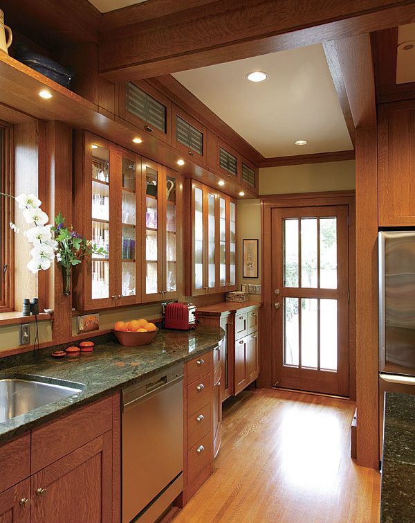
Synopsis: With the exception of some superficial details, the kitchen in Gail and Peter’s 1918 house hadn’t changed in almost a century. Gail and Peter asked architect Daryl Hansen, whom they had already hired for a remodeling job, to tackle their kitchen as well. Hansen began by enclosing the covered entry, which added 52 sq. ft. This provided space for a long counter to run across the north wall, where Hansen also added a continuous bay of windows, two of which are fronted on the interior by backless cabinets with glass doors. These and other oak cabinets complement the woodwork in the living and dining rooms. On some of them, Hansen specified glass doors in which he inserted laser-cut metal designs. The new kitchen also features new appliances and a new peninsula, arranged for better circulation, as well as a new entry to the backyard.
I had not quite finished the remodel of Gail and Peter’s house when Gail said to me, “You know, Daryl, we have to do the kitchen next. I have always wanted to have a beautiful, functional kitchen.” Gail and Peter’s existing kitchen never matched the original Craftsman-style woodwork in the rest of their 1918 house, and that period detailing had been a big factor behind their purchase of the house.
The kitchen had other problems as well: It was small, it had only two small windows, and its access to the backyard was convoluted. The appliances were old and outdated, and they interrupted the circulation. Working in the kitchen required lots of walking back and forth, and the counter space was limited for a house of its size.
First, expand the space
More space would require an addition, and the existing covered entry seemed like a good place to start. By enclosing the L-shape of the entry space, I gained 52 sq. ft. The bigger kitchen area made room for new counters and cabinets to extend all along the north wall of this space over a 19-ft. expanse. A new entry would extend toward the back.
The second way I added space and additional light to the room was to project a continuous bay of windows along the north wall above countertop height. More light was good, but because light and storage were better, I designed backless cabinets with glass fronts that fit into the bay. Pushing out the upper cabinets opened the countertop space, and the remaining bay-window projections added an extended ledge above countertop height that enhanced the feeling of space in the room. A new glass back door brought views and sunlight in from the east.
Traditional cabinets fit like a glove
The extra space left room for a large central peninsula that served as a new prep and eating area. By removing a doorway at the western end of room, we were able to extend the cabinetry into the hallway, which added to the flow of the room. Tucking the new larger refrigerator into a modified cabinet recess kept it out of the circulation path around the peninsula.
The existing woodwork in the living and dining rooms provided the impetus to design a kitchen that echoed the enthusiasm of those portions of the house. Working closely with Gail and Peter, I included as much cabinet space as artfully possible. I designed upper cabinets that extended to the ceiling above and along the entire new bay-window area. Open display shelves created continuity between upper cabinets.
We used lightly stained quartersawn white oak for the new cabinetry and millwork. The oak inspired details such as the base cabinet legs, assembled from mitered pieces so that a quartersawn face was exposed on every side. We specified complementary black-stained walnut for some open shelves.
For more photos, drawings, and details, click the View PDF button below:

