Spotlight on Textures
An Oregon contractor wrestles more function from his small vintage kitchen.
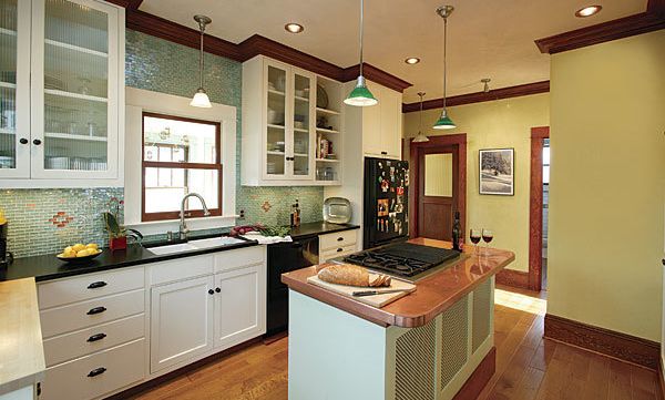
Synopsis: Contractor Jay B. Lane had worked on everything from decks to bathrooms, but he had never before tackled a kitchen remodel. An opportunity presented itself when Lane decided to remodel the kitchen in his own home, which suffered from a shortage of daylight, the absence of an island, and a poor layout. Lane began by changing the layout so that the sink, fridge, and range were within easy access of each other. He did this by removing a wall to create space for the fridge, then adding an island to center the kitchen’s work area. The island is topped with a copper counter and has a built-in range, lighting controls, and a microwave tucked into one side. Daylight comes from a motorized skylight and new windows over the sink. The new kitchen benefits as well from Venetian plaster on the walls and ceiling, and green glass tiles with copper accents that cover the area around the sink.
I got my start as a contractor in 1996 building fences and decks. Over the years, I progressed from doing remodels of bathrooms, entryways, and front staircases to starting my own window and door company. It wasn’t until recently, though, that I got to apply my skills on my own house, specifically my tired old kitchen.
Never having remodelled a kitchen before, I teamed with Melissa McCall of McCall Designs to assist me with the layout. The footprint of this small space was complicated by the six entryways that all converge at the kitchen. On top of that, I really wanted an island a center piece both to define the work area and to offer a place for guests to gather while the meal is being prepared. Of course, storage and natural light were both big items on my list.
Squeezing out every inch of space
My whole idea with the layout was to create a freely flowing space where a couple of people could work at the same time. To minimize distances, I grouped the work triangle of sink, fridge, and range all within easy access of each other. Now I can reach everything I need for prepping food, washing and storing dishes, and cooking without having to walk more than five steps. This way, guests can sit at the island and give the cook some elbow room. It’s where everyone gathers for evening cocktails.
The new island houses a Jenn-Air gas cooktop/electric convection oven, and a microwave is tucked into one side. (Hiding the microwave minimizes its visual impact.) I chose a range with a downdraft vent because I thought a hood would make the kitchen feel small. Unfortunately, a downdraft vent is not as effective. The laws of physics dictate that the suction of the fan tends to pull the flame (and heat) away from the pan. Furthermore, the suction really cannot pull the smoke from the top of a pan. It does work satisfactorily with the grill side, however. Installation was easy because the basement isn’t finished; I just ran the vent to the exterior of the foundation.
In addition to being the kitchen’s focal point, the island is also the control center. I installed the room’s lighting controls next to the microwave. The texture on the back of the island is a cloverleaf pattern stamped onto heavy-gauge steel panels that I also used on the bar-cabinet doors. Available in many hardware stores, the material is typically sold in sheets and is used to build radiator covers. My shop mate, Jason Crawley, built the custom-size cabinets. If I’d gone with standard counter-depth cabinetry, I’d have lost a precious 2 in. of space in the galley walkway.
For more photos, drawings, and details, click the View PDF button below:

