(This case history from Renovation 4th Edition reflects today’s need to maximize space and functionality, conserve resources, and create homes that can accommodate life’s changes.)
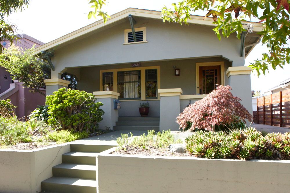
The two-bedroom bungalow “instantly felt like home” to Sandra and David. It had beautiful old windows, wavy glass, unpainted woodwork and built-in china cabinets in the dining room, and the house had been well-cared for. Small by today’s standards–roughly 1150 sq. ft.–it had comfortably housed a couple and their three kids when it was new. Its close quarters would be something of a challenge because one of the bedrooms would become David’s home office, but the couple welcomed the opportunity to get rid of stuff they didn’t need, recycle on a regular basis and live simply.
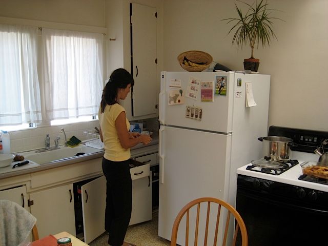
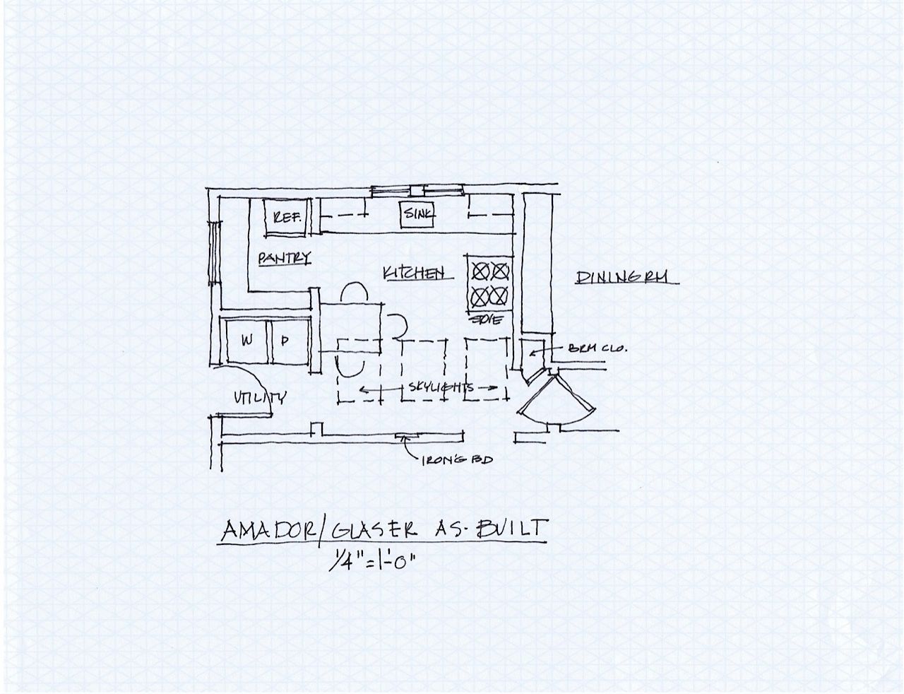
The kitchen, however, was a horror: cramped, dingy and badly out of date. The bathroom was also dark and a bit funky, but they could live with it. The couple lived in the house before starting their renovation but when they did, they had an ace in the hole. David’s cousin, Fran Halperin, was an architect who loved a challenge.
Client requirements
“A kitchen you can use without bumping into stuff! More storage, more counters, more room. It’s impossible to keep clean, and the old linoleum is shot. The bathroom is dark, it would be nice for both of us to have our own space in it. We rarely use the tub.”
Kitchen solutions
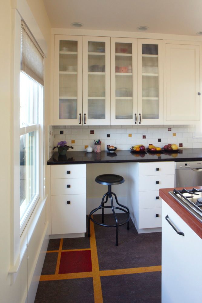
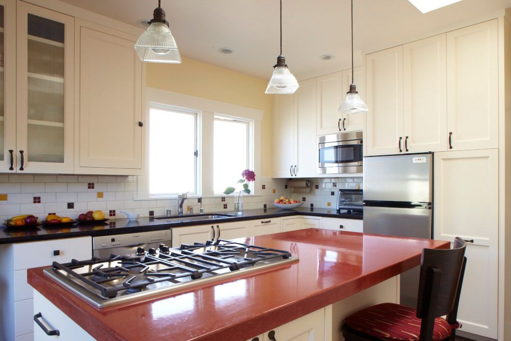
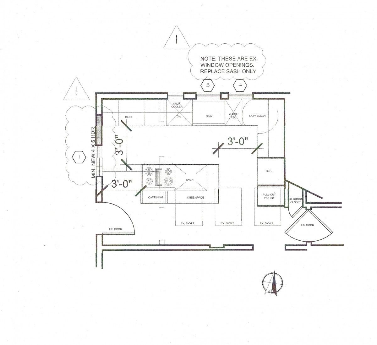
Take out the walls and open it up to create one large kitchen space. Create a large island whose concrete countertop includes a cooktop, prep areas and places to eat and hang out. Replace the full-sized fridge (17 cu. ft.) with a European (9 cu. ft.) model. Upgrade the sink and replace the glass in the over-sink window with obscure glass to increase privacy. Replace the old linoleum with Marmoleum. A desk in the kitchen for Sandra next to the east window.
Bathroom solutions
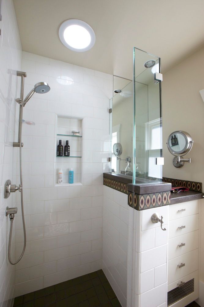
Replace the old, encased tub with a glassed-in shower stall. Instead of installing a second window on the south wall, install a light tube over the shower at a fraction of the cost–and greater privacy. Tile floors with radiant heating. In the small space next to the shower, a stand-up beauty area just for Sandra–David can have the medicine cabinet over the sink for his stuff.
Green touches
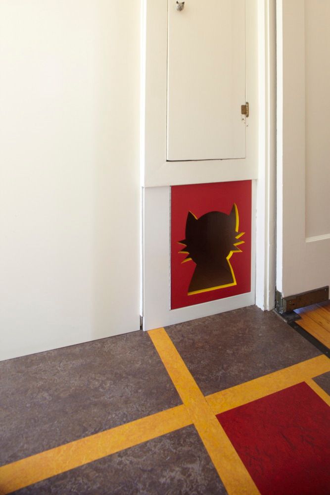
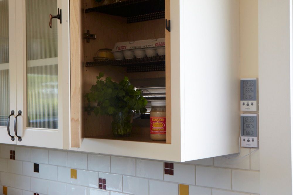
The California cooler in the north wall keeps produce cool naturally so the refrigerator can be smaller: Shop often, eat fresh. Marmoleum flooring. The light tube is free lighting.
Color therapy?
Interior designer Sharon Low and architect Fran Halperin often collaborate because their skills mesh so nicely. Says Fran, “Sharon is able to pull all the pieces together. Architects aren’t really into all those tiny little details, the pulls, the towel bars. You have to be a born shopper to be able to find all that stuff. She’s a hunter-gatherer.”
Says Sharon, “Fran’s a 3-D person, I’m more 2-D. I understand how colors and surfaces and textures work. And I’m a pretty good diplomat. If I am working with couples whose color choices are on totally opposite ends of the scale, I can somehow come up with a palette that pleases them both [laughing] so they can chose their battles about something else. I like to say that I’m sort of a color therapist–there’s probably about 20 percent design and 80 percent therapy in each project. Often I throw in something so completely different that it rocks them off their boats and really gets them talking to each other.”
Thousands of field-tested tips
This blog was adapted from Renovation 4th Edition, just published by Taunton Press. In addition to case histories about award-winning designs, Renovation 4‘s 614 pages include 250+ technical drawings, 1,000 photos from the 40,000 I have taken over the years, and thousands of field-tested tips and techniques that master builders have shared with me. I hope you find it useful. –Mike
© Michael Litchfield 2013
Fine Homebuilding Recommended Products
Fine Homebuilding receives a commission for items purchased through links on this site, including Amazon Associates and other affiliate advertising programs.

All New Bathroom Ideas that Work

Get Your House Right: Architectural Elements to Use & Avoid

All New Kitchen Ideas that Work

