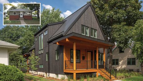
Small-House Secrets
This 800-sq.-ft. cottage uses 10 strategies for great comfort and style.
In “The Purloined Letter,” edgar Allan Poe’s mischievous observation on human nature, a stolen correspondence with compromising information is hidden in plain sight. After elaborate investigations have failed to find the letter, Poe’s detective spots it pinned to the wall, where no one has bothered to look.
Cathy Schwabe’s cottage reminds me of this classic tale. The small house deftly combines a catalog of design strategies that work together to make it feel expansive without ever feeling “designy.” These strategies are all right there in plain sight. Seasoned architects and designers know these guidelines, but judging from the fumbled opportunities that plague a lot of small houses being built today, I think they’re worth revisiting.
Like the notes in a song, these design strategies do not exist in a vacuum. They are the building blocks of smart small-house design, meant to work together with the goal of creating beautiful, comfortable spaces that fulfill their functions and delight their occupants. They turn up everywhere on a walk through Cathy Schwabe’s house tucked amid the redwoods of the California coast.
1. Raise the Ceilings
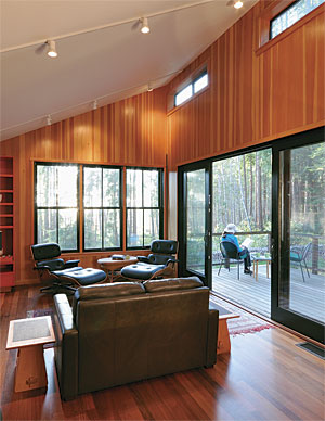
In the living space, the sloping shed roof rises to 14 ft., where clerestory windows admit north light and provide ventilation when needed. Notice how the light from the clerestories bounces off the white, gypsumboard ceiling, evenly illuminating the room. Each of the other rooms has either a cathedral or a sloping ceiling instead of the standard 8-ft. flat ceiling. If you can’t slope a ceiling, raising it to 9 ft. also will give a small room a surprising lift.
2. Use scale to your advantage
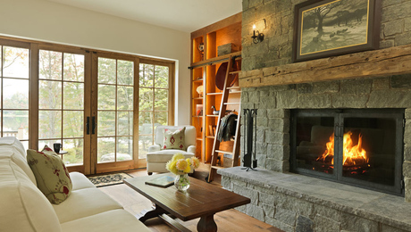
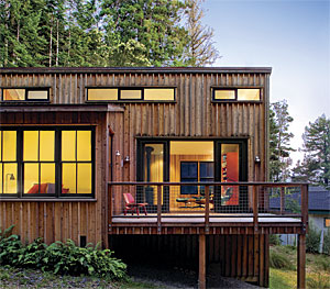
Exaggerated architectural elements such as the 8-ft.-tall sliding doors and the three tall double-hung windows in the west wall speak to generosity. It’s hard to imagine this room with smaller windows and doors. The vertical shapes of the frames and glazing echo the vertical lines of the trees in the background. The black window frames recede, emphasizing the view. Try to imagine them in typical white. It doesn’t work.
3. Borrow views
The shed roof rises to the north rather than to the south for two good reasons. First, a tall south-facing wall would have added too much solar gain to the room, and more important, there is a forested watershed to the north that will remain forest. The tall windows to the north and west take advantage of these views, and in fact, they reinforce the vertical lines of the trees. You can see the treetops through the clerestories.
4. Use texture and color sparingly
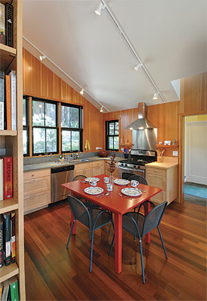
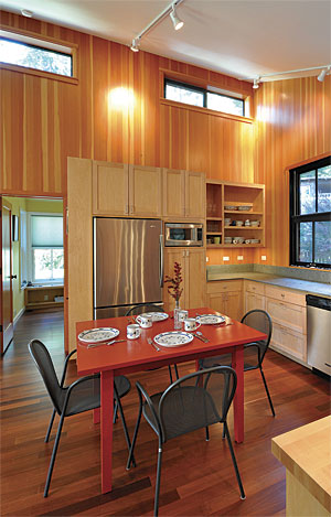
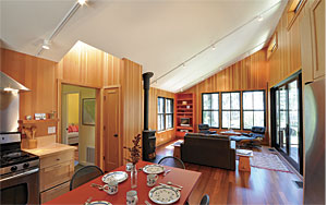
The vertical-grain Douglas-fir paneling adds a soothing amber glow and vertical lines of sap and heartwood that reinforce the lines of the windows and tree trunks. The crisp edges where the paneling meets the gypsum-board ceiling emphasize the architecture. Putting fir paneling on the ceiling would have diminished the impact. The ipé floors and maple cabinets have calm grain patterns that don’t compete with the fir. The vermilion front door, dining table, and bookcase in the main room add an unmistakable personal touch without going over the top.
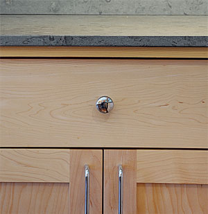 Maple cabinets
 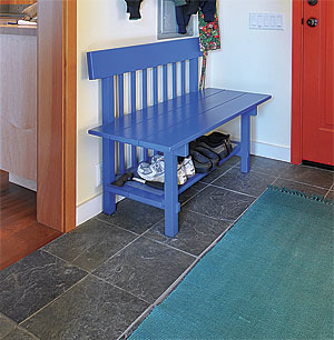 Slate floor
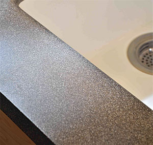 Avonite vanity top
  Limestone counter
5. Spend money on high-quality materials where it counts
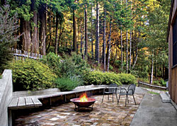
If you’re building a small house, you’ve already saved some money on materials. Invest some of those saved dollars in high-quality hardware, windows, doors, and elegant details. In this house, the fir paneling, ipé flooring, custom solid-wood maple cabinetry, and slate floors in the bath and entry are premium finishes that express the care and thoughtfulness of the designer and builder. Focus on the parts of the house that get plenty of attention and use. The limestone kitchen counter, dotted with fossils, and its undermount stainless-steel sink with integral drainboard are good examples of this. Outside on the patio, the herringbone weave of the cedar bench boards where they turn the corner says that somebody cared. There’s just no substitute.
6. Minimize hallways, and make them do double duty
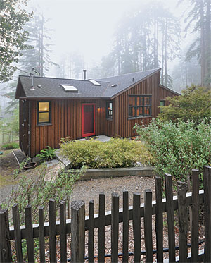
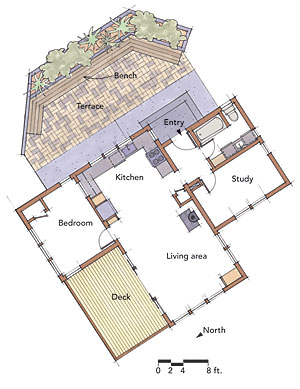
A small house is no place to spend precious space on long, narrow hallways. Instead, centrally locate the entry hall so that rooms can pinwheel around it. This applies to upstairs landings, too. Schwabe allocates a bit of entry space for a bench, which serves as a mini-mudroom for shoes below and a coatrack above. The vermilion door and bright blue bench add a zesty note. The entry leads either to the bath, the study, or the living space to the north, where the circulation paths to the primary bedroom and the deck merge with the living space, becoming comfortable spatial boundaries between the sitting area and the kitchen/dining area.
7. Create long interior views
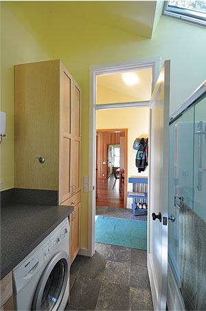
The diagonal views across the living space are only part of what makes the house feel spacious. The view from the entry through the windows in the study is another, as is the sightline from the bath right through the window of the bedroom. Placing transom windows over interior doors, as was done in the bathroom, channels daylight and views deep into small spaces.
8. Make multipurpose rooms
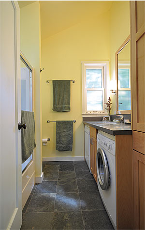
The one and only bath is also the laundry room, with a full-size front-loading washer and dryer tucked under the lavatory counter. This strategy not only saves space, but it also minimizes plumbing runs. Likewise, the study is also the guest bedroom.
9. Use windows on as many sides as possible
We humans like daylight, and when the sun is out, we gravitate toward daylit rooms. To satisfy that need, try to put windows on at least two sides of a room. The great room in this house has windows in all four walls, and a generous skylight over the passageway from the entry hall is a silent guide that says, “Walk this way.”
10. Create private outdoor spaces
Nothing amplifies the perceived size of a small house more than a sunny outdoor space. Here, the sloping lot required a cut in the grade to create a level pad on the uphill side for the entry. Schwabe saw this as an opportunity to carve out a wider pad for a brick terrace. The retaining wall rises about 5 ft. at its highest point. A lower retaining wall in front of it creates a planter between the two for landscaping that screens the neighboring house. Brackets support a yellow-cedar bench. Just about the time that the sun passes over the patio, it starts to light up the deck off the living space. Tucked into the notch between the bedroom and the living area, the deck becomes a private outdoor retreat.
SPECS
Bedrooms: 1, plus a study that doubles as a guest room
Bathrooms: 1
Size: 800 sq. ft.
Cost: $335 per sq. ft.
Completed: 2006
Location: Gualala, Calif.
Architect: Cathy Schwabe
Builder: Chuck Arana, Marine View Construction
Charles Miller is an editor at large. Photos by the author, except where noted. Illustration by Martha Garstang Hill.
 David Wakely

