Color in the Kitchen
A designer’s savvy approach to using color will help you create a standout space.
Synopsis: It’s no secret that color, when used correctly, can transform the spaces in our homes. Nowhere is that more true than in the kitchen. In this article, interior designer Courtney Fadness explores her approach to implementing color in the kitchen based on three important factors: commitment, budget, and style. She explains how to create spaces that reflect the architecture of a home and the signatures of its particular region and location. The article includes valuable information on adopting a color scheme to further help navigate the daunting task of choosing just the right colors for a new kitchen.
I work for Hutker Architects, a full-service architecture and interior-design firm with three offices in Massachusetts: Falmouth, Martha’s Vineyard, and Nantucket. Our goal is to cultivate our clients’ lifestyles, explore what “living well” means to them, and then match their life patterns with the homes we help create. Color plays a significant role in that effort.
When it comes to selecting colors for a home, and specifically its kitchen, I’ve seen trends come and go over the years. However, when considering kitchen designs of the past, one thing is crystal clear: Using color in some way is an enduring trend. The success and timelessness of a colorful kitchen design lie in the selection of the color itself and how it is implemented.
My approach to implementing color in the kitchen is based on a few important factors: commitment, budget, and style. The goal is to create kitchen spaces that best exemplify the architecture of a home and also the signature features of that home’s particular region and specific setting.
Weigh your commitment to color
A person’s perception of color can have a dramatic impact on the scope of a kitchen design. When you are unsure of how a color might affect the space, it is far easier to take the safe approach and not use it at all. In such an instance, a kitchen design can easily fall flat. Color infuses a space with life and energy, even if it’s used sparingly. For example, an entirely white space feels livelier with even a few colorful accents.
On the opposite side of the spectrum, a love of color can often lead to a lack of restraint. Overzealous application of trendy colors can date a kitchen quickly and lead to greater expenses down the road.
When I work with clients who are not so adventurous when it comes to color but who also don’t want their space to look dull or bleak, I begin by identifying the colors that they do like and feel most comfortable with. If that is difficult to ascertain, I ask to peruse their wardrobe. Clothing preferences are often a direct indicator of color preferences. And don’t discount “neutrals.”
I caution the timid to avoid falling victim to colors “of the moment.” Not that these fashionable colors aren’t often lovely, but color selection should be driven more by personal preferences than what is in vogue.
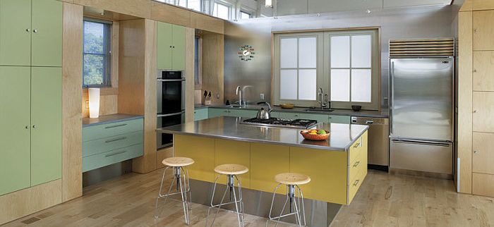
As a color lover myself, showing restraint with color is far more difficult than employing it. Kitchens are largely comprised of hard and permanent surfaces that are unforgiving and difficult to alter in the future without a significant amount of money and effort. I’ve found that using a single color in a large statement is one of the best ways a color lover can achieve a dramatic effect that will stand the test of time. Painting the cabinetry in a single color is effective in achieving this. Smaller doses of secondary colors can then be added to easily changed items such as furniture, textiles, and accessories.
For more photos and details, click the View PDF button below:


