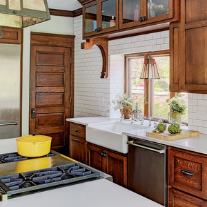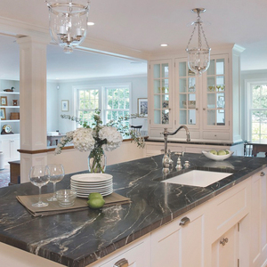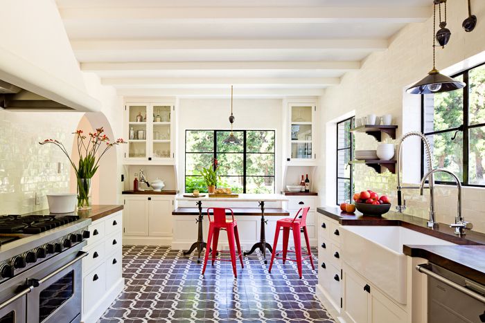
I really was impressed by this kitchen remodel I shot for Jessica Helgerson Interior Design. The original kitchen was only half this size, split into two rooms. She knocked down a wall to open up the eating area to the main kitchen area. Then she opened up an archway to allow a more natural flow into the dining room. When I shot it, it made perfect sense and I couldn’t believe it wasn’t part of the original floor plan.
Her designs are stylish, yet subtle and elegant. She takes great care in creating a material palette that works together as a theme. For this kitchen she used encaustic concrete tiles for the floor and locally hand-made ceramic tiles for the walls. The counters are solid walnut slabs made from locally felled trees. And the hand-made ceramic pendant lights were painted to match the dark purple-gray concrete floors.
Fine Homebuilding Recommended Products
Fine Homebuilding receives a commission for items purchased through links on this site, including Amazon Associates and other affiliate advertising programs.

Code Check 10th Edition: An Illustrated Guide to Building a Safe House

Not So Big House

A Field Guide to American Houses

Photo by Lincoln Barbour
