Bright Kitchens: Going Toward the Light
A kitchen is reborn through a bright and spacious renovation.
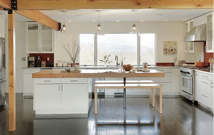
Synopsis: Architect Elizabeth Herrmann redesigned a dull 1980s house, transforming a dark and cramped kitchen into an open space that envelops the living and dining rooms. In this article, she describes the space, which is bright with natural light, courtesy of the larger windows added during the remodel, and the dominant white color scheme reflects that light. A massive island topped with a thick fir counter is the kitchen’s centerpiece and the family’s favorite gathering spot.
Though untouched since it was built in the 1980s, this house had lots of potential. However, its lack of windows made the interior dark. It was a disjointed, compartmentalized building that paid surprisingly little attention to its surroundings. Knotty-pine paneling covered many of the house’s small rooms. The new owners, who knew that the house was ripe for a redesign, hired me to create an open plan more suited to the lifestyle of a modern family.
Here, as in many homes, the kitchen is the hub, and it was crucial that it work just as well for large gatherings as for daily family routines. The key was to get rid of some interior walls, to add larger windows, and to brighten the interior—all while staying within a tight budget.
The homeowners also hired builder Red House of Burlington, Vt., to do the remodeling, which began with gutting the entire first floor. Together, we reconfigured the space to include a mudroom, large kitchen, living room, laundry, and half-bath.
Wood and windows
The original house had a lot of wood in addition to the knotty-pine paneling, including some fir beams and a blond-oak floor. The flooring was still in good condition, but the finishes were worn, so we decided to refinish it with an ebony stain and water-based poly to unify the different areas of the floor plan. (We also stained the treads and risers with the same ebony color.) To brighten up the house, we replaced the pine wall paneling with drywall, or in the case of the stair wall, we chose to paint it white.
Around the kitchen, I specified new windows that match the style of the existing windows to help maintain an overall continuity to both the interior and the exterior. The new windows also made a huge difference in the amount of light reaching the interior. I located them to frame views of the surrounding area that make the kitchen feel bigger. In particular, the massive 9-ft.-wide window in the kitchen looks out onto the Green Mountains and brings light deep into the house.
We used the kitchen’s existing fir beam as a departure point and added one perpendicular to it to define the area around the island. To replace the bearing wall, Red House added a matching post and custom-made the beams’ enameled-steel connecting hardware.
For more photos and details, click the View PDF button below:

