Cool, Calm & Collected: Kitchen Remodel
A kitchen remodel that lives comfortably in this 100-year-old house.
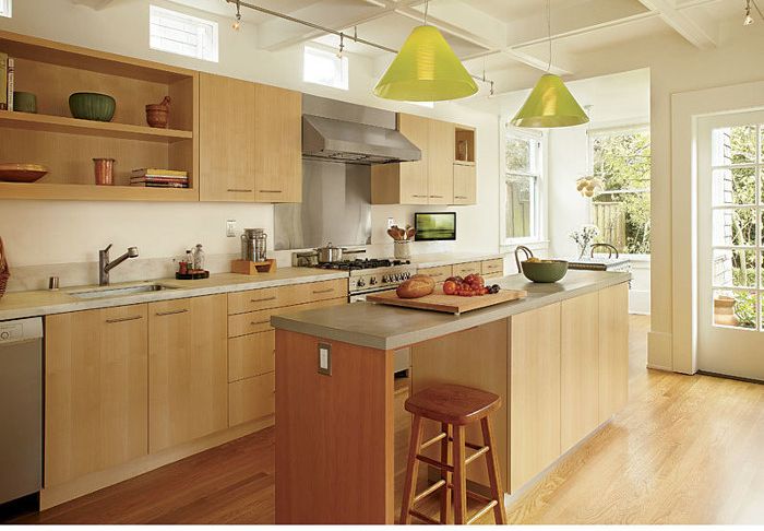
Synopsis: Jace Levinson’s San Francisco clients, an artist and an illustrator, sought to transform an outdated kitchen into a light-filled cooking, dining, and entertaining space. In this article, Levinson writes about the Arts and Crafts–inspired remodel he designed, which adapts and enhances existing features while completely revitalizing the space with new modern finishes and fixtures.
Photo: Muffy Kibbey
Originally constructed in 1905, this 1800-sq.-ft. Craftsman home located in the Sea Cliff neighborhood of San Francisco evokes simple yet elegant living. During my first visit, I was taken by the character of the modestly proportioned rooms and by the sunny, carefully tended garden in the yard just beyond the kitchen. The kitchen itself, however, didn’t leave me with such positive impressions. It had been remodeled in 1982, and it lacked the charm of the Craftsman aesthetic found elsewhere in the home. The narrow space had a large, awkward island at its center that contained the sink, the dishwasher, and the range. Due to the island’s width, the previous remodelers could only provide a 1-ft.-wide series of base cabinets along the longest wall in the kitchen. Too narrow to store anything of much size, the base cabinets also failed to offer a reasonable food-preparation area. A good deal of space was wasted in the entire arrangement.
My firm’s challenge was straightforward: The owners, Norman and Rosemary, wanted an improved plan in a style more appropriate for the home, but they did not want to build an addition.
Establishing calm
I like to think of our work as understated but vibrant. We look to nature for our inspiration, and in this case, we were influenced by the simplicity and color palette of the nearby garden. An interior with soft tones and delicate bursts of color seemed appropriate.
In the remodeled kitchen, open spaces predominate, with solid objects placed carefully within the layout. For example, upper cabinets do not extend fully to the ceiling, which makes them far less imposing. Portions of cabinets are left open and have the same effect. We chose not to maximize the amount of cabinetry in the kitchen, but rather to show a bit of restraint in order to create a more-open floor plan. Similarly, we could have selected a larger sink, but a modest-size unit helps emphasize the expansiveness of the new marble countertop. These design decisions, though subtle, keep the kitchen appropriately proportioned.
Modern yet warm
Given our desire to reflect the home’s natural surroundings, wood was an obvious choice for the kitchen’s primary surfaces. I have always liked the way the soft yellow tones of maple balance the deep amber hues of Douglas fir. For the primary cabinetry, we chose vertical-grain maple veneer; for accents—the end panel at the island and 4-in.-deep art shelves on the walls—we selected fir.
The light fixtures provide the bright, colorful accent we were looking for, while at the same time reinforcing the sense of craft. Manufactured by Leucos from Italian Murano glass, they have delicate stainless-steel attachments that help establish a modern tone.
For more photos and details, click the View PDF button below:


