Dutch-Colonial Kitchen Remodel
A small kitchen is redesigned for open family living.

Synopsis: The owners of a 1920s Dutch colonial in Minneapolis wanted a kitchen that would be more functional, less cramped, and brighter than their existing kitchen, which had undergone a poorly done renovation in the 1980s. Architects David O’Brien Wagner and Chris Meyer of SALA Architects came up with a new design that used the same footprint but that reconfigured the space in a way that improves the entire main floor of the house. They created three distinct zones–one each for meal prep, dining and entertaining, and cleanup and storage. In addition to creating an improved circulation path, they added two windows, which bring added daylight into the space.
With three growing kids and a family dog, the owners of this 1920s Dutch colonial in the heart of Minneapolis were looking to create a more modern and functional kitchen that would integrate well with the house’s traditional bones and detailing. The new kitchen replaces a 1980s remodel and addition that was dark, inefficient, and cramped. The homeowners were interested in creating open and visually connected spaces with a slightly Scandinavian feel as a nod to their family heritage. Budgetary limitations meant that we would be unable to alter the external footprint, so we knew the work would need to be subtle.
Small changes with significant results
The original flow of space from the dining room to the family room was a rat’s maze of traffic patterns. The new layout creates a direct route between the front and the back of the house. The new circulation path helps to organize the kitchen into two zones: one for prep and cooking, and the other for cleanup and storage. The original 1980s family room remains unchanged structurally, but we enhanced it with a more focused set of furnished spaces for casual dining and sitting.
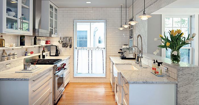
Access to daylight was an important concern for the homeowners, and the kitchen benefits from two new windows. A single Marvin Magnum double-hung window, with tempered glass in the lower sash, floods the work area with daylight while creating an open, airy atmosphere. A second, smaller window is tucked beneath a set of open shelves to the left of the dishwasher. This small window washes daylight across the countertop while providing an unexpected view to the backyard. The window alcove is framed with the same Carrara marble used for the countertop and nearby shelves.
Light and white
Daylight is generously shared throughout the kitchen by reflecting off the bright marble countertops, walls that are clad in classic white subway tile, and cabinets that have been finished in lustrous off-white enamel paint. The effect is a clean, simple, and timeless style that permeates the kitchen and newly renovated living spaces.
To view the before and after floor plans, along with more photos of the remodeled kitchen, click the View PDF button below.


