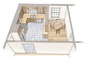
Hurried lifestyles have made it necessary for the functions of the kitchen and the main living areas of a house to overlap. In addition to cooking, kitchens have become places for dining, entertaining, working, paying bills, and studying. The ascendancy of the kitchen is a relatively recent development, however, and homes only a few decades old are likely to have cramped kitchens with little connection to the rest of the house.
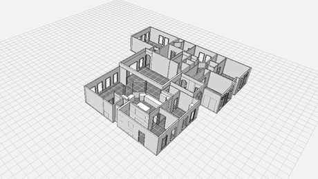
Fortunately, many of these dated kitchens can be improved with relative ease. The kitchen pictured here is typical of what you might find in an original suburban home built in the 1970s. The sketches that follow illustrate three strategies for reconfiguring this kitchen to make it an open, multifunctional space. While your project won’t have this exact layout, the three approaches illustrated here are easily modified, and they offer valuable insight into the potential that lies within remodels of various costs and levels of complexity.
Cost and complexity: Low
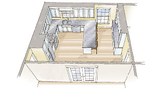
The existing kitchen is kept intact, but a more open feel is achieved by removing the ceiling-hung cabinetry. This makes the room feel larger and facilitates interaction between the cook and those in the eating area. The storage capacity lost by eliminating the cabinets is offset with a built-in buffet that has a pass-through window to the dining room. The top of the buffet has glass doors on both sides to share light with the dining room. To unify the kitchen, new hardwood flooring is installed throughout the room. The existing cased opening is replaced by a 5-ft.-wide pair of glazed French doors to create a better connection to the living room.
Cost and complexity: Moderate
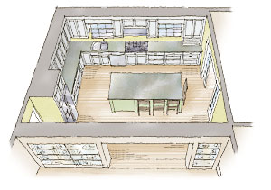
The breakfast area is annexed into the kitchen by removing the peninsula and ceiling cabinets. The cabinetry at the sink wall is extended, significantly increasing storage capacity. The range is moved to the middle of that wall, creating a long run of valuable counter space, and a large island provides eat-in functionality. To enhance the connection to the living room, a large opening that matches the width of the island is created. This opening is treated as a transition zone between the rooms and is enhanced with open shelving, which is handy for stashing cookbooks or displaying fine china. Though the flooring surface is hardwood in both the kitchen and the living room, a wide, flush wood threshold between the rooms provides a delineation of spaces. A wide opening with pocket doors is centered on the short side of the island to make an elegant connection to the formal dining room.
Cost and complexity: High
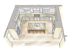
A flush header installed in the ceiling creates a continuous plane between the kitchen and the living room and allows removal of the wall that separates the spaces. This plan demands visual organization, so the cabinetry is laid out in an elongated U that wraps three sides of the room. The cabinetry cradles a large island with a sink at its center. The island acts as a visual marker of the transition from the living area to the kitchen. Large pendants suspended over the island will help to reinforce this transition. A cooktop with a decorative tile backsplash is aligned with the sink and becomes the kitchen’s focal point. Tall cabinets for the wall ovens and the refrigerator bookend the cabinetry and countertops. New hardwood flooring helps tie the kitchen and the living room together.
Drawings by Jim Compton







View Comments
I appreciate the emphasis on varying levels of cost and complexity, making these design strategies accessible for different budgets. The idea of removing cabinetry to create a more open feel is particularly clever, as it fosters interaction between the cook and guests. Additionally, incorporating islands and large openings can seamlessly connect the kitchen to living areaskitchen to living areas, making it perfect for family gatherings and entertaining. Overall, these design strategies are inspiring for anyone looking to revitalize their kitchen!