Same Space, Twice the Room
Keeping a traditional look in a kitchen remodel designed for cooking and entertaining.
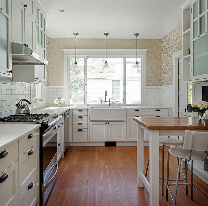
Synopsis: Old kitchens can be charming — until you try to cook or entertain in them. By repurposing a too-small dining nook and a disused hall, Seattle architect Nicole Taylor turned an outmoded and dysfunctional kitchen into a cook’s delight without changing the room’s footprint. By salvaging some original materials and carefully sourcing others, Taylor and contractor Nicole Dumas respected the house’s existing Arts and Crafts detailing while bringing the kitchen into the 21st century.
When I first met with Toni-Ann and Neil to discuss their kitchen remodel, I asked them how often they entertain. Their response amazed me. Even with full-time jobs, they cook for family and friends five nights a week. Consequently, Toni-Ann and Neil’s design priority was simple: Create a space that facilitates and celebrates sharing a meal with guests. This remodel was an opportunity to improve their life in a rich and fundamental way, and it was done without increasing the house’s footprint. While the century-old Seattle house’s existing kitchen was large enough, its poor layout, bad ventilation, minimal natural light, and cramped spaces made cooking a challenge.
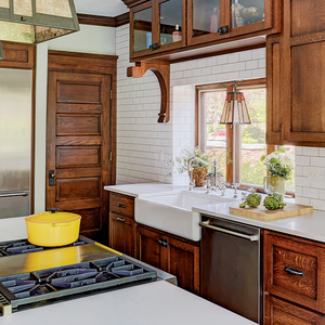
In addition to improving the kitchen’s utility, Toni-Ann and Neil wanted a healthy, green remodel that would pay homage to their 1900 home. Reusing existing flooring, lighting, and cabinet doors met those ends and also helped reduce construction costs. The new base cabinets use FSC-certified plywood with maple-veneer interiors and painted poplar frames. To minimize off-gassing, the plywood has no added urea formaldehyde. The new trim matches that of the rest of the house to create a seamless transition between the old and the new. Improved ventilation, daylight, and a design that welcomes family and friends into the kitchen create an inspiring space Toni-Ann and Neil enjoy sharing.
Simple Changes Make a Big Impact
The greatest challenge with the original kitchen was the location of the stove in a peninsula that split the kitchen into a cooking area and a dinette. There was no ventilation above the stove, and neither side of the peninsula was roomy enough to serve effectively as a kitchen or a dining space. The kitchen was dark, and the upper cabinets crowded low over the counter, making food prep almost impossible. Cabinet space was minimal. The rear entry door swung in, devouring space, and the refrigerator was placed like an afterthought in a back corner.
Getting rid of the peninsula and moving the range to the south wall allowed for an exhaust hood and expanded the kitchen into what had been the dinette. Converting the mudroom entry to a pocket door made room for cabinets and a sink on the west wall, where daylight now floods the kitchen through an expansive sliding window. The window also provides a pass-through to the outside grill. Moving the bathroom door and reframing a couple of walls to recess the refrigerator into what had been an awkward hallway opened up the east end of the kitchen.
For more photos, drawings, and details, click the View PDF button below:

