Tailoring a Full Bath for Empty Nesters
This family bathroom was remodeled into a luxury en-suite retreat.

Synopsis: In this article, Jennifer Jones writes about a small bathroom remodel her firm designed for an older couple who were looking to create a luxurious bath more closely aligned with the style of the rest of their home. The project demanded a redesigned floor plan that eliminated the tub to allow for better circulation through the compact space and a generous shower. This article explores lessons in small-bath planning and the execution of details that bridge the gap between traditional and contemporary design.
Our clients, a couple of empty nesters with a charming Bay Area house built in 1914, asked us to create a beautiful but functional suite bathroom that would complement the architectural details of their home. We wanted this to be the one and only remodel of this bathroom. Creating a timeless design that would remain stylish and functional for many years was our top priority. We achieved this through smart space planning and by using classic materials and fixtures, and a soft, muted palette.
Four details worth replicating
This project illustrates the potential in reimagining existing spaces with light remodeling work. Combining layout improvements with updated fixtures and finishes has resulted in an absolutely new bath within the old bath’s footprint. Here are the changes that had the greatest impact.
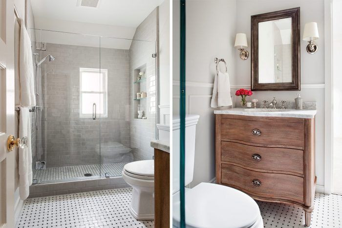
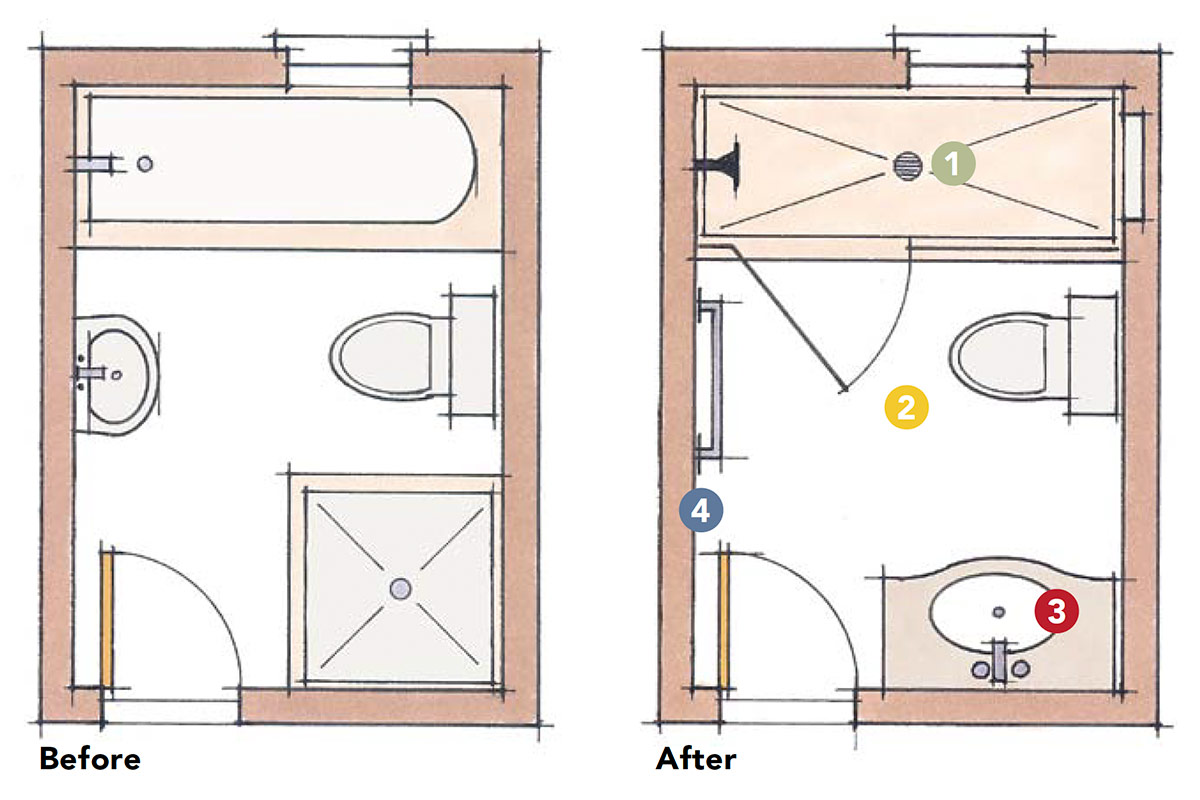
1. Removing the existing tub made way for a large light-filled shower defined by a glass partition and curb. The partition, as well as a recessed shower niche with glass shelving, helps bridge the gap between the traditional and the contemporary styles of the space.
2. The Carrara-marble basket-weave floor evokes a traditional quality. Keeping the flooring consistent throughout the compact space helps tie the design together and make the space feel cohesive.
3. The freestanding weathered-oak vanity provides a textural contrast to the muted-gray ceramic tiles and light dove-gray walls while providing plenty of storage. The Carrara-marble top and cross-handle faucet controls add a traditional touch that blends well with the home’s original details.
4. Applied panel molding that simulates traditional wainscot is inexpensive and adds another layer of traditional detail to the bath. Adding tile to these walls would have overwhelmed the small space.
Formed to fit
Paying attention to the dimensions in this project yields insight into what arrangements may work in your own bath designs. Here are some of the author’s recommendations when it comes to spatial planning, which exceed code in some instances.
- Shower width: 30 in. minimum
- Shower-door width: 28 in. minimum
- Space on each side of toilet tank: 10 in. to 12 in.
- Clear space in front of toilet: 24 in. minimum
- Clear space in front of vanity: 30 in. minimum
Details
- Vanity cabinet Empire Rosette Single Vanity, Restoration Hardware, restorationhardware.com
- Vanity top Carrara marble, Restoration Hardware
- Floor tile Tribeca New White Basketweave, Walker Zanger, walkerzanger.com
- Wall tile Elements tile, color 915, Ann Sacks, annsacks.com
- Faucet Lugarno 8-in. widespread, Restoration Hardware
- Lights Lugarno Sconces, Restoration Hardware
- Shower fixtures Symbol, Kohler, kohler.com
- Toilet Eco Promenade, Toto, totousa.com
Location: San Francisco
Designer: Niche Interiors, nicheinteriors.com
Builder: Gil Construction, gilconstruction.com
Jennifer Jones is the owner and principal designer of Niche Interiors in San Francisco. Photos by Thomas Kuoh.


