A New Face for an Old Cape
An architect applies a modern mountain vibe to a New England icon.
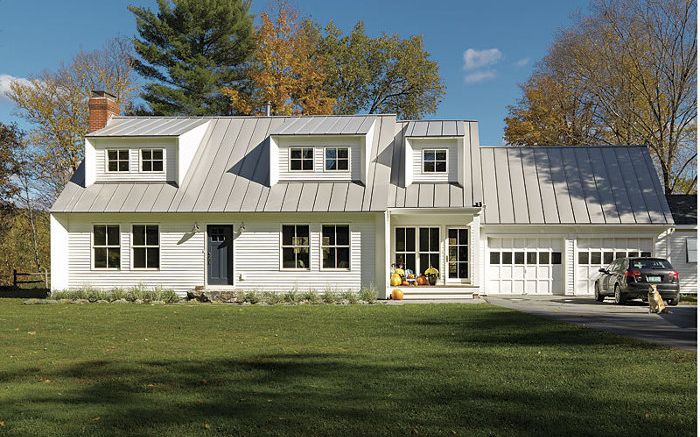
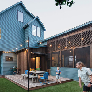
Synopsis: Over a decade of designing mountain homes in Montana, architect Brian Hamor found his own style diverging from the traditional approach involving large timber frames and soaring stone fireplaces. In its place, he developed a more modern aesthetic inspired by the agricultural and industrial buildings dotting the old West. He carried this new sensibility with him when he moved his family east, employing it in a remodel of a traditional, 1960s Cape they purchased in Stowe, Vt. Inside, Hamor opened and expanded the floor plan; outside, he transformed the house’s appearance from common to cutting-edge. At the same time, with a pressing need for better energy efficiency, he upgraded the envelope and mechanicals for a home that was as up-to-date behind the walls as on the surface.
Early in my career, I worked in Montana for firms that designed mountainside estates and ski chalets with a rustic air typical of Western architecture. Eventually, Montana’s vast, uncluttered landscapes inspired in me a desire to explore a more contemporary interpretation. Rather than create ornate objects on these landscapes, I began to focus on simple forms and durable materials — homes with large windows and free-flowing interiors that, for me, captured the natural grandeur of the West. With this as my mission, I opened my own practice in residential design and construction management with a contemporary spirit. I retained that sensibility when, with the birth of our first daughter, my wife and I decided to move east, closer to our families. We chose the village of Stowe, Vt., for its tight-knit community and the mountain lifestyle we’d become accustomed to. Our goal was to buy a modest home that we could remodel into something truly our own.
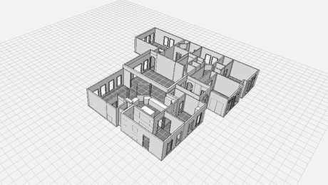
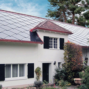
We purchased an 1800-sq.-ft. Cape in the heart of the town that offered a great location near the mountains, a bike path, and village amenities. The house itself, however, left much to be desired. The traditional floor plan consisted of small, closed-off rooms with tiny hallways, a tight kitchen, and outdated finishes — both inside and out. Nonetheless, we saw potential. We decided to remodel the place to emphasize the house’s New England charm, adding design elements that matched our own aesthetic and our growing family’s needs. By breathing new life into the old structure, we would create a home that expressed our lifestyle but still adhered to its own sense of place.
It did not turn out to be that simple. As we began the demolition, it became apparent just how poorly the house was built. The framing was undersize, and the electrical and plumbing were not up to code. The heating system was outdated and needed to be replaced. Faced with either patching the building back together or increasing the scope of the work, we chose the latter, stripping the building down to the studs and subfloor and rebuilding it. This also gave us an opportunity to make the house more energy efficient, as our first year in the house was met with exorbitant heating bills. We added Energy Star standards to our goals and incorporated durable materials that could withstand the harsh northern climate with little maintenance. Although these decisions doubled our budget and added two and a half months to the construction schedule, they also gave us more flexibility in reworking the floor plan and in remaking the home according to our own spin on the mountain aesthetic.
For more photos, drawings, and details, click the View PDF button below:
