Vintage Modern Kitchen
Traditional details tie a functional, modern layout to a century-old house.

Synopsis: The kitchen in this 1918 Seattle house was typical of its era: dark, bare, and separate from the rest of the house. In her renovation, architect Nicole Starnes Taylor added an arch to the main entry, enlarged the entry from the dining room, and blended traditional and industrial details to fit a modern kitchen in a century-old house.
Homeowners Jennifer Sargent and Matthew Cazier envisioned a light-filled kitchen with a clean-lined, modern aesthetic that still reflected the grace and charm of their 1918 house in the center of Seattle. Such a kitchen would welcome family and friends with sunlight and views to the garden. Its simple layout would be an inspiring backdrop for cooking and a welcome change to the existing kitchen’s blend of outdated details.
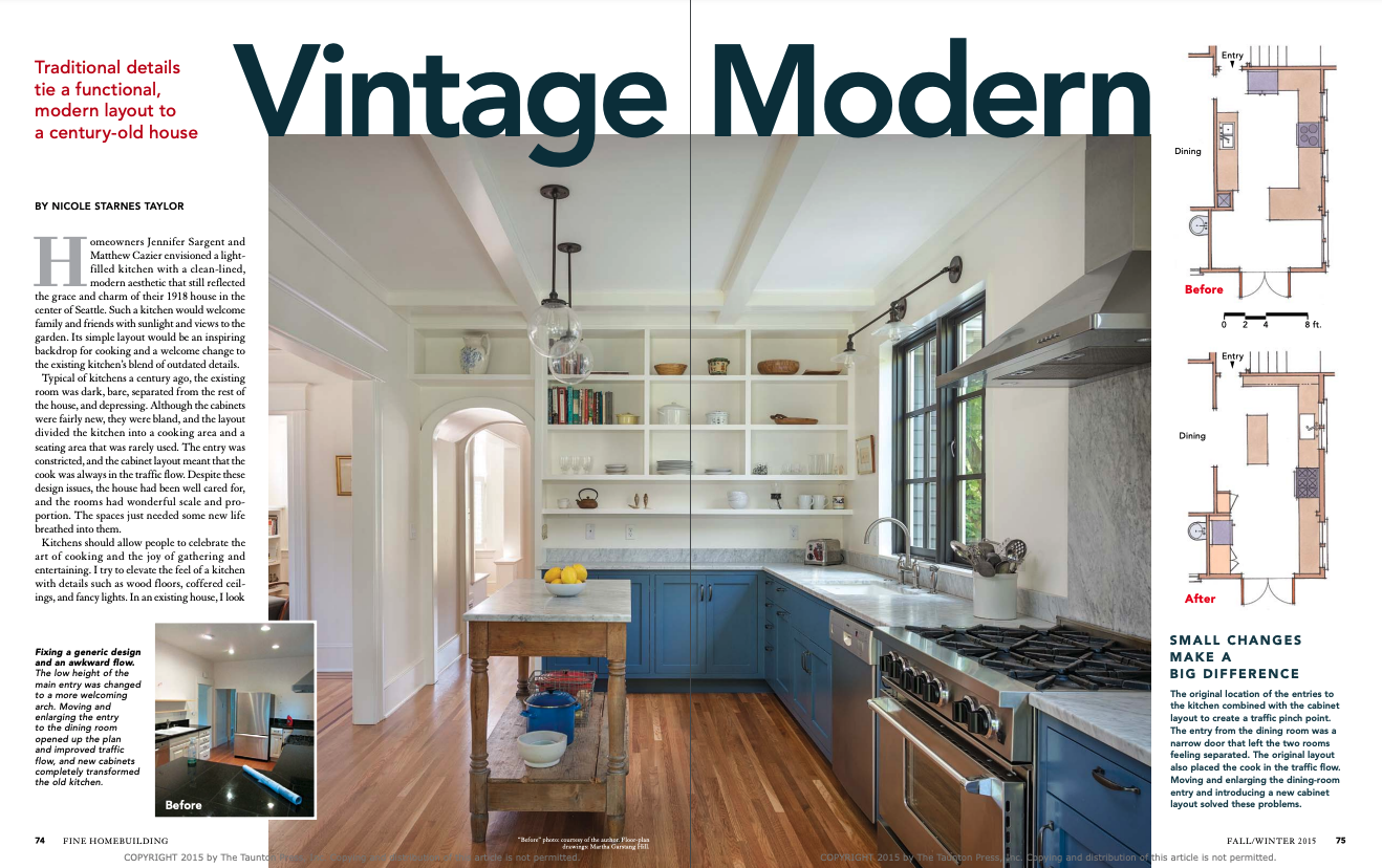
Typical of kitchens a century ago, the existing room was dark, bare, separated from the rest of the house, and depressing. Although the cabinets were fairly new, they were bland, and the layout divided the kitchen into a cooking area and a seating area that was rarely used. The entry was constricted, and the cabinet layout meant that the cook was always in the traffic flow. Despite these design issues, the house had been well cared for, and the rooms had wonderful scale and proportion. The spaces just needed some new life breathed into them.
Kitchens should allow people to celebrate the art of cooking and the joy of gathering and entertaining. I try to elevate the feel of a kitchen with details such as wood floors, coffered ceilings, and fancy lights. In an existing house, I look at the original details to see how to integrate the newly remodeled space with the original home. Next, I look for new details that can enliven the space and speak to the client’s personality, aesthetic, and goals for the project. In kitchens, I find that adding an industrial bent keeps them from becoming precious and stuffy.
Open a wall to improve flow and feel
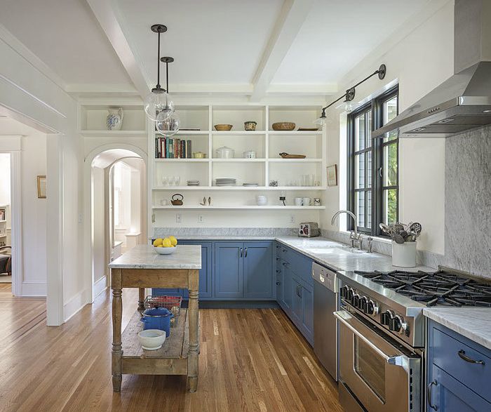
With general contractor Nicole Dumas doing the work, we replaced the small door between the kitchen and the dining room with a 6-ft.-wide cased opening to better connect the two rooms and to tie the kitchen visually to the rest of the house. At the other entry to the kitchen, we replaced the low, flat ceiling under the stair with an arch that followed the rise of the stair’s stringers and added 8 in. to the ceiling height in the center. Not only is the arched opening in keeping with the historical period of the house, but it makes the experience of entering the kitchen more dramatic.
By eliminating the peninsula and extending the kitchen into what had been the seating area, we increased storage without adding upper cabinets, helping to make this narrow room feel open and bright. An island made from an old wood table that Jennifer found at a neighborhood furniture store replaced the seating at the old peninsula. The table’s reclaimed wood brings texture and warmth to the kitchen. Nicole replaced the table’s dilapidated wood top with Carrara marble, connecting it with the other countertops.
For more photos and details, click the View PDF button below:


