Upgrading the Basic Trim Package for a Colonial Home
Exterior trim is worthy of more than just a few fleeting moments of design time.
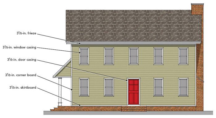
BASIC IS BORING
The most basic colonial home starts with a trim package in which all of the elements are the same. The skirtboard, corner boards, frieze, and window and door casings all have the same dimensions. With no crowns, cornices, coves, and the like, the whole elevation is flat with no distinguishing character. Even the windows, with no divided lites to provide some detail, are flat and two-dimensional. The only architectural element that breaks this pattern is the front door, due to its bright color and prominent position at the center of the house. While there is nothing about this trim package that is inauthentic, the exterior trim elements don’t contribute any interest. There’s nothing that beckons us in. With no place to rest our eyes, we can’t delight in any detail. We simply move on.
Exterior trim is worthy of more than just a few fleeting moments of design time. An exterior trim package that consists merely of the most basic elements and that displays little or no distinction between pieces can result in flat, almost two-dimensional exteriors that lack character. By contrast, a robust trim package that consists of a hierarchy of elements and sizes creates a rich exterior that draws us in and holds our interest. Such an exterior entices us to, as I was told once, “go knock on the door and invite myself in for tea.”
Using a hierarchy of trim is a time-tested method for enriching a building’s exterior character and telling its story. Starting in classical Greece, buildings were embellished with elements such as entablatures, pediments, and cornices not only to tell a story but also to break up large masses and enliven the exterior.
In today’s homes, the hierarchy of exterior trim is primarily dimensional and is based on location. Horizontal trim—along the foundation line and roofline, for example—wants to be tall and robust to create a feeling of strength and groundedness, while the corner boards and other vertical trim elements want to be narrower, remaining dimensionally and visually distinct from the horizontal trim elements. There should be a consistent hierarchical relationship between vertical and horizontal trim pieces throughout the home’s exterior.
A common example is to make a window appear larger and consistent with the overall trim design by leaving the casing legs narrow while increasing the height of the head casing. The narrower vertical elements counterbalance the robust horizontal trim. The taller horizontal trim offers an opportunity for embellishment using an entablature of achitrave, frieze, and cornice above the windows and doors and at the roofline. In this way, the trim package creates a more interesting, three-dimensional exterior facade.
BETTER TRIM STARTS WITH PROPORTIONS
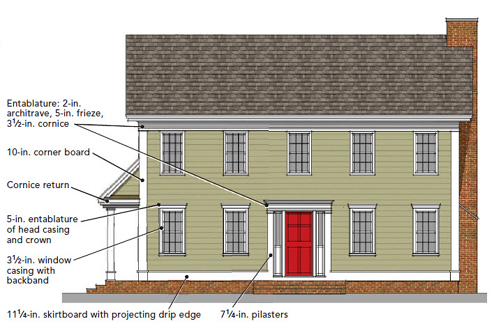
A better trim package starts with understanding that each element should have its own dimension. In this design, the skirtboard is taller, the corner boards are wider, and there’s a drip edge. The second-floor windows and roofline are connected with an entablature of architrave, frieze, and cornice. There’s a similar entablature detail above the entry. The first-floor window casing is widened with a backband and heightened with an entablature of head casing and crown. Another refinement is the addition of cornice returns at the roof, which help to minimize the large triangular field of horizontal siding and to bring the roofline back to the house. Half-round trim pieces serve as horizontal banding elements to bind each trim piece to the next. There are two character additions to this elevation. The first is the double-hung window sashes that now include divided lites. These reduce the overall scale of the windows and give our eyes some finer detail to respond to. The second addition is the sidelites and robust pilasters at the front entry door. Now the front door takes on the important stature befitting its nature.
Starting with the colonial form
A simple, center-hall colonial with lap siding, symmetrically arranged double-hung windows, and a steeply pitched gable roof provides an excellent example of the principles of trim hierarchy in action. Colonial is probably the most prevalent house style in the country, having been around for centuries. Colonials are as likely to be found on the West Coast as on the East Coast and in the heartland. Additionally, the style’s simplicity makes it highly adaptable. Starting out as a simple box, a colonial can be expanded to include an attached garage and additions, and its floor plan can be adapted to be more open.
Another feature of colonials is how they can be made to be anything from pedestrian to extremely high in style through the application of different trim packages. Of course, the trim package includes more than corner boards and casing, and sometimes it may mean upgrading the windows themselves or adding a porch or other design element to bring dimension and the opportunity for embellishment.
THE BEST TRIM HAS DEPTH
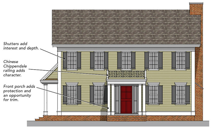
With the addition of a few architectural features, it’s possible to create a much more three-dimensional and lively elevation. First, window shutters add another shape, color, and layer to the elevation. By reducing the visual fields of horizontal siding, the shutters provide another place for our eyes to rest and take in detail. The trick to getting shutters right is to make sure that they are sized realistically for the windows and installed in a traditional manner with shutter hardware. Too often, shutters are attached to the house with a screw in each corner. This flattens them out, giving them a cartoonish look. A shutter should be slightly in front of and angled off the window trim to look authentic. Finally, a front porch provides protection and adds a distinctly formal character to the house.
Trim upgrades are cost-effective
A robust and rich exterior trim package need not break the bank. With all of the newer materials and stock trim profiles available, exterior trim can be a costeffective way of adding curb appeal and, therefore, value. The trick is making sure that you use a trim style sympathetic to the overall style of the house and that each element is from the same stylistic family. Just as you wouldn’t want to mix stripes and plaids, you don’t want to mix, say, colonial and Craftsman trims.
In the end, for about 2% of the construction cost, you can add value to a house through the use of trim and architectural features. The character and joy created with a better trim package is money well spent.
Fine Homebuilding Recommended Products
Fine Homebuilding receives a commission for items purchased through links on this site, including Amazon Associates and other affiliate advertising programs.

Musings of an Energy Nerd: Toward an Energy-Efficient Home
Pretty Good House
Get Your House Right: Architectural Elements to Use & Avoid


View Comments
Great simple article that describes most of what we do and believe.
PS
The second image is missing two captions that were cut off on the bottom. What were they supposed to say?