A New Kitchen and Much More
Without a single inch of new space, a remodeled kitchen transforms a house
Susan and John have three active boys. It’s safe to say they are on the go with regular hockey, soccer, and basketball games; swimming meets, school plays, spelling bees, and music lessons. On top of that is their busy social calendar.
Like many American homes, Susan and John’s house has a rarely used formal front entry that opens to the living room. The more commonly used back door put the family right into the kitchen, which was therefore doubling as the mudroom for all of their coming and going and the things they carry. And the old plastic laminate kitchen cabinetry was falling apart. They had to do something.
Susan and John considered moving. But they live in a dynamic neighborhood in a first-ring suburb of Minneapolis, across the street from a park, with neighbors that are like family, and just down the block from actual family, including me. Susan is my sister. I assured her that we could make her home work better. She and John needed a functional mudroom and a new kitchen. They had enough space. It simply needed to be reorganized.
A plan that flows
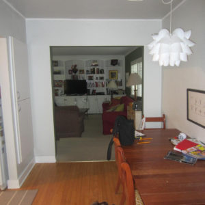
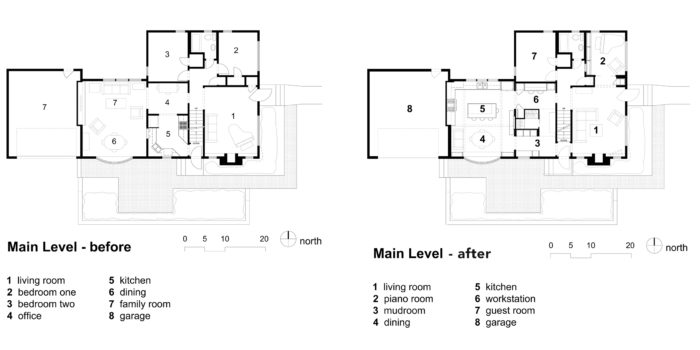
Before the remodel, the home’s back door opened into a foyer that was just big enough to handle the door swing. Straight ahead, stairs led to the basement, and to the left was the kitchen. The kitchen opened to a home office; the office opened to a combined family room and dining room. Though each room was comfortable, the transitions were abrupt and awkward, with the dining room the farthest away from the kitchen. The family room really wasn’t necessary, given the living room just a few steps away at the front of the house and a lower-level rumpus room for the boys to play.
The first thing we did was move the kitchen away from the door. Instead of a series of rooms as the plan had been before, we created more free-flowing circulation. From the back entry, the family can now access the mudroom and the new workstation on their way to the open kitchen and dining area. Circulation happens around a central walk-in closet and pantry. We also opened the entry to the formal living room in the front of the house, which had required a long walk around the stairs.
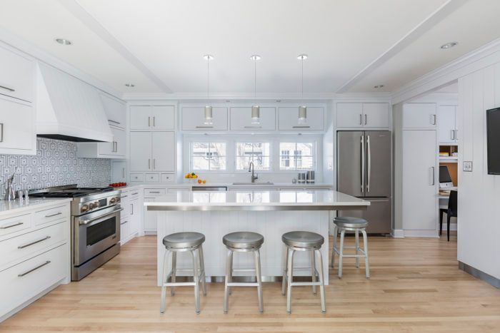
The new light-filled kitchen is the heart of the house. We centered the kitchen on an existing bay window in the former dining room and mirrored that expanse of glass with three new windows above the kitchen sink. Whether in the kitchen or the dining area, there are sightlines into the living room.
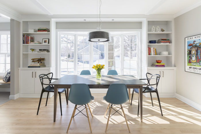
The space has excellent natural lighting during the day. At night, multiple lighting scenarios are possible. Recessed cans provide general illumination. All worksurfaces are lit directly by undercabinet lights or pendant lights. Pendants at the table and the island create a pool of light to gather around. Dimmers on all the lights provide the flexibility to set the right mood for cranking out a meal, doing homework with the boys, or savoring food and conversation with friends.
An edge on tradition
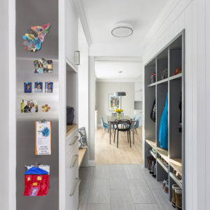
Aesthetically, Susan and John wanted the remodeled spaces to maintain a stylistic connection to the traditional 1940s cottage interior, with a dash of modern vigor mixed in. We created a modern cottage style that is evident as soon as you enter the mudroom, where there is tension between the traditional V-groove paneling on the walls and ceiling and a stainless-steel reveal at the base. There is also a stainless-steel bulletin board and square, modern hardware on the mudroom cabinetry, while a panel door slides on barn-style hardware at the entry to the walk-in closet.
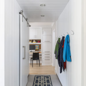
In the mudroom, the workstation, and the kitchen, the cabinet doors and drawers are inset (a traditional detail), but the flush panels with a square groove defining the edge are modern. This subtle line of detail hints at tradition and relates to the wall and ceiling paneling, which is also employed on the range hood and island base.
The windows above the kitchen sink are proportioned to allow views and light as well as to carry the line of upper cabinets across the whole wall. The mass of the refrigerator is balanced by a dish cabinet at the far end of the kitchen that sits on the counter. Stainless steel appears in the kitchen at the island toe kick, where it supports the island top’s overhang as well as the finish on the appliances.
The showpiece in the kitchen is the backsplash behind the range. The geometric stone mosaic tiles combine the warmth of a traditional material with a modern composition. The simple cabinetry and the white color palette lets this tile backsplash take center stage. New maple flooring matches the home’s existing floors, and new built-ins at the bay window tie the kitchen and the dining space together. A minimal ceiling trim detail suggests a traditional coffered ceiling.
Good design is iterative
Rarely does design work take a straight line from concept to completion. Each project we work on is specific to its place, our client’s preference, and the budget, as well as the nature of the team of people building it. After exploring a few of our preliminary design options, Susan and John picked a schematic direction that they liked, and we had builder Joel Johnson put together a preliminary price. It was 25% more than Susan and John wanted to spend. So we looked back to one of our less complex schemes that left dollars in the budget for architectural details and quality materials. We saved money in a few other ways, too.
First, we committed to working within the existing foundation. We didn’t add any space to make this remodel work; we just reorganized the existing space to function well. Second, rather than replace the large, expensive bay window, we saved money by aligning the new kitchen on it for a great view. Third, Susan and John selected modest appliances. These savings allowed us to include the high-end finishes—the backsplash, the stainless-steel details, and the wall and ceiling paneling. And the family got to stay in their home.
Architecture by Jean Rehkamp Larson, AIA, principal, and Angela Taffe, project manager of Rehkamp Larson Architects (rehkamplarson.com). Photos by Andrea Rugg (andrearugg.com), except where noted.
Fine Homebuilding Recommended Products
Fine Homebuilding receives a commission for items purchased through links on this site, including Amazon Associates and other affiliate advertising programs.

Musings of an Energy Nerd: Toward an Energy-Efficient Home

Get Your House Right: Architectural Elements to Use & Avoid

All New Bathroom Ideas that Work







View Comments
Fully customized work with our experts to create a unique home plans in Calgary Alberta Visit here- http://maxviewhomes.ca