Self-Taught MBA: How Much Architecture Should You Know?
The growing trend of traditional neighborhood development requires adding architectural literacy to the builder’s skill set.

Builders often complain about the architect’s lack of understanding on constructability. And that’s with good reason, as many architects have never swung a hammer and don’t know how hard we builders work at figuring out how to construct their drawings. But the opposite is also true. Many builders lack sufficient knowledge in architecture to interpret drawings, and it shows.
Reading Plans is Our Job
Some builders value their experience over the architect’s drawings and specifications, ignoring the details that homeowners pay designers to incorporate. Architects often discover their plans misinterpreted and ignored. I’ve done it, and maybe you have, too.
When we pick up a set of plans, we become responsible for rendering those designs in much the same way a professional musician must give a credible rendition of a composer’s score. You cannot imagine any working musician, whether classical, jazz, or even heavy metal, interpreting scores without knowing anything about the history of the music he’s playing, the style, or the context in which it was written.
Even worst, builders often consider themselves architects and offer to design, when they don’t have the education to do so. Just drive around your town, and no doubt you’ll see far too many examples of builders who have no idea that the work they did clashes with the home’s architectural style. Especially when remodeling, residing, and installing windows.
I was inspired, or more accurately riled into writing this blog when I recently drove past a home where a remodeler had just centered a four-foot wide, flat, horizontal window on the first floor of an Italianate style home. A classical, and elegant style where tall, narrow windows, set symmetrically are the norm. The remodeler had ruined the house.
Should a homeowner be entitled to suit?
I think so.
Architectural Illiteracy Shows
A hairstylist should know something about hair styles; a chef something about cuisine; and contractors ought to read up on some basic tenants of classical architecture. At least enough to distinguish the various styles of housing inspired by classical design, from Georgian to Queen Ann, as well as the more modern styles, such craftsman and prairie.
For one, it’s interesting reading, and since you are part of architectural delivery chain, you should be an informed performer.
After you read a few books on architecture, you’ll understand why those wonderful, wide, tapered columns that have become so popular, don’t belong on a Greek Revival house—they belong in a craftsman bungalow. And you will understand why architects have a heart attack when they spot details out of proportion, or plain wrong, such as narrow, square-top shutters on alongside a pair of arched windows. Something else I saw driving through the neighborhood.
On the other hand, drive around and you’ll easily spot homes designed by architects. These buildings generally appear coherent and contextual. Builders (as well as homeowners) often mix and match styles without understanding they are creating a hodgepodge. A little like wearing stripes and plaid, sneakers with a tuxedo, and… well, I know, this now in style, but, you do get my point. Proportions exist in classical design, and the language of each style has evolved over time to optimize these proportions.
This is not necessarily apparent, in the sense that homeowners can readily identify the errors in architecture, but anyone can instantly see the beauty of homes that do respect the strictures of an identifiable architectural pattern. This is why historical neighborhoods are popular and pricey.
In the old days, folks understood these patterns intuitively, it’s all they had ever seen.
Resources to Develop Architectural Literacy
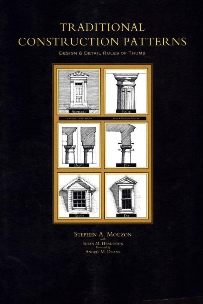
Some excellent resources exist that illustrate the dos and don’ts of long-established architectural patterns. I find Steve Mouzon’s Traditional Construction Patterns especially useful because he devotes ten chapters to the patterns commonly built incorrectly. Each of these details occupies a two-page spread, with the incorrect method on the left side and the correct method on the right. And Steve explaining the difference—in case you don’t get it. As Steve put it, his intent with this book was to, “Illustrate the correct methods clearly and plainly enough that anyone would be ashamed to build the patterns incorrectly again.”
One reason Steve wrote the book, was the realization that builders throughout the tract-home era had built so many poorly executed architectural details that most of us have lost the intuitive sense of right and wrong proportions. Something that until the mid-20th Century any builder understood, by simple exposure to architecture done right. As Steve challenges his university students, “go out and find me a single home built before 1930 that doesn’t look right.” They can’t.
Another book along similar lines is Marianne Cusato’s Get Your House Right: Architectural Elements to Use & Avoid. Featuring Marianne’s line drawings, with “avoid” and “use” versions of the same elements side by side, but lacking the historical context that Steve’s book supplies.
But if you decide to go deep, there’s the comprehensive A Field Guide to American Houses (Revised): The Definitive Guide to Identifying and Understanding America’s Domestic Architecture, by Virginia McAlester. Written by a bonafide architectural historian devoted to residential design, Virginia’s book provides a historical overview of all the dominant residential styles, and offers an iconography of architectural elements.
This iconography, or pictorial guide, helps you understand the grammar of traditional, American housing, element by element. For example, when you see super steep, side-facing gables, you should think: Tudor, Gothic Revival, or Queen Ann. When you see a low pitched, centered gable, think Italianate, Beaux Arts, or New Traditional. The book takes you through every style of roof and slope, dormers, balusters, windows, siding, brick coursing, chimneys, and trim.
Epilog: What’s This Gotta Do with Pickles?
As a builder or remodeler you are in the business of architecture—like it or not. The builders that run their business on a purely economic model, without taking esthetics into account, are also the builders responsible for neighborhoods made less charming and sometimes downright ugly. They follow the old business school adage that the business of a pickle factory is not making pickles, it’s making money.
I disagree.
Builders have always been proud of their craft skills, the door hung perfectly, the tight miters. Then building science came to give us a whole new perspective on the craft, which included performance. Today, the trend of traditional neighborhood development requires adding architectural literacy to the builder’s skillset.
Pickle makers ought to make great pickles, and builders should understand the aesthetics of architecture before erecting or remodeling buildings the rest of us have to look at and live with.
Once you train your eye to see a little like an architect, you’ll never look at houses the same–and you’ll respect the project architects contribution, even when you have to scratch the hairs off your head figuring out how to build it.


View Comments
As usual, the time it took to get this comment box up almost made me forget what I had in mind, but I reread the article while waiting,
An artist friend once said to me she didn't like houses. I said that judging houses from what you typically see is like judging art by what you see on the walls in motel rooms. As a designer and builder I sometimes get very discouraged with the ugly built landscape that prevails. I know many builders are responsible, but I've also met architects who have little regard for traditional forms and feel free to throw anything and everything into the mix. This is especially evident in the grotesquely monstrous 'homes' that occupy the high priced segment of the market. Style is one thing, proportion (as in appropriate overall size) is another.