Window Placement: Use One Ratio
In order to create visual interest, use the right proportions when deciding what goes where.

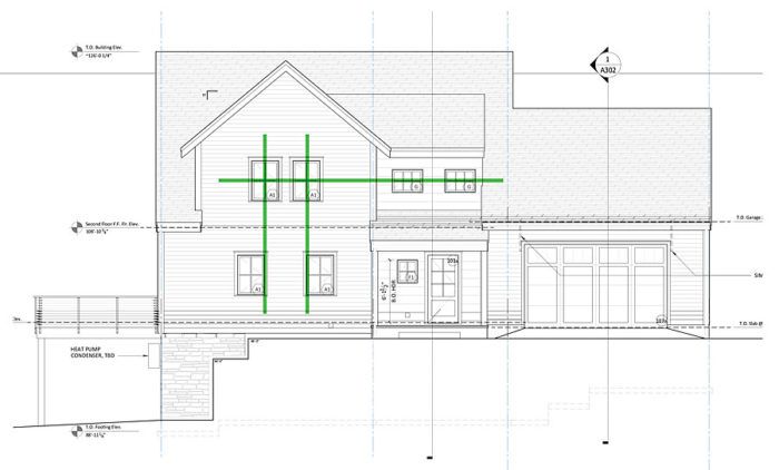
ProHOME designer Michael Maines says that it’s the arrangement of windows that makes a house interesting, and he offers some rules of thumb he used for placing windows in the ProHOME. Aesthetically, the proportions are critical. When windows have multiple lites, as they do on this house, maintaining a consistent width-to-height ratio on all windows allows you to mix windows of different sizes on the same elevation. Lining up the horizontal muntins of the different-size windows maintains the sense of scale and alignment.
There’s always some back and forth between the exterior arrangement and the interior location of windows. Sometimes this tension means that head heights of windows vary or that they don’t stack neatly over one another from one floor to the next. In these situations, there’s no hard and fast rule of placement, but Maines says that the decision should be guided by an organizing principle. In the ProHOME, most of the windows in the house have a head height of 6 ft. 8 in., but on the second floor, the secondary bathroom and laundry room needed a lower head height. On the reverse gable on the front of the house, there wasn’t room to align the second-floor windows directly over those on the first floor. Maines chose to align the outside edges of the lower windows.
So choose an organizing layout principle. If first-floor and second-floor windows can’t be stacked directly above each other, or if the head heights must vary, align vertical or horizontal elements such as muntins and edges so that placement doesn’t appear haphazard.


View Comments
Thanks Michael! This is very good advice and should be heeded by more designers. Window placement often illustrates, and calls out, a "swing and a miss!"